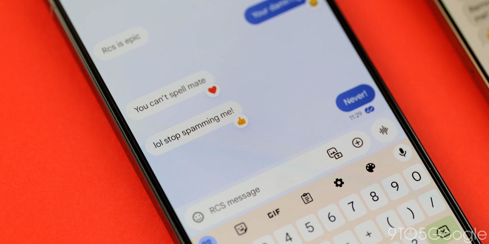
Still in testing, Google Messages has made a small color tweak to the upcoming redesign of RCS read receipts that makes the indicator bolder.
The original design had the circular background of the read receipts match the rest of the bubble. Meanwhile (in dark theme), the checkmarks (and ellipsis) were white like the text of your message.
Recently, Google Messages updated the design so that read receipts stand out a great deal more by having a white background. This aids visibility, but is a bit bold, especially if your message is on the shorter side.
Old vs. new


Google Messages started rolling out the read receipts redesign in August. The indicator moved from the bottom-right corner of the message bubble, while you now view timestamps and end-to-end encryption status by swiping left.
| Ellipsis | Sending |
| Single check with ring | Sent |
| Double check with ring | Delivered |
| Double check solid circle | Read |

More beta users got the server-side update in November, but it’s not yet widely rolled out. On one of our phones, the new receipts are only live in the main message list/homepage, while it’s unchanged in actual conversations.
This bolder color tweak rolled out earlier this week for Google Messages users that have the new read receipts.
More on Google Messages:
- Magic Compose missing from Google Messages with latest beta
- Google Messages more widely rolling out dual SIM RCS support [U]
- Google Messages now lets you set your own photos for contacts, replacing profile sharing
Thanks Dee!
FTC: We use income earning auto affiliate links. More.


Comments