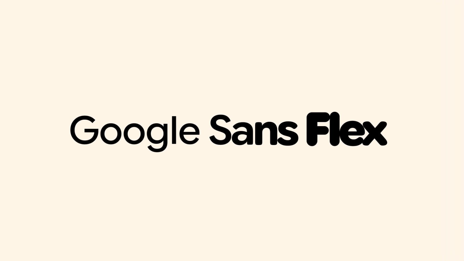
As part of open-sourcing Google Sans and Google Sans Flex, the company’s design team this week detailed the modern history of its fonts.
Due to the 2015 Google logo redesign, the company created Product Sans to update hundreds of product lockups, or the “fixed arrangement of the logo paired with each product name” that you might see in the top-left corner of apps. It was “based on the clean geometric forms of the new logo,” with the new “font’s repeating geometric shapes and tightly spaced characters made it perfectly suited for big product names at big sizes.”

Google Sans came next as Marketing and Product teams wanted to use the new typeface in advertising and user interfaces, respectively. However, there were issues:
- “…in practice, the typeface fell short when you only had a couple of seconds to catch consumers’ eyes.”
- “Product Sans wasn’t optimal for lengthy passages of text, or at the smaller text sizes used on phones and tablets.”
While still based on the 2015 logo, Google Sans from Colophon Foundry optimized the “character shapes, terminals, ascenders, descenders, x-heights, and stroke contrasts.”
The Google Sans typeface so clearly represented the brand that marketing teams could strip back most, if not all, other branded elements to let the product shine.

Google Sans Text (Colophon Foundry) in 2020 helped replace Roboto for smaller text. Characters here are “taller, more condensed, and less circular” compared to Google Sans, while there’s more space between them to aid readability. Additionally, “numerals are less geometric, and the angled cuts on terminals are less severe” for a “more uniform and readable experience, even at small sizes.”
It was also designed to match the proportions of Roboto, Android’s default typeface, to make switching from Roboto a smoother process.


Next up was support for “non-Latin scripts like Arabic, Chinese, and Thai.” This involved “meticulously crafting hundreds of thousands of new glyphs across more than 20 additional writing systems.”
All together, this massive global language support makes Google Sans one of the world’s largest typeface families.

There’s also Google Sans Mono in 2020 to “support contexts that needed fixed-width characters for editorial design, at medium and large text sizes.”
However, it was not ideal for coding and resulted in Google Sans Code (Universal Thirst) in 2025: “a monospaced typeface specifically designed to make code more readable.” Open-sourced, it’s used to display code in the Gemini app today.

Finally, we have Google Sans Flex (Font Bureau and Pathfinders) because the original “didn’t offer the nuanced expressive range required to truly match a product’s mood or a user’s preference.” In the current Material 3 Expressive era, it offers “granular control over six different design axes: weight, width, optical size, slant, grade, and roundedness.”
Google Sans Flex lets designers “sculpt” UI text with remarkable precision. Imagine making text feel “calm as a whisper” or “loud and rugged” simply by adjusting its weight, or evoking a “personal, playful” tone by fine-tuning its roundness. Our designers were particularly excited by the ability to precisely adjust how rounded or soft the text appears; these subtle shifts deeply influence how readers experience and connect with a design.

In recent weeks, Google open-sourced Google Sans and Google Sans Flex to allow for a “more consistent and polished digital environment for everyone.”
By offering Google Sans and Google Sans Flex to the wider community, we hope more developers and designers will bridge the visual gap between first-party and third-party apps. The goal is a more unified experience across devices and platforms, creating clearer, more comfortable interfaces for users wherever they engage with technology.
FTC: We use income earning auto affiliate links. More.


Comments