
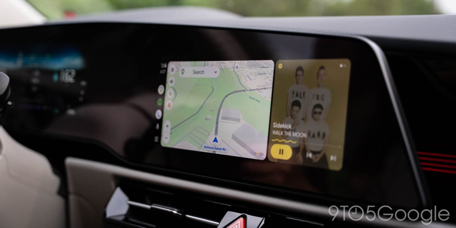
Google is preparing a redesign for Android Auto’s dashboard media player and, while it may be a bit of a visual downgrade, it’s functionally a huge upgrade.
Ever since Android Auto’s dashboard redesign debuted back in 2023, the media player widget has been fundamentally the same. Full-size album art takes over the widget, while Play/Pause and track control buttons sit underneath the track information. There’s been a Material 3 Expressive coat of paint applied, but that’s about it.
Hiding behind the scenes of “recent” versions of Android Auto, Google has a much bigger redesign in store.
Android Authority managed to enable this new look, with the redesign pushing the Android Auto media player widget to have smaller album art in the center with track information underneath and, below that, more controls than even. The usual Play/Pause and track skipping controls remain, but with additional buttons underneath.
In the examples of YouTube Music and another undisclosed media app (maybe Samsung Music?), additional buttons include shuffle and repeat, as well as thumbs up/like. This presumably varies per-app, and might include other controls for podcasts or other types of media.
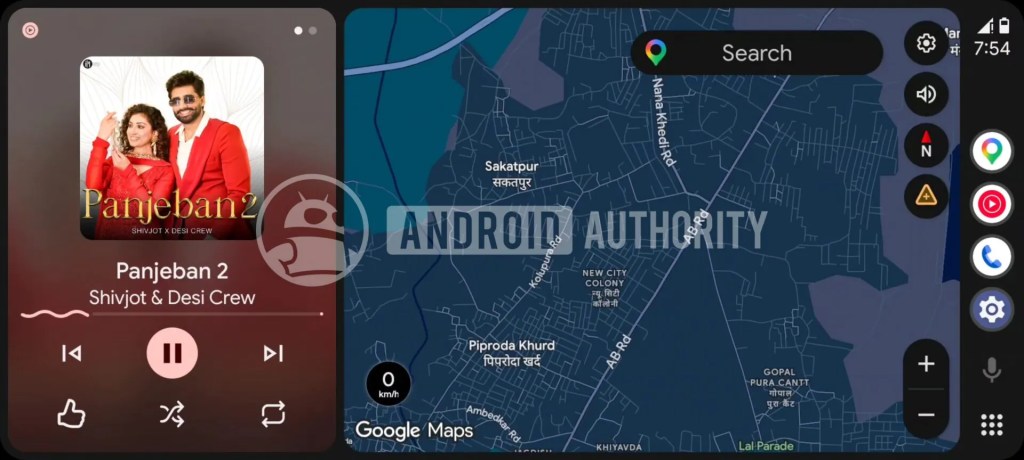
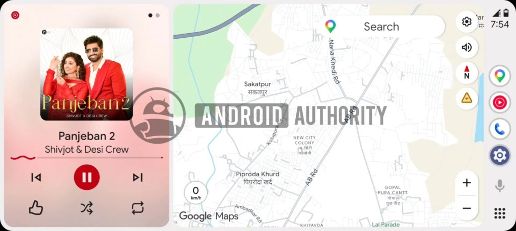
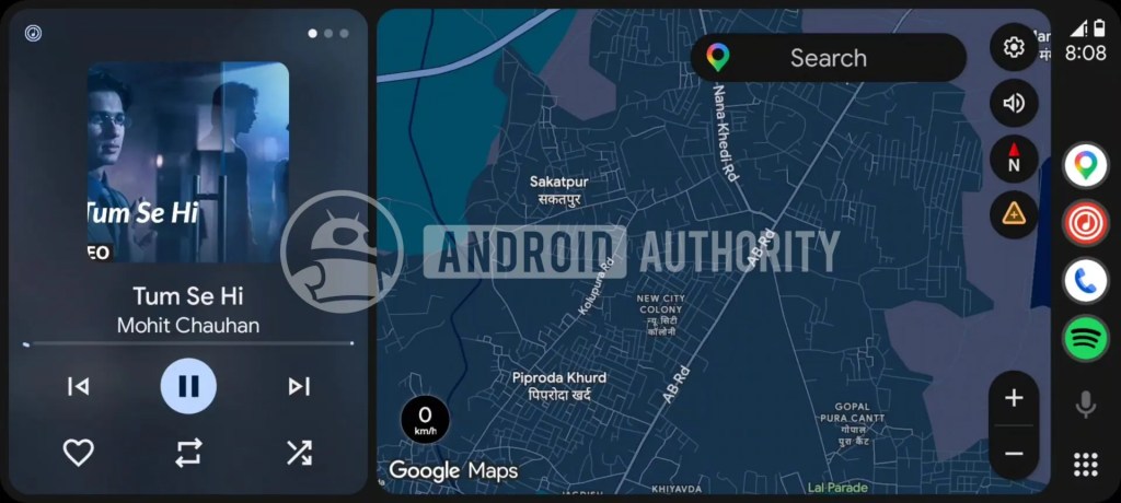
The background of the widget is a heavily blurred version of the album art.
It’s unclear when – or if – Google plans to roll out this new design. It’ll likely show up in beta first whenever it does roll out, but there are still plenty of features we’re still waiting on such as the light mode that was yet again manually enabled in the screenshots here.
Perhaps it’ll arrive with Google’s bigger Android Auto overhaul this year?
More on Android Auto:
- Android Auto gets navigation optimized for motorcycles, CarPlay too
- Google still hasn’t fixed my biggest problem with Gemini on Android Auto [Video]
- Motorola MA2 wireless Android Auto adapter, ‘the only one engineered by Google,’ gets a release date and full details
Follow Ben: Twitter/X, Threads, Bluesky, and Instagram


FTC: We use income earning auto affiliate links. More.

Comments