Google’s Android Auto platform has put out a few updates recently, and with them have come some tweaks to music and media apps. Here’s what’s changed.
On the Android Auto platform, all music apps share the same basic design to keep a sense of consistency for users. There’s a “home” page with recommendations and recent selections, and usually tabs for playlists, library, and other core elements of the app.
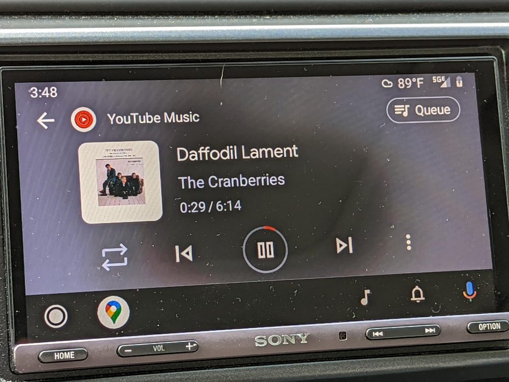
Then, in the corner, there’s a shortcut for the “Now Playing” screen which also has the same core design across apps. There are buttons for play/pause, skipping through tracks, and a mix of other controls such as shuffle, repeat, favorite, and others that change based on the app being used. For instance, podcast apps usually have a different layout here versus standard music apps. The buttons can also change based on the content being played. And in all cases, there’s album art next to the song title and artist, and that same art is used in a blurred out form in the background.
This same UI applies to Spotify, YouTube Music, and other apps.
But now, it’s getting a slight redesign. As was spotted on Reddit earlier this week, Android Auto 7.9 which is currently in beta brings a slight redesign to the Now Playing screen.
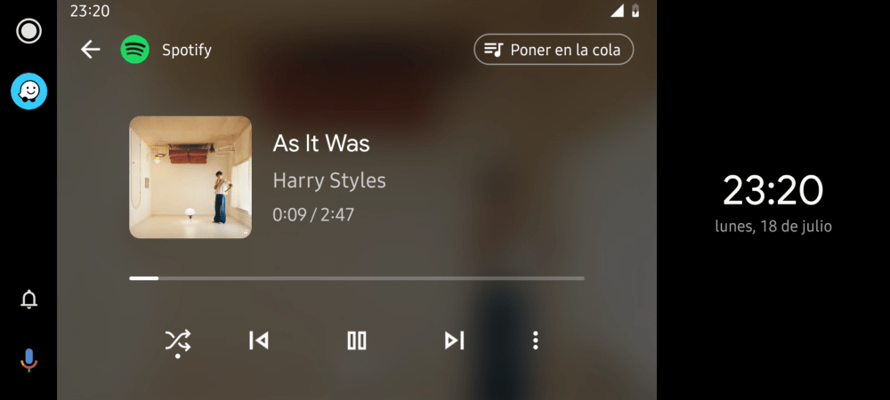
No longer is there a progress bar around the play/pause button, but a dedicated progress bar that spans most of the screen’s width. It’s a clean design, and one we’re definitely interested to see expand to more users over time.

And beyond that, Google also made a slight tweak recently to the Now Playing screen on wider displays. The blurred background no longer glitches on out these larger displays, and actually expands to the full width of the display. It’s unclear which version of the app this change went live in, but Android Auto 7.8 seems like a safe bet.

These aren’t the only tweaks Google is making to the design of Android Auto, though.
Back at Google I/O, the company announced a complete redesign to the Android Auto platform that includes better multitasking and conforms to fit more car displays. That redesign has yet to go live, but it shouldn’t be too far away.
More on Android Auto:
- Latest Android Auto update seems to break wireless support for some
- Android Auto 7.9 now available in beta, as previous update rolls out widely
- Android Auto redesign brings split-screen mode to in-car displays of all sizes
FTC: We use income earning auto affiliate links. More.


Comments