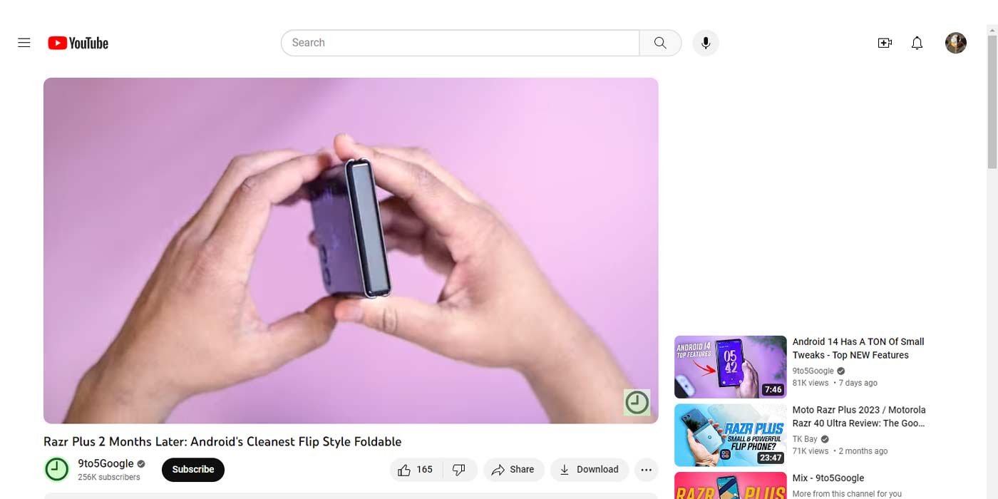
Google might be going through a phase. The latest update to YouTube brings rounded-off corners to the video player, somewhat matching changes we’ve seen in both YouTube TV and Google TV.
Opening up YouTube and playing a video shows off a very slight UI change (via The Verge). Each corner is now rounded off, doing away with the right angles of old that we’ve grown accustomed to. The new rounded corners only appear in the default view. Theater mode offers sharp edges against a black background, which makes perfect sense considering rounding off corners does cut off detail, although minimal.
A similar change was spotted on YouTube TV, though it doesn’t affect the video player. The Channel Guide has been adjusted to show live results in rounded boxes, opting to remove the right angles. That change closely matched Google TV’s Live tab and what results were showcased there. The new rounded corners in those apps soften the appearance a little bit and bring a modern touch. They also unify both products so that the gap between the two is less prevalent.
The change to YouTube is a little more interesting, however, as it’s so minor and doesn’t match something we’ve seen with other video players across Google’s sites.
As a whole, Google seems to be making changes throughout its products, adjusting certain design elements to flow a little better. The new YouTube video player change is small, but it might end up being divisive. We’re not sure if theater mode will see this change or if it’s more of a quality-of-life change.
Either way, we think the new video player on YouTube looks fine, and if it’s part of a much larger effort to polish YouTube, YouTube TV, and other Google products, the change is welcome.
More on YouTube:
- Multiview comes to YouTube and gets official YouTube TV launch, but with limits
- YouTube is testing summaries written by AI
- YouTube working with music industry on adapting to generative AI
FTC: We use income earning auto affiliate links. More.


Comments