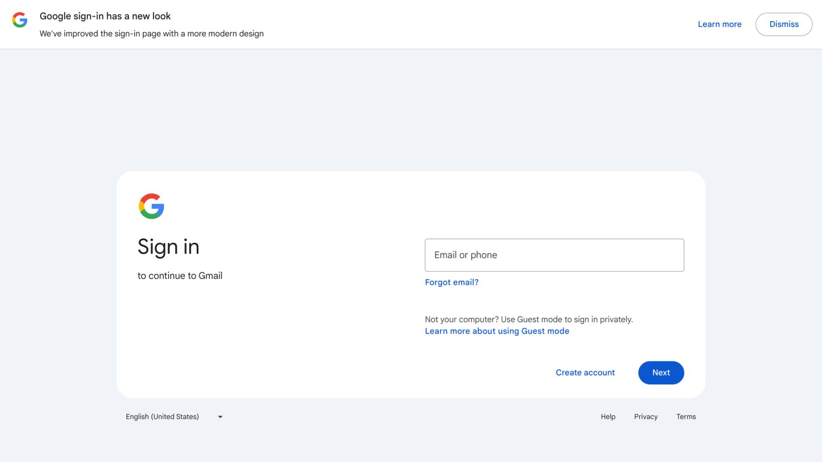
Following the announcement earlier this week, the new Google Account sign-in page is rolling out to phones, tablets, and computers.
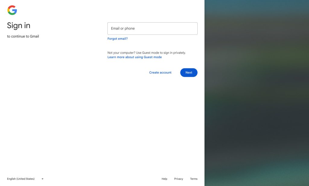
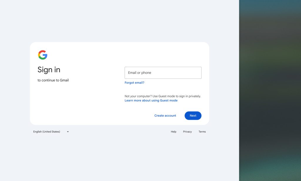
Google says this “new sign-in page has a better layout for all screen types, which includes large and wide screens.” It better conforms to Material 3 and feels less cramped given the improved spacing.
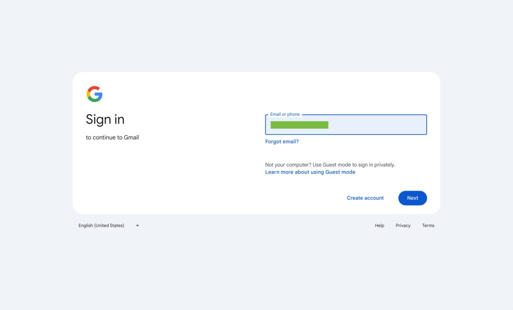
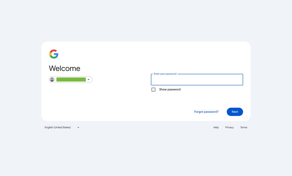
This desktop design has two columns, with the Google ‘G’ appearing at the left. The “Email or phone” and “Enter your password” text fields appear at the right with a blue “Next” button housed in a pill at the bottom-right corner. It’s housed in a rounded rectangular container that has a white background. Outside, you get a language switcher and links to Help, Privacy, and Terms.
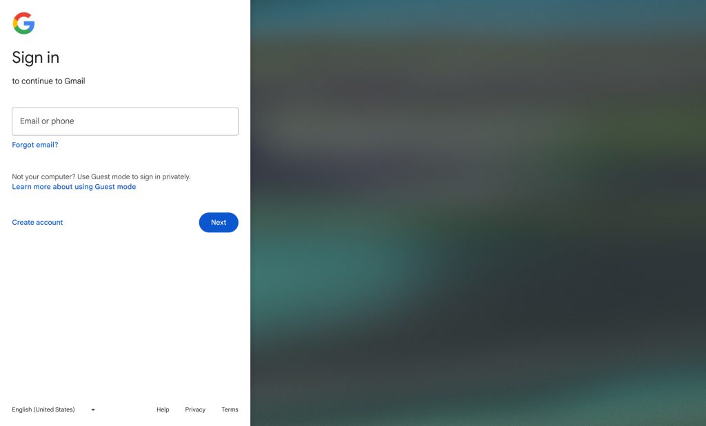
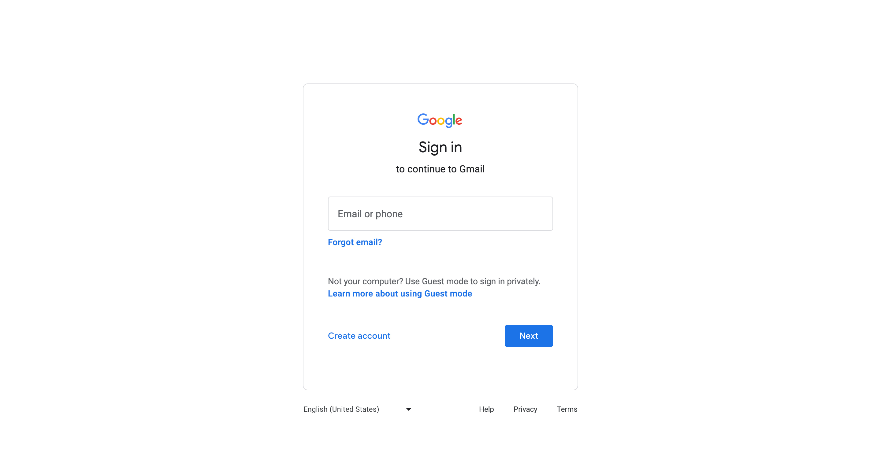
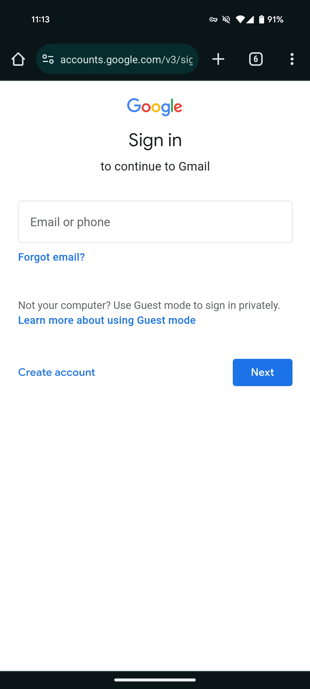
This sign-in page is responsive and adjusts as you adjust the window or view on different devices. The outer container with a light blue/gray background disappears at some widths, while the mobile layout uses just a single column. One small difference is how some elements are now left-aligned instead of being centered.
The banner on the old site helped usher users into the revamp. In fact, there’s a different message on the redesign that links to a new Google Support document.
Google emphasizes this is a visual change, and that the “steps to sign in haven’t changed.”
You enter the same information you usually do, like your email address and password.
Google says you’ll get the old sign-in page “if you use an older version of a browser.”
This redesign is not yet widely rolled out and will be fully available over the coming weeks.
FTC: We use income earning auto affiliate links. More.


Comments