As teased, Google is rolling out a redesign for its Account sign-in page across all services that better conforms to Material 3.
This “more modern look” is for the Google Account sign-in and sign-up pages. Google says it is “in-line with the Material Design across our other products.”
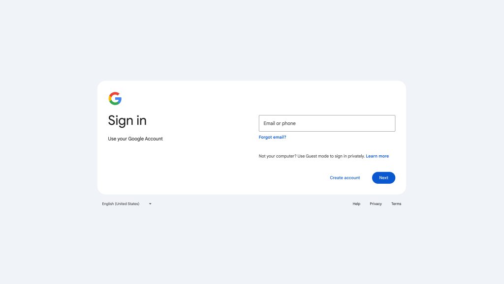
Instead of the page being centered on desktop, Google places the email/phone text field to the right, while a Google logo and other information appears at the left.
A pill-shaped button is used for “Next,” while every other button is just directly placed text. The inner rectangle has a white background, while the outside is slightly darker (gray with a blue-ish tint that reflects the default Material 3 accent color).
You get a language switcher, Help, Privacy, and Terms at the bottom.
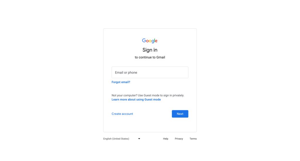
This is also coming to mobile where it will presumably be centered and might look more like the current design.
Google says this is “strictly a change in visual appearance, there are no functionality impacts or changes.”
Google is rolling this sign-in redesign out starting today with full availability in the coming weeks for all personal Google Account and Workspace customers.
More on Google Account:
- Google will store Location History, Maps Timeline on your device for privacy
- Google Accounts will prompt users at login to set up passkeys
- Google Account switcher on web gets larger Material You redesign
FTC: We use income earning auto affiliate links. More.

Comments