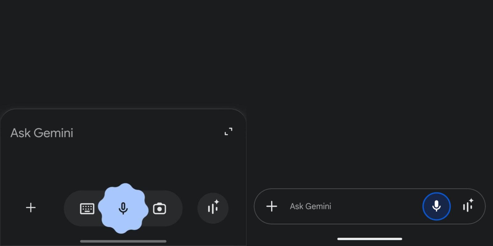
Last October, Google greatly simplified the Gemini app on mobile. With the overlay redesign on Android, the Gemini homepage continues to get simpler.
Original vs. October 2024 design


The latest round of changes to the Android homepage focus on the “Ask Gemini” field. There’s no longer a pill housing the shortcuts for voice and camera input. The ‘plus’ menu is now home to Camera, Gallery, Files, and Drive, with the last two options only available for Gemini Advanced subscribers.
Additionally, the Gemini app loses the separator line above the bar for a cleaner, more continuous surface.


Google has made the text field a tiny bit shorter, while the Gemini Live shortcut is now inside the container instead of standing alone. This design appears across all responses when you’re inside a chat. Overall, it matches the current gemini.google.com web UI, which was updated in December.
The previous design, and Gemini overlay, on Android has an elaborate (Material You) animation for voice input. That has been replaced by a blue circle around the microphone icon, which is now filled instead of just being an outline.
Old vs. new


These tweaks to the Gemini app homepage are rolling out with the broader overlay redesign, which is not yet widely available. Google will presumably refresh Gemini’s iOS homepage in short order to match.
Speaking of the iPhone app, Google updated it on Monday (version 1.2025.0220100) with:
- Improved support for external keyboards
- Improvements to dark mode formatting
- Bug fixes and improvements
FTC: We use income earning auto affiliate links. More.


Comments