
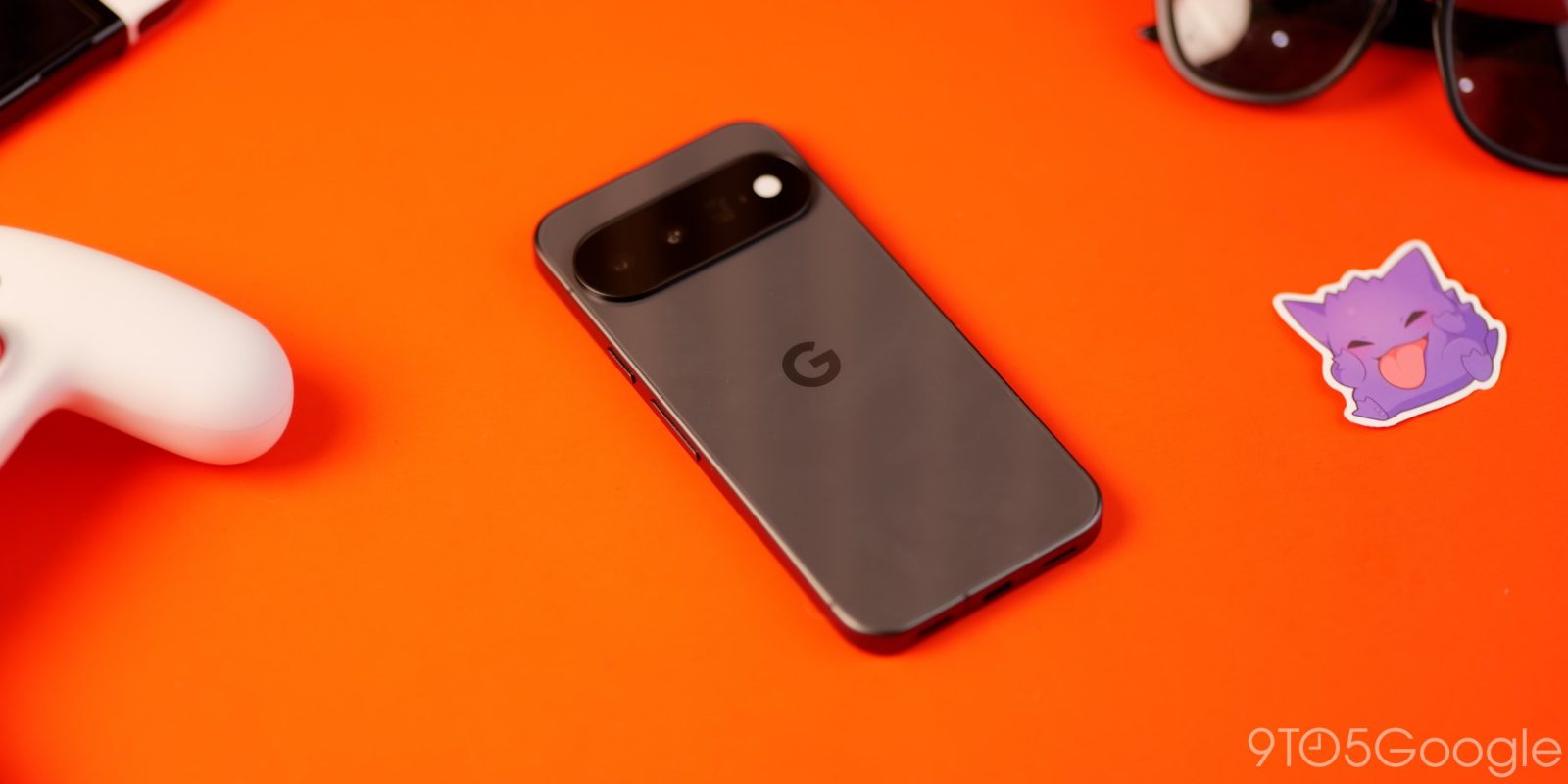
Following the version 2.0 update rolling out earlier this week, Google is now beginning to launch the Pixel VIPs widget redesign announced in the September Feature Drop.
Previously, the widget could be expanded to take up your entire screen. This redesign limits Pixel VIPs to two layouts.
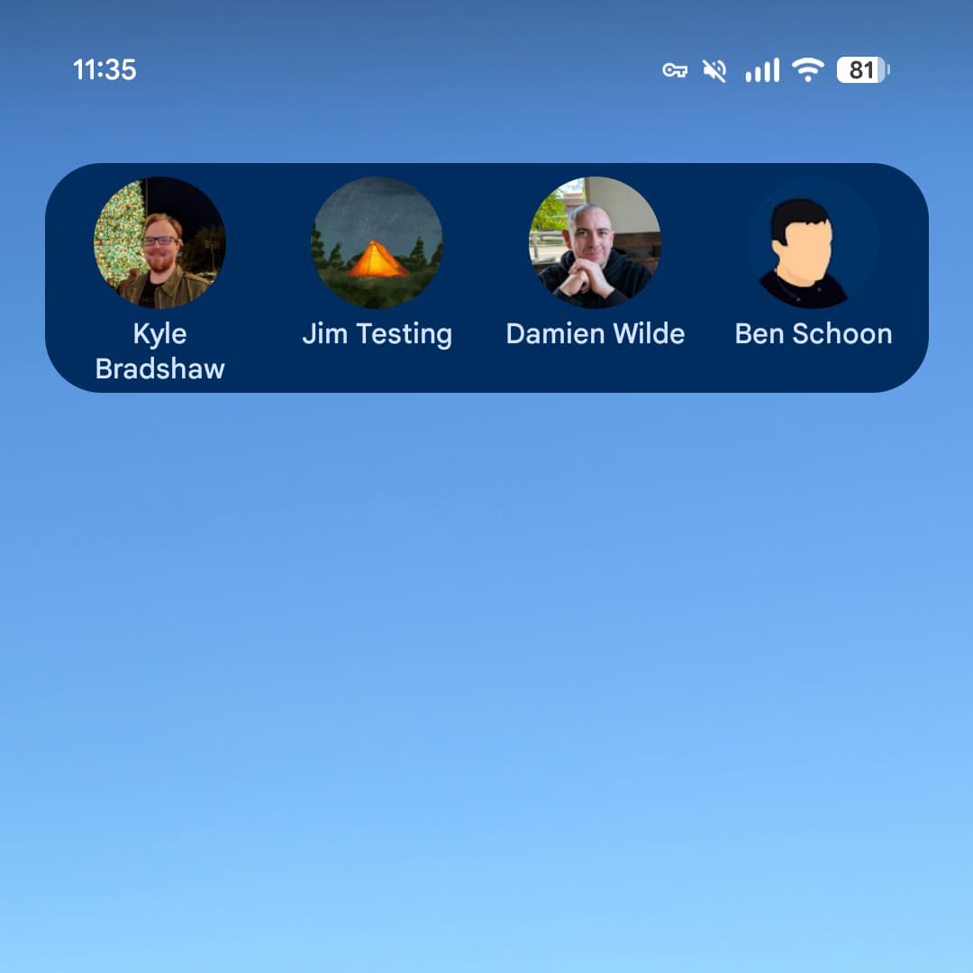
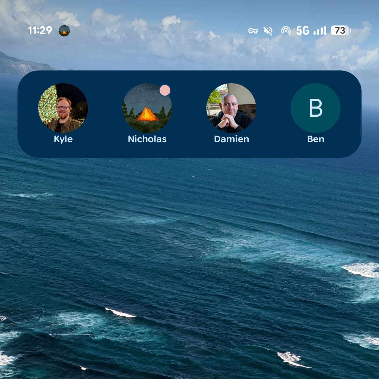
The 5×1 layout shows just one row of your prioritized contacts (up to four) at a time with the ability to scroll for more. This view pairs circular profile avatars with just first names, rather than including surnames as before. The change results in a more consistent widget appearance.
Old vs. new
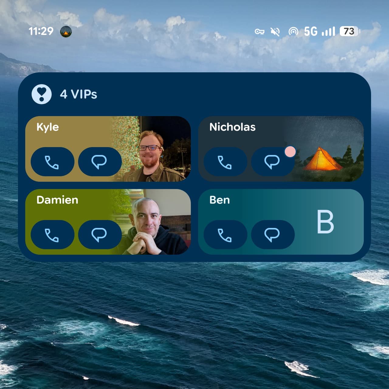
The 5×2 configuration is now the max size for the Pixel VIPs widget. Depending on the number of contacts, Google will display rectangular cards that feature pill-shaped buttons to quickly call or message.
Meanwhile, unread messages will result in a circular badge appearing in the top-right of the circular profile or the messaging icon, which would benefit from being a little bit more noticeable in the latter configuration.
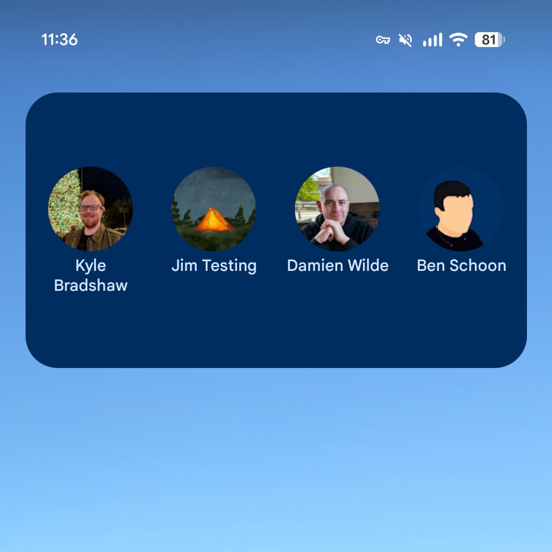
This is rolling out via a server-side update that is not yet widely available. It’s only appearing on one of our Pixel devices today.
Version 2.0 rolled out earlier this week with a fullscreen design that replaces the bottom sheet approach. There are also some tweaks to the feed, while a dock at the bottom of the screen lets you quickly switch between your VIPs.


FTC: We use income earning auto affiliate links. More.


Comments