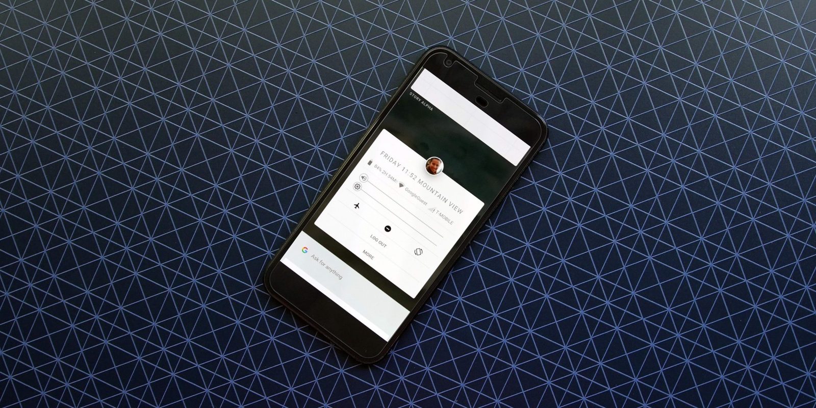
Last year it was revealed that Google had another new operating system in the works called “Fuchsia.” In the time since, we haven’t heard much about the OS, but it seems work has continued in the background. Now, it’s been discovered (via ArsTechnica) that an actual user interface for Fuchsia is in its earliest stages, and luckily, we can take an early peek…
Looking back for a moment, you may recall that Fuchsia’s future is still very much up in the air. Google has been working on the project out in the open and so far we only know a few things about it. Included in that is, first, that this OS drops the Linux base Android currently has in exchange for Google’s “Dart” programming language. Further, this new OS seems like it will work on several different platforms, including mobile phones and tablets.
Thanks to the hard work of a Kyle Bradshaw at HotFix.net , we have our first look at the new UI in action and an early glimpse at how it differentiates itself from Android. Obviously, this is still a very early build of this OS, and almost nothing works so far. As you can see in the video below, we can simply see the barebones of how this UI works at this point in time.
Focusing on just the UI for now, we can start by talking what appears to be a home screen. It appears that this home screen takes the focus away from applications and instead focuses on personal information, Google cards, and what appears to be some sort of recent apps menu.
Front and center is the user’s profile image which, when tapped, can reveal a handful of quick settings for brightness and volume among others, and which also looks a bit like Chrome OS’ quick settings menu. That menu also has “Log Out” and “More” options, but it’s unclear what those will do since nothing is working yet. Opening and closing this menu also shows a very fluid (and pretty) animation.
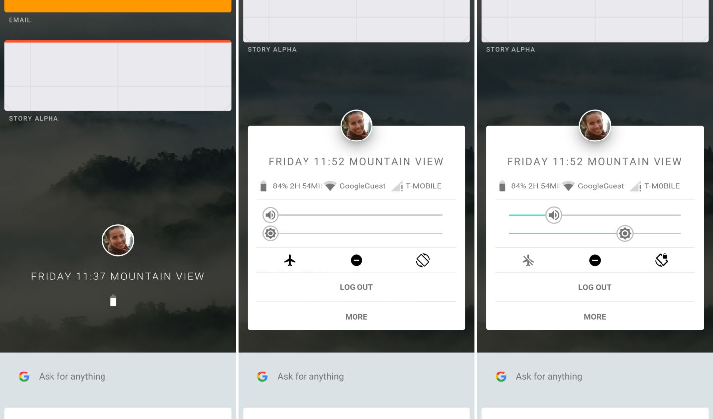
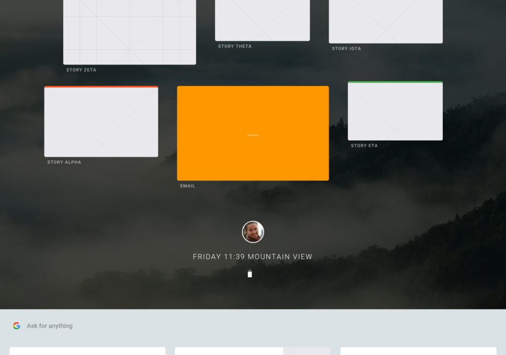
A swipe down from the main screen reveals what seems to be a new “recent apps” screen which inserts “apps” that are opened in chronological order, just like Android. Swiping up from the bottom reveals some sort of Google menu that appears to recommend which apps to open, as well as offering a quick shortcut to the search menu. It’s also interesting to note that Fuchsia appears to have a new keyboard that is fairly similar visually to Google’s Gboard on Android.
The entire OS is very clearly influenced by Material Design and purportedly thanks to the “Dart” programming language behind-the-scenes, all of the animations are incredibly fluid. That’s especially impressive considering the fact that this is a pre-alpha build running on another Android device.
Outside of the video, ArsTechnica shows off some other portions of the OS, including the tablet UI and multitasking features. Like current versions of Android, the multitasking menu appears to trigger multi-window modes, this time doing so by dragging one app in that view on top of another. That triggers a 50/50 split, but that’s not all “Fuchsia” is capable of. Apparently, the OS can handle three apps at once with a 33/33/33 split, or even four apps at 75/25/75/25.
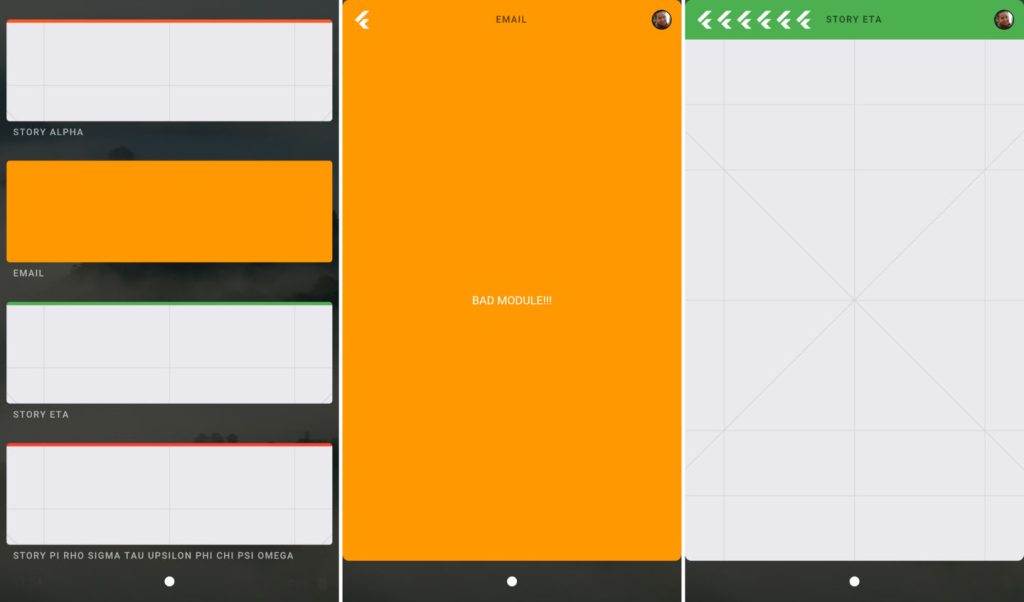
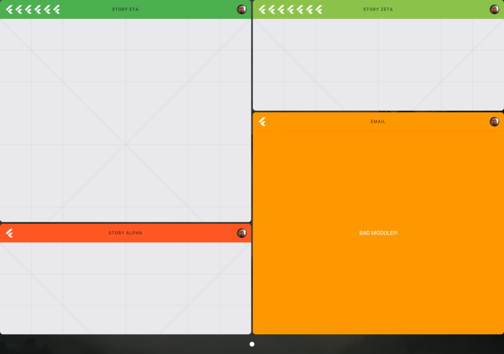
Behind the scenes, Fuchsia uses a Google microkernel called Magenta which helps run the operating system with the same levels of performance regardless of the hardware it is on, something Android has struggled with a lot even to today. The interface and apps are also written using the Flutter SDK which creates code that works on Android and iOS, meaning that apps written with Flutter (in the Dart language) can work with the two main operating systems as well as Fuchsia. This is one way Google could prevent the app-gap that has ruined so many other mobile operating systems.
The future for Fuchsia is still completely unknown. Some signs point toward it being a potential Android replacement, but if that is the case, it’s going to be a long time before that happens. Ron Amadeo from ArsTechnia brings up the interesting idea that the Fuchsia project simply asks what Android could/would be like if it was designed today. Android wasn’t developed with billions of users in mind, and because of that, the company has run into a lot of issues over the years. So far, Fuchsia looks promising, but it’s going to be quite a while before we see what Google really wants to do with it.
FTC: We use income earning auto affiliate links. More.


Comments