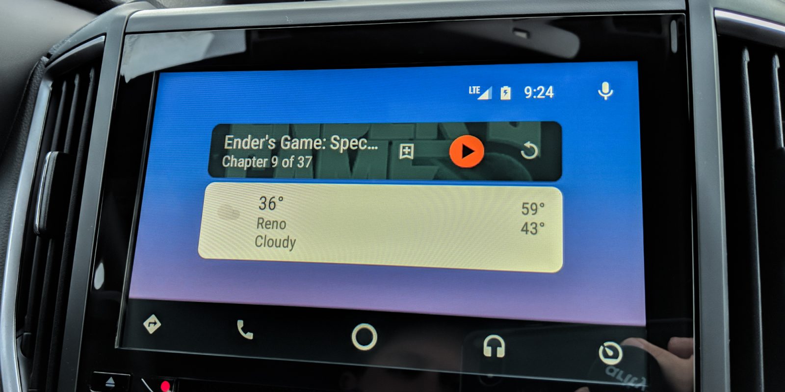
Back in December, without any public announcement, Google updated and refreshed Android Auto’s design. These changes included tweaked menus, the removal of some transparent overlays, as well as other incremental changes to apps like the dialer. Now, Google is slightly tweaking things again by making icons round instead of squares…
First noticed by Derek Ross on Twitter, these new rounded icons replace almost every box found on the home page and the application switcher. As you can see from the photos below, all of the quick action boxes such as the music player and weather card are now rounded off.
While it’s a minor update, it does make Android Auto’s UI resemble things like Google Feed which feature informational cards with rounded corners.
Android Auto was last updated in the Play Store on January 4, but because the changelog hasn’t been updated in months, we don’t know if this design variance was introduced then or if it was server-side. I already had the updated interface when I went to check this morning, so if you’re using Android Auto, you might have it too.
Besides the rounded icons, we haven’t found anything else new. Make sure to let us know in the comments if you see this change or any other design tweaks.


Check out 9to5Google on YouTube for more news:
FTC: We use income earning auto affiliate links. More.


Comments