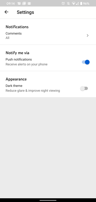
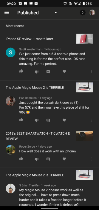
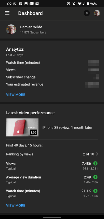
Despite the fact that the standalone YouTube app has had the feature for quite some time now, the official YouTube Studio app now has its own dark mode switch.
The update is available as part of the YouTube Studio version 20.26.101, which is rolling out on the Google Play Store right now (h/t Android Police). Considering that almost the entire library of Google internally developed applications already have a darkened theme, and YouTube is a premier product, this option is long overdue.
One thing to note is that — frustratingly — you can’t have YouTube Studio follow your system theme. That means you’ll have to toggle the dark mode or standard light mode from within the YouTube Studio settings. This feels like an oversight but considering that most people tend to stick with one theme constantly, it’s not too big an issue from the outset.
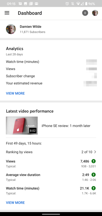
However, we’d love to see Google add system theme support for YouTube Studio in a future release. Also if you’ve ever spent time in YouTube Studio on Android, you’ll know that a dark mode is the least of its problems. Yes, it’s great for quickly glancing at statistics, viewing figures, and more but it really needs a full UI overhaul.
It would be nice to see some parity between the latest desktop UI overhaul for YouTube Studio and the mobile apps, as there is quite a big disparity between the two at this stage of 2020. That said, the dark mode for YouTube Studio is a definite step in the right direction.
More on YouTube:
- YouTube will turn on mid-roll ads for all eligible videos this month, lowers time limit
- Ninja streams Fortnite on YouTube w/ millions of viewers following Microsoft Mixer shutdown
- Google Fit adds curated YouTube playlists about exercising at home
- YouTube Kids arrives on Amazon Fire TV
FTC: We use income earning auto affiliate links. More.


Comments