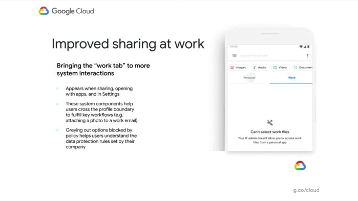
With Android 9, Google introduced the concept of partitioning work and personal apps in the launcher. Android 11 now brings the “Work” tab to the share sheet, system settings, and file picker.
In bringing the “Work” tab to more parts of the OS, Google said at Cloud Next that it wants to “make the separation between work and personal data clearer to end-users.”
When sharing links, there are two tabs that you can switch between to see different colleagues and app suggestions. The intention is to have users be more deliberate about sharing.
In Settings, the tabs will appear when viewing Location, Storage, Accounts, and App info. It’s also available in the “Open with” menu and when selecting documents, though options will be grayed out if data protection rules are applied. For example, the system picker might warn you that you “Can’t select work files.”

Besides sharing, other Android 11 work enhancements include graying out app icons on the homescreen that have been paused, similar to timers in Digital Wellbeing. Another usability change has to do with logging in:
And when a user turns on their work profile, they no longer have to enter their work passcode if it’s the same as their device passcode.
With Android 11, Google is working on “connected work & personal apps” given that some existing applications today do not “neatly split” between business and home life. Calendar is the prime example, with most users wanting to see an overview of their entire day and expecting to receive notifications in either profile.
Google is working on these merged experience with 11, starting with the Pixel Launcher’s At A Glance widget and Calendar. It’s also looking for other interested third-parties.


FTC: We use income earning auto affiliate links. More.


Comments