
The idea that cheap phones are bad has persisted for a long time, but it often isn’t true of every cheap phone — case in point, the Poco M3.
In the Android smartphone space, there appears to be both a concurrent “race to the bottom” and an immense ceiling price for emergent flagship devices. We’re seeing the “middle” get stretched and contorted in ways that didn’t seem likely in previous years with the likes of OnePlus and Xiaomi duking it out for the “killer flagship” moniker.
The Poco M3 isn’t in the same league as, say, the Poco F2 Pro, but it fills a nice little slot toward the bottom portion of the Xiaomi sub-brand lineup. An entry-level device that does see a few features disappear, but not so many that you lose out in any major way.
Table of contents
Video — Poco M3 review
Subscribe to 9to5Google on YouTube for more videos
Hardware & design
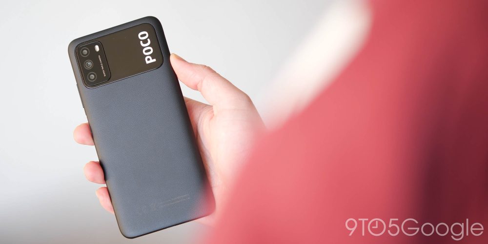
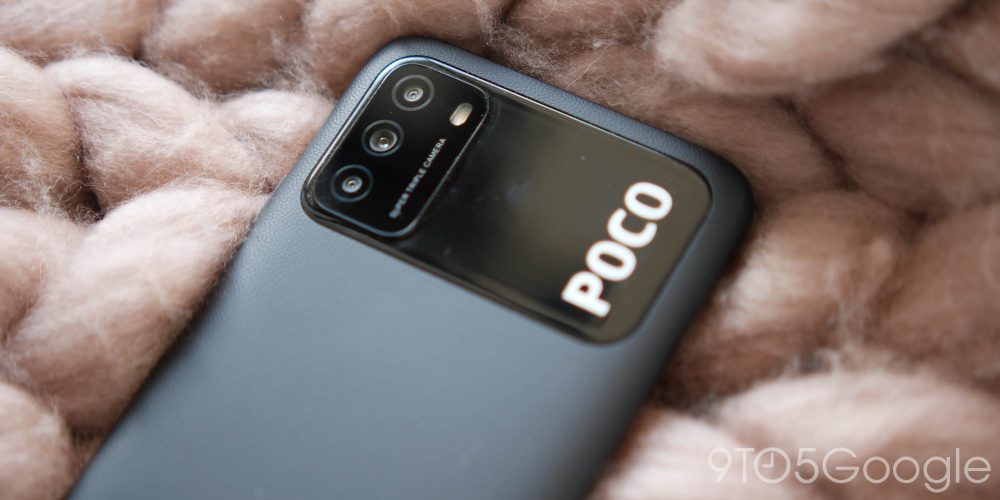
The Poco M3 is a tall, wide device that does feel lighter than the footprint would have you believe. As expected, it has a mainly plastic frame, but there is a faux-leather finish on the rear panel, which is a nice differentiator between the M3 and other polycarbonate finish smartphones.
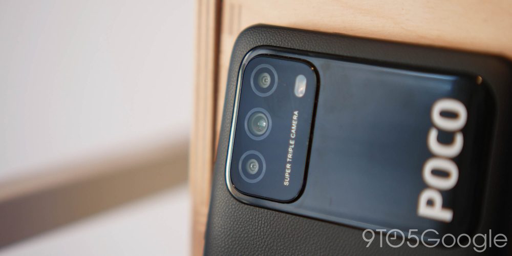
One weird design trait that I’ve found myself enjoying anyway is the elongated panel within which the camera module sits. The small domino setup looks eerily similar to that of the OnePlus 8T, but like a certain Cyberpunk 2077 special edition of that device, the camera is inset within a larger panel. The embossed Poco logo is an in-your-face way to confirm who made the device, but it’s by no means to the detriment of the look.
I’d imagine that this is a far more striking design on the more colorful yellow and blue variants, which retain the black camera panel. Here it just reminds me of the now defunct Nexus 6P visor — albeit a slightly different interpretation.
My only major complaint is that the Poco M3 does feel a little “hollow” in the main body portion. A tap on the rear panel reverberates around a little, but there are no flexes or creaks in the chassis. I get the impression that it would survive a real beating without much detriment to the overall structure.
At the top and bottom edge, the outer bezel is almost completely flat, while the sides softly curve into that faux-leather finish at the rear. Despite its oversize look and feel, this is a comfortable phone to hold with good balance in the palm. There’s a real weight to it that you don’t often get with predominantly plastic smartphones.
Along that flat top bezel there is room for a speaker, IR blaster, and, as this is a cheaper Android device, a 3.5mm headphone port. The Poco M3 has a lot of extras that in yesteryear we’d associate with top-end flagship devices. How times have changed, eh?
Display

I’m really surprised that at $150, the Poco M3 comes with an FHD+ panel, but it is the LCD variety. Unlike many competitors, the display on offer is a core selling point, and one that does elevate the M3 from the similarly priced competition – including the Nokia 3.4.
The auto-brightness setting isn’t always the most responsive and the maximum levels top out at 440 nits when the Sunlight Mode is enabled. It’s not exactly superb but nor is it terrible. The minimum brightness is actually one area I think this LCD shines, as in really dark environments you have plenty of room to play with before things start to get invisible and frustrating to interact with.
Software & performance
Packing in the Qualcomm Snapdragon 662 and 4GB of RAM, there is no denying that the Poco M3 isn’t going to “fly” in the daily performance stakes. However, it can do just about everything you may ask of it without much of a complaint.
I won’t sugarcoat it, there is a noticeable amount of lag here and there. It appears to be most prominent in areas like the Settings menu — tapping the search bar would mean up to a half a second wait for the keyboard to appear. If you’re used to top-tier performance, then this might become a major bugbear. That said, the slowdowns are infrequent enough that they can be a little jarring — that is a bit of a backhanded compliment for sure.
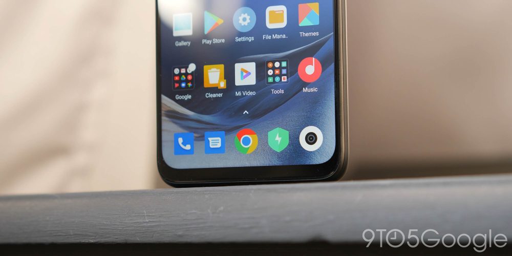
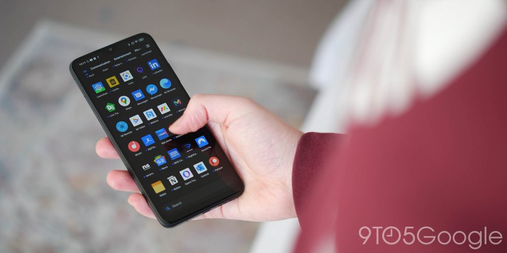
My gripes with MIUI are pretty varied, as I find certain UI elements too “over the top” for my own simple tastes. For a start, the Settings menu is poorly organized, the recent apps menu or app switcher still retains a horrendous tile-style layout, and listing gesture navigation under “Full screen display” is borderline criminal. However, I will concede that it’s not a bad skin if you like added features and customization options right out of the box.

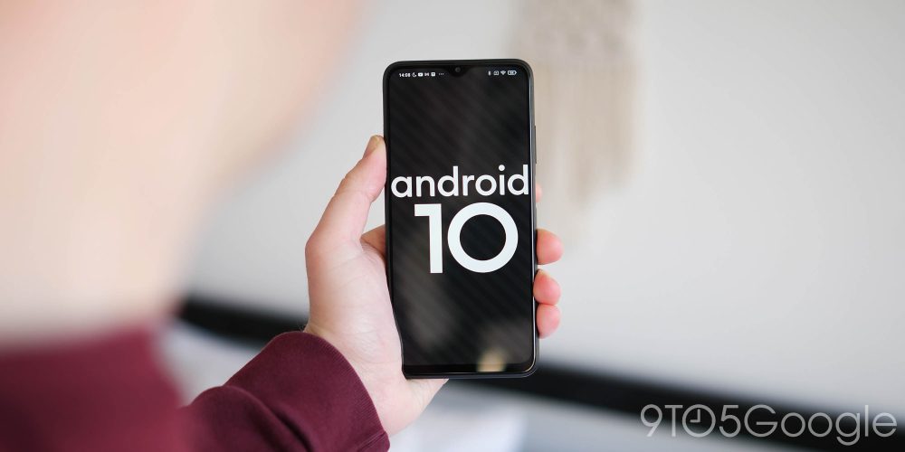
The animations are pretty sleek, and I can genuinely understand why MIUI has such a large, avid fanbase. Unfortunately, the Poco M3 is running MIUI 12.0.4 on my device, which is still an Android 10 build. It’s not entirely clear if or when we’ll see Android 11 and MIUI 12, but it will be a stellar addition we’re sure.
One major notable I do really like is that the Poco M3 — and most Poco devices — lets you swipe right into the Google Discover feed and sets your default SMS app as Google Messages. These are nice touches, but there are still far too many duplicates in Xiaomi’s flavor of Android. I counted around 11 that were almost redundant once I restored my device from a previous backup.
Camera
It’s hard to fathom phones that cost just $150 can come with a triple-camera setup nowadays. Alas, there are not too many situations you’ll be fully covered with the Poco M3’s triple-camera array though. It sports a 48-megapixel main sensor, which has been very good in our testing. However, the 2-megapixel macro sensor and 2-megapixel depth sensors really don’t add a great deal to the package on offer.
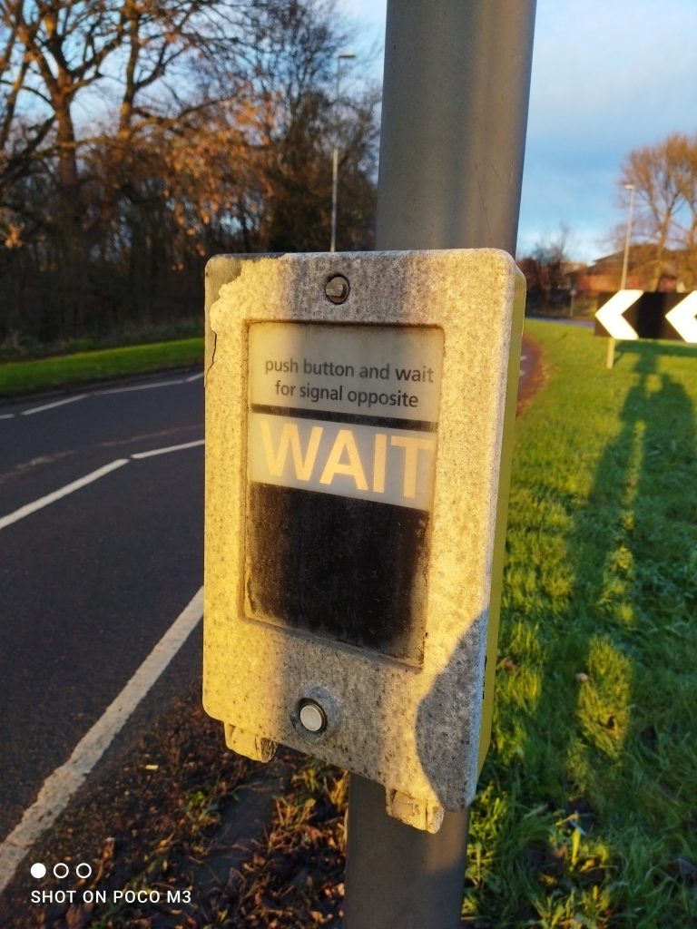
Yes, it’s nice they are there, but they are not particularly useful in the way a telephoto or ultra-wide would be. Shots from the main 48-megapixel sensor are very nice and do stand head and shoulders above similarly priced Android smartphones.
Dynamic range is fairly good, with reasonable detail in shadows and impressive highlight control, while things look sharp compared to lower-resolution competition cameras. Colors pop in a trademark Xiaomi way, but if lighting conditions become mixed, then things start to get a little fuzzy around the edges. The big annoyance for most people might be the auto-watermarking, although as someone who takes a lot of images with various devices, it was a useful tagging feature.
I must say that the Night Mode is one that has me the most impressed by the camera package — the longer exposures really clean up low-light photography, and the results are particularly good. By no means is it as good as Night Sight on the Pixel 4a — or 3a for that matter — but you’ll likely be surprised in much the same way I was.
Video tops out at 1080p and is capped at 30fps. That is a sore point as 60fps would have been an excellent inclusion, but hardware limitations cannot always be helped. Like many affordable smartphones, this is another area where the Poco M3 falters.
Battery

Frankly, the battery life is nothing short of extraordinary on the Poco M3. It’s not rocket science to decipher that a massive 6,000mAh battery is going to withstand even the most brutal of daily usage patterns. Such is the supreme confidence in the lifespan, Xiaomi even included reverse-wired charging. This means you can use the Poco M3 as a powerbank.
It’s simply fantastic for anything and everything you’ll throw at it. The only major issue you’ll encounter is the relatively slow 18W charge speeds. Is it the slowest? No, but it takes a couple of hours to go from 0 to 100% capacity.
Final thoughts
I’m still holding the opinion that the Xiaomi Poco X3 NFC is the best budget phone of the past 18 months. However, the Poco M3 is one hell of a frontrunner for those not wanting to spend more than $200 on a smartphone.
The battery life is exceptional, the display is good given the pricing, plus the performance really isn’t bad by any means. When compared directly to the “best of the best,” yes, the Poco M3 doesn’t look all that impressive. But within its own league and price bracket, the Poco M3 is almost untouchable.
FTC: We use income earning auto affiliate links. More.





Comments