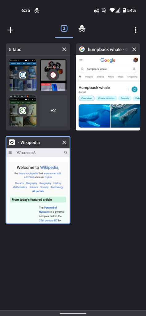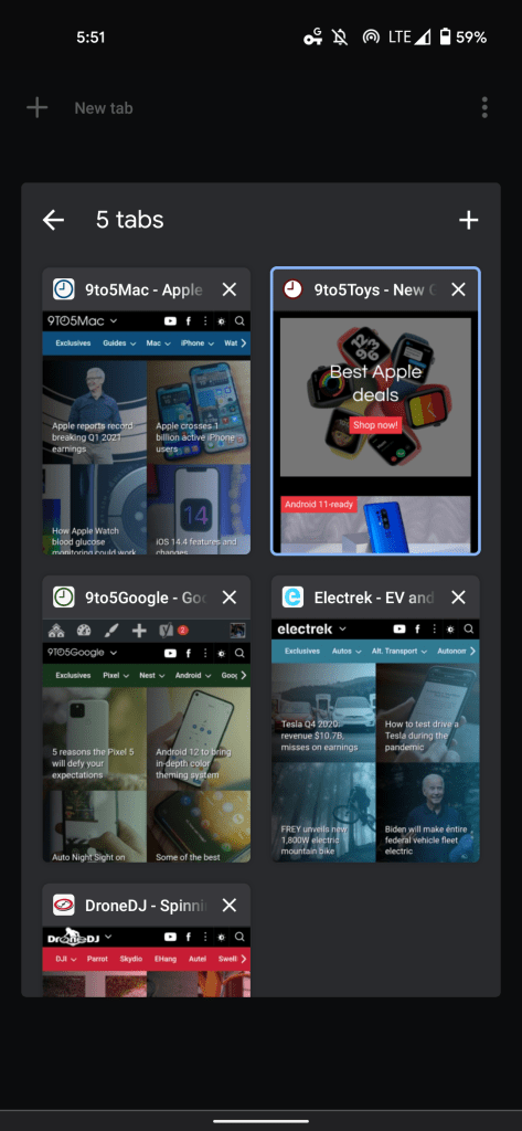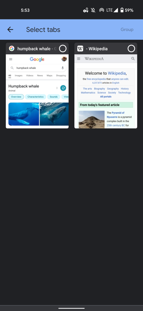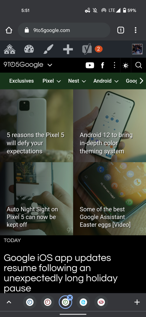
Back in September of 2019, Google announced that its browser was adding a convenient way to organize open pages. Tab Groups fully rolled out on desktops a year later, and is now beginning to come to Chrome for Android with a new grid layout.
Update 2/20: The Chrome for Android grid view, which also adds Tab Groups, is now widely available. It’s been almost a month since Google rolled out the redesign, though the company has yet to officially debut it. The reaction from end users continues to be mixed (give us your thoughts in the comments below).
If you don’t have this revamp enabled, closing Chrome from the Recents menu or restarting your phone should do the trick. Meanwhile, one permutation that features the “Google” logo at the top of the tab grid is being tested.
How to turn off Chrome Tab Groups grid
Some users dislike this new layout given their muscle memory for the previous interface that has remained relatively unchanged for years. Meanwhile, this grid view has been in use for some time now on Chrome for iOS.
At the moment, you can turn it off by entering the below link in the address bar, tapping the dropdown menu, and selecting “Disabled.” Relaunch your browser afterwards by clicking the blue button that appears at the bottom of your screen. You might also need to close Chrome from the Recents multitasking menu or force stop under App Info.
chrome://flags/#enable-tab-grid-layout


Original 1/28: Chrome’s new grid layout replaces the vertically arranged list of cards that nearly spanned the entire width of your screen. Each tab is now significantly smaller, but you get to see more of the page without having it obscured by other cards. Like before, the favicon, page name, and close button appear at the top, while you can still swipe left/right to dismiss. A small tweak sees a “New Tab” label in the top-left corner.
On most phones, you will see six tabs at a time before having to scroll. As a result of this layout, Incognito sites no longer appear next to the list of regular tabs. There’s instead a switcher at the top to access that grid view.
This new view allows Google to bring Tab Groups to Android. From the grid, users can drag and drop one page on top of another to form a grouping, as well as reorder open pages. Another creation method is opening the overflow menu and selecting “Group tabs,” while long-pressing any link provides a new “Open in new tab in group” option.
When viewing Tab Groups, a new bottom bar switcher with favicons for each open page appears. The left chevron symbol opens the grid layout for that space while a New Tab button is at the right corner.
For some, the Chrome grid view and Tab Groups started rolling out alongside version 88 last week. It’s not yet widely available, but appearing for more users than before via a server-side update.
FTC: We use income earning auto affiliate links. More.


Comments