YouTube’s constant state of evolution on Android — and mobile generally — continues unabated with a new test of the comments section including what looks like a quick reply option.
If you cast your mind back, you’ll remember a time when the comments section would be easily accesible on YouTube for mobile. Changes to the positioning have given further video content greater prominence, effectively hiding the comments section or at least making it harder to get into a discussion with the “smartest people on the internet™.”
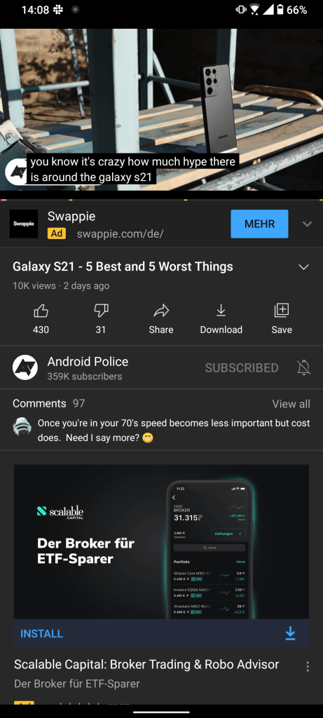
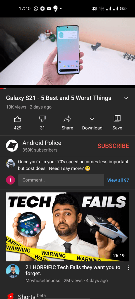
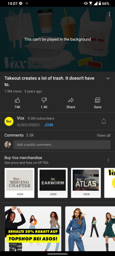
A recent test that was spotted by Android Police shows that YouTube has started testing and tweaking the comments section yet again, with a potential quick reply and “View all” options spotted. At the moment, when you fire up YouTube on your device, the comment section can be expanded by tapping on the first comment underneath a video.

image: Android Police 
image: Android Police 
image: Android Police
This YouTube A/B test shows a small text field allowing you to send a quick reply or comment, while there is also a more prominent “View all” button to indicate that more comments can be viewed. It’s far clearer but a little cluttered compared to how YouTube currently just shows the top or most recent comment.
What is even more interesting, as AP also notes, YouTube is testing a few other UIs for the comment section on mobile. There are a few minor variations, with all including a “View all” button but some just having a quick reply comment text field. This could mean that whichever option sees the most engagement will make the cut, but of course nothing is certain at this stage.
Let us know down in the comments section below if you are seeing this UI redesign or quick reply feature on the YouTube for Android app on your device. What do you think? Would it make you more likely to comment on a video?
More on YouTube:
- YouTube Music Now Playing redesign starts rolling out to iPhones
- YouTube Analytics adds ‘new’ and ‘returning viewer’ metrics
- YouTube Music begins testing a ‘Library Tracks’ playlist
FTC: We use income earning auto affiliate links. More.


Comments