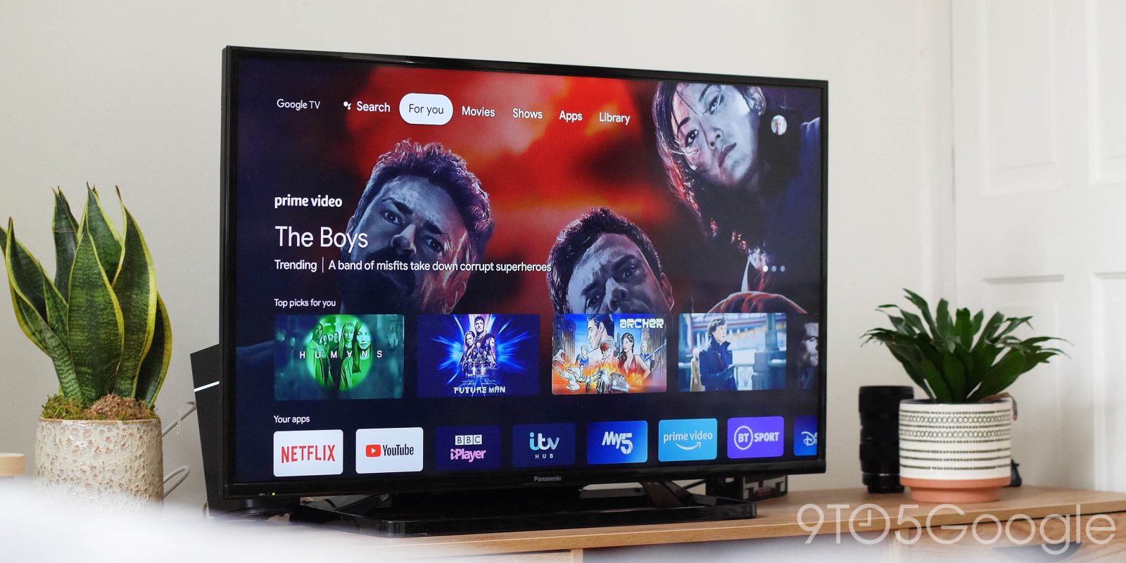
The best part of the Chromecast refresh is the Google TV interface that comes along with it, but as with any Google product, that UI is subject to change over time. In early February, Google TV rolled out a revised homescreen with much smaller app icons, but in early April, things have gone back to normal.
Article updated on April 3 following switching back to larger app icons.
In early February, some users saw a silent update to the Google TV homescreen that adjusted the size of the app icons to where they’re now significantly smaller in size. The Google TV homescreen lists apps on the “For You” main tab underneath two rows of content recommendations.
The difference wasn’t easy to spot at a glance (which is probably intentional on Google’s part), but it’s clear when you take a closer look. The apps row indeed shrunk the size of the icons, making room for more icons while also slimming down the overall size of the row. Since launch, this section has been able to show seven complete app icons as seen in the image above, but with this change, it can show nine, as seen below.
Functionally, this doesn’t change anything, but it does take a bit of emphasis off of apps and refocuses it on the content recommendations that Google TV is so good at.

At first, the change wasn’t rolled out widely, only for a few Reddit users. Within a few days, the change rolled out to all Google TV users which, at the time, included only the new Chromecast.
As of April 3, it seems Google TV is reverting its homescreen app icons back to normal-size icons. We spotted the change on one of our own Chromecast devices, and friend-of-the-site Joe Maring also noted the change on Twitter.
More on Google TV:
- TikTok is now available on Android TV, but only in select regions
- TCL will bring Android TV 11 to 2019 and 2020 models this year, Google TV UI possible
- Chromecast w/ Google TV ‘data may be corrupt’ issue affects some users, here’s how to fix it
FTC: We use income earning auto affiliate links. More.


Comments