After years of its loyal community asking for a smartwatch, OnePlus has finally delivered with its $159 OnePlus Watch. We have a full review of the new product in the works, but in the several days I’ve spent so far with the OnePlus Watch, there’s been one major standout in the software; that’s not a good thing.
OnePlus Watch software is a glaring Wear OS clone
They say imitation is the sincerest form of flattery, and from the looks of it, OnePlus really likes what Google has done with Wear OS.
The software that ships on the OnePlus Watch is about as close as you can get to a 1-to-1 clone of Google’s platform. That starts with the navigation. From the watchface, a swipe down reveals the quick settings menu, looking nearly identical to its Wear OS counterpart, albeit with some different functions. A swipe up from the watchface shows your notifications, which, again, look identical to how they do on Google’s platform. To the right of the watchface, you have “cards” for options such as workouts, weather, music, and more.
The similarities continue from there. When switching watchfaces or adding “cards,” the design is blatantly identical to the same functions on Wear OS. The app drawer also looks the same and rotates around in the same way. The only thing OnePlus doesn’t have is a left-most screen, which on Wear OS is a Google Assistant page.
Unlike Wear OS, though, the software on OnePlus Watch doesn’t feel as modern. Animations don’t exist, and little touches that improve how these functions work on Wear OS are gone as well. For example, notifications lack the ability to reply, to open on your phone, and to show any media previews. In the app drawer, you can’t pin apps to the top. These are minor things, but they make the experience a little better.
I could go on about the similarities, but looking at them side-by-side tells the whole story. Take a look.
This is remarkably unfinished and unpolished
OnePlus makes its software a point of pride, which is why I was shocked at just how many major flaws I found with the Watch. Here are some of the examples I’ve found so far.
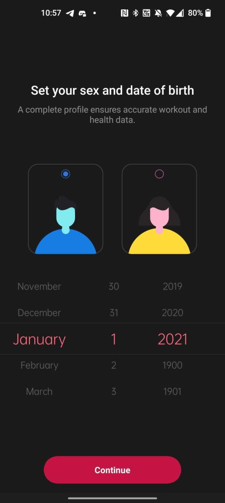
The first flaw appears during setup. Pairing is remarkably quick, but the OnePlus Health app is messy. During setup, you’re asked to put in your gender and birthday, but the icons for genders are unnecessarily confusing. That’s minor compared to the rest, though. I had to install a system update on my Watch after unboxing it, and during that process, the Watch switched from English back to Chinese. It was confusing!
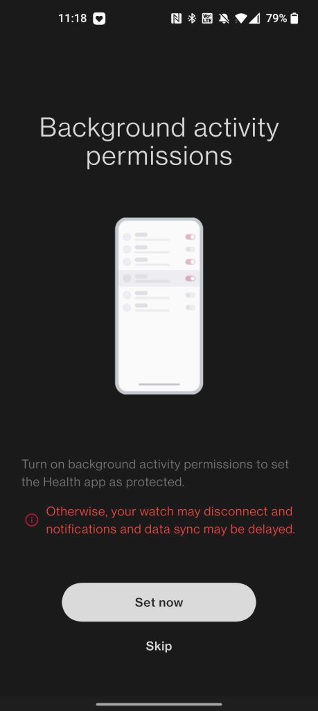
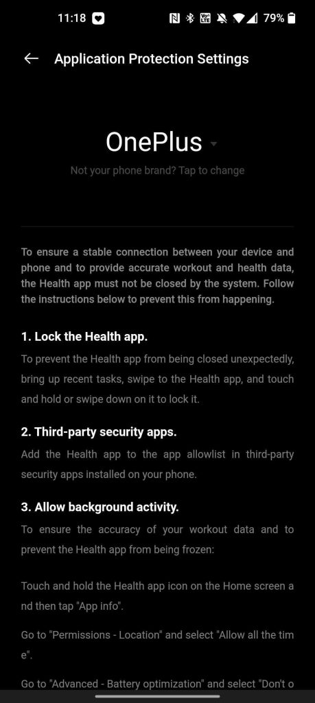
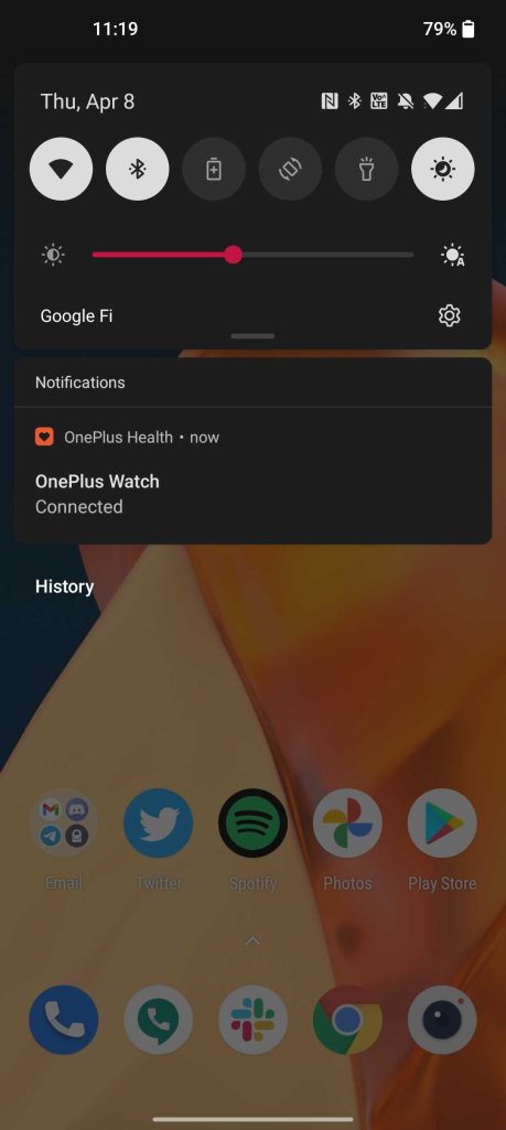
After setup is complete, the app also shows a “Device Connected” notification 24/7, and by default, it’s set to “Important” priority. There’s no way to turn this notification off from within the settings of the app. You can set it to “Silent” priority, which keeps it at the bottom of your notifications, but it doesn’t remove the icon from appearing in the Android status bar at all times. It’s obvious that this is being used to keep the app in system memory. OnePlus also pushes users to change battery optimization of the app through a clunky instruction pop-up, not a shortcut, which is possible. The app even asks you to lock it to the system memory if you’re on a OnePlus smartphone.
This is a problem Android solved years ago, so why is OnePlus putting users through so much work? The company says it fixed background app issues on OxygenOS, but this sends a message to the contrary.
A core problem I had with the OnePlus comes down to using it as a watch. Inexcusably, OnePlus doesn’t offer an option to use a 12-hour option for time, something users in the United States absolutely need. It’s mind-boggling that during the development time for this product, no one thought to include this option, but at the very least, OnePlus tells us the option will be included in an update shortly after launch.
Another legitimately hilarious issue is with the health tracking app. As with any fitness tracking wearable, you’ll set a daily step goal and a notification appears when you hit it. Honestly, the picture just speaks for itself in this instance.

Why not just use Wear OS?
This all begs the question. If you’re going to go through the effort of cloning Wear OS so effectively, why not just use it in the first place? The answer, obviously, comes down to two things. First, battery life. OnePlus said as much before launch, and even under the best-case scenario, the OnePlus Watch could only manage about two days of battery life using Google’s platform. Without it, they claim up to two weeks. That’s a figure I’ve not had time to test based on the embargo times — we’re holding our full review until we’ve successfully killed the battery — but seems doable based on what I’ve seen so far. After nearly five days, I’m at 63% charge.
The second reason is cost. The chips powering the OnePlus Watch are significantly less powerful and, thereby, more affordable than Qualcomm’s Snapdragon Wear chips. It’s pretty safe to say that this would be a considerably more expensive product if it were using Wear OS. At the very least, it almost certainly wouldn’t be $159.
We’ll have a full review of the OnePlus Watch soon to talk about battery life, health tracking, and more soon. Sales open today from OnePlus.com. Drop a comment below and let us know if the software we’ve detailed today is a deal-breaker for you.
More on OnePlus:
- OnePlus 9 Review: A well-rounded step down that’s arguably the better buy
- OnePlus Watch skipped Wear OS over battery life, always-on display being evaluated
- OnePlus 9 Pro review: Consistently inconsistent [Video]
FTC: We use income earning auto affiliate links. More.


Comments