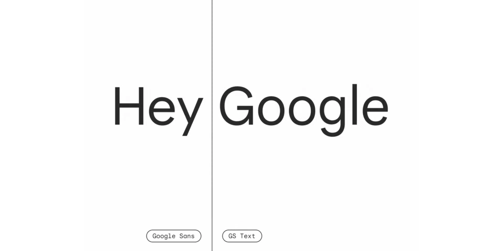
At the “What’s new in Material Design” session this morning, Google shared that its apps are starting to use Google Sans Text. We’ve seen it pop up in some products already, but the company at I/O 2021 better detailed the font.
As we learned in 2018, Google Sans is a size-optimized version of Product Sans, which is only intended for the company’s official product logos. Since then, the company has created Google Sans Text.
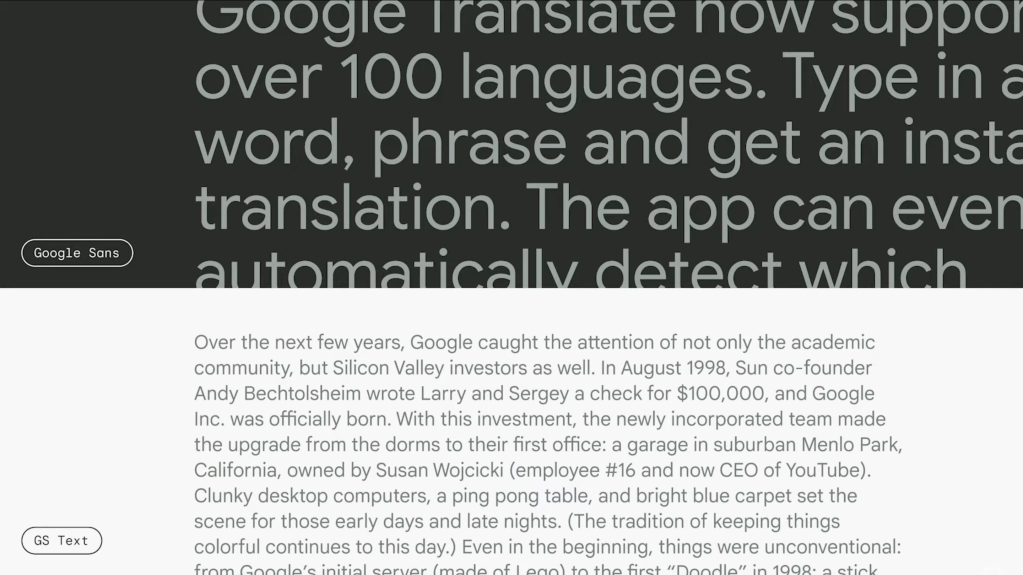
It’s an addition to the Google Sans family familiar from Google’s marketing materials. A new optical size is designed for smaller point sizes and perfectly suited for body text.
One obvious difference is the capitalized “G,” but the changes are more apparent in lowercase letters. It’s unclear if Google has any plans to open up access for third-party developers or whether it will remain proprietary to first-party experiences.
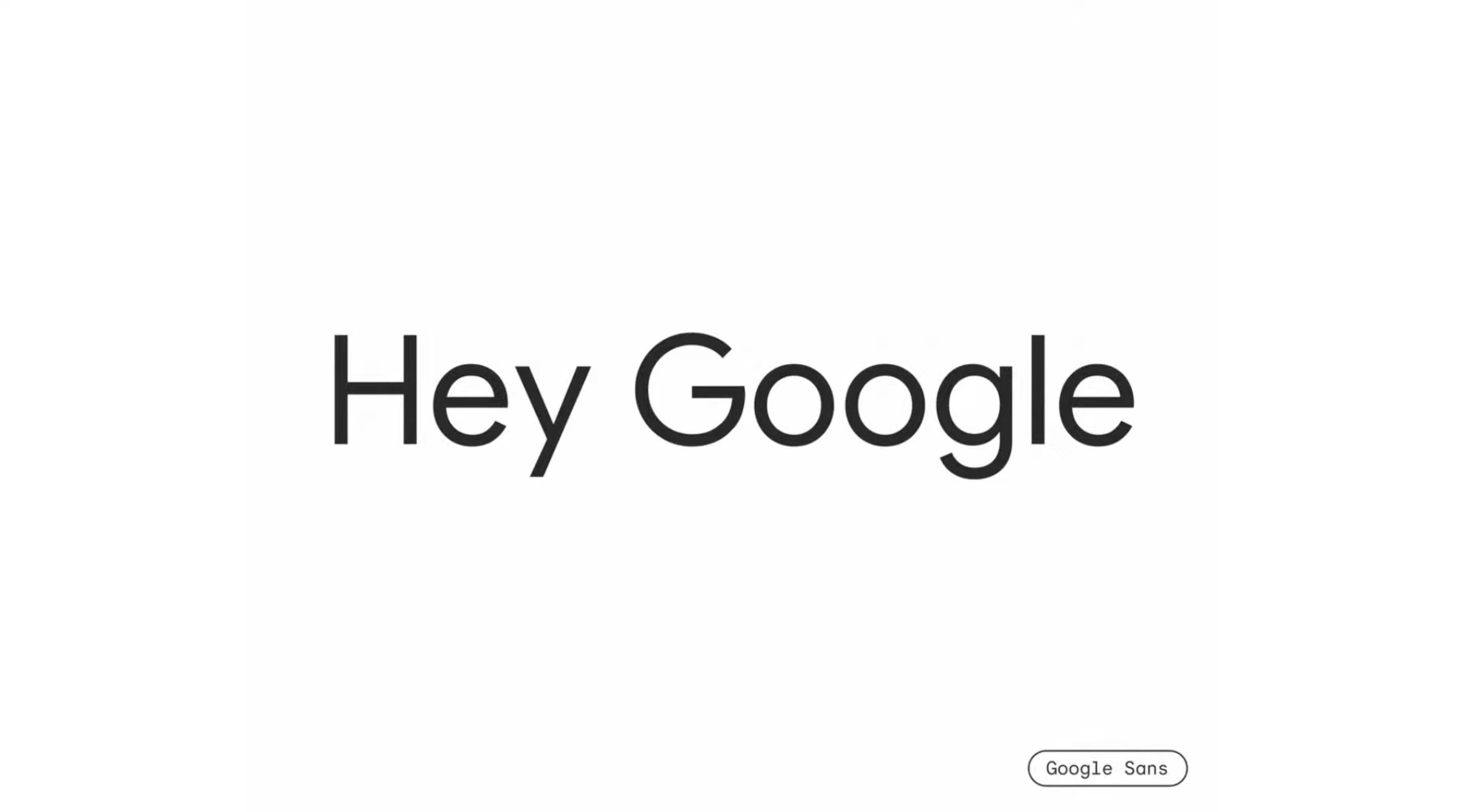
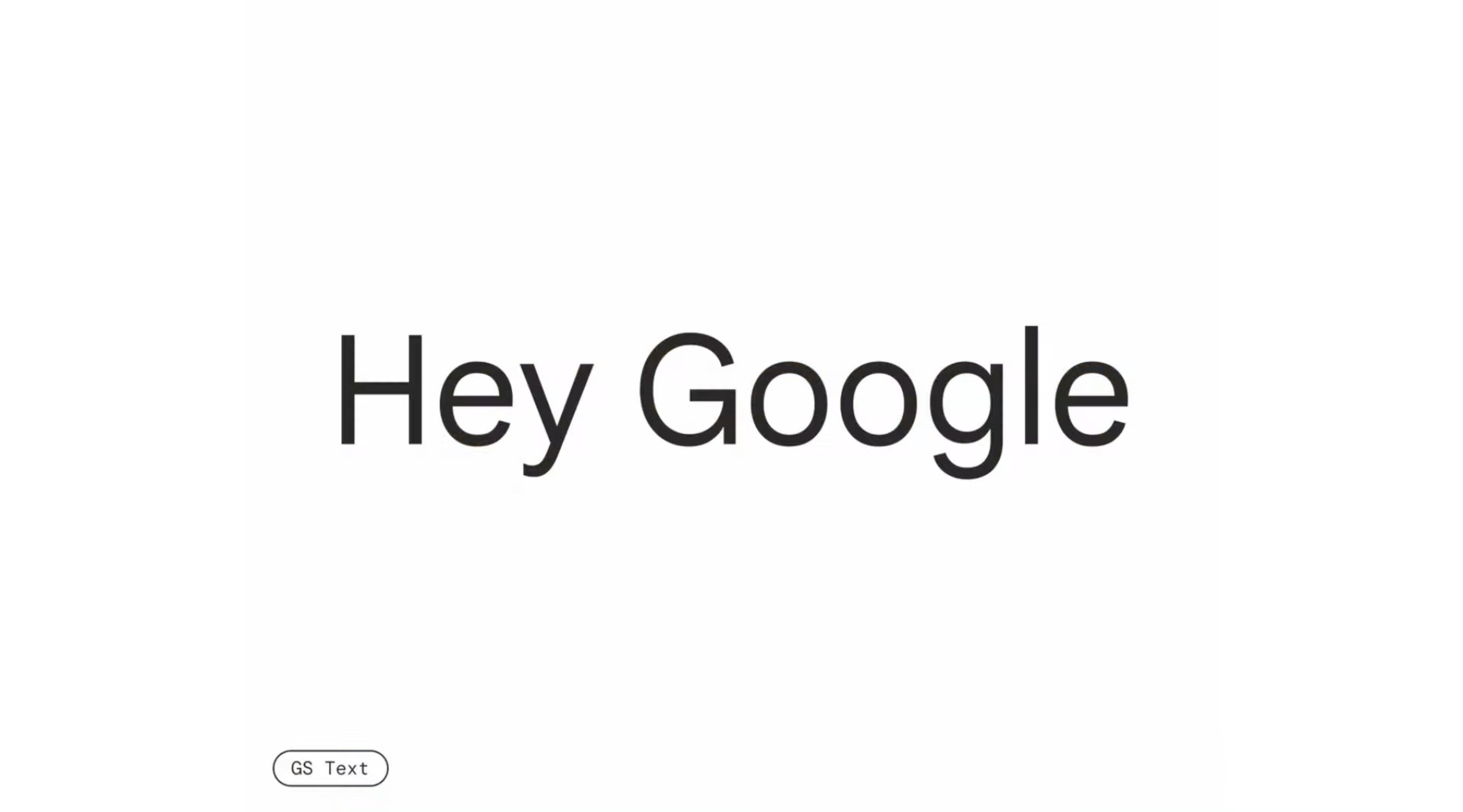
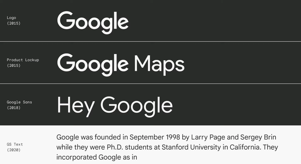
In one slide, Google notes the evolution between the company’s logo (revamped in 2015 following the Alphabet reorganization) and “Product Lookup” to the Google Sans font in 2018. GS Text was introduced last year, with some previously spotting it on the Google Design page. We’ve also seen Google Sans Text being A/B tested in Gboard on Android 12 for a handful of users.
Google says it’s also using variable font technology to make possible a “range of adjustments or variations” while maintaining a single file.
More about Material Design:
- Google updates Material Design to work better on large screens ahead of I/O 2021 push
- Google bringing Material Design to the web in a significant way with WordPress plugin
- Google’s 2020 Material Design Awards crown best dark theme, motion, and theming
FTC: We use income earning auto affiliate links. More.


Comments