
Google Phone is the latest app to get a Material You makeover ahead of Android 12’s release later this year.
Update: Within days of the Material You design rolling out, Google Phone has gained the dynamic colors to match, for some.
In the last few weeks, Google has been rolling out Material You redesigns with greater frequency, with Android 12 Beta 5 bringing colorful new designs for the Calculator and Clock apps on Pixel phones. While the usual hallmark of Material You, particularly on Android 12, is that apps will use a custom color scheme matching your current wallpaper, there are other tweaks that easily set it apart from the previous Material Theming.
Earlier in the week, a new beta update to the Google Phone app – version 70 – began to roll out via the Play Store, which didn’t have any immediately noticeable differences. However, as of Thursday evening, we’ve seen that Google Phone has, for some, taken on a new design.
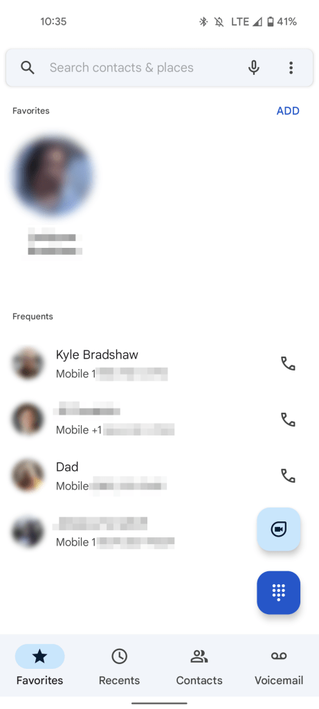
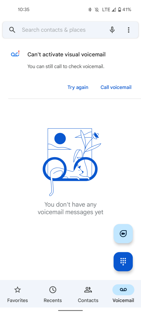
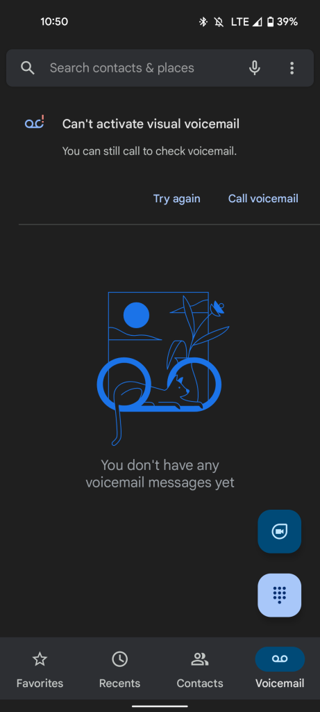
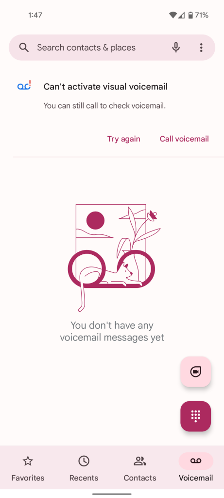
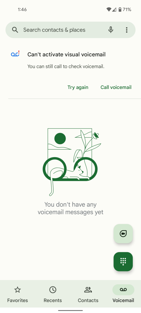
The most noticeable change is to the app’s bottom navigation bar, which now includes a pill-shaped indicator of which tab you’re on, a design choice that is distinct to Material You. Similarly, the two floating buttons — one used to open the dialer, the other a shortcut to Duo — changed from a circle to a rounded square. This same change can be seen in most of Google’s newly redesigned Workspace apps.
The actual dialer of the Phone app gets a much more subtle tweak, with the round Call button being switched with an oval shaped one.

Interestingly, despite the usual emphasis on color theming in Material You, Google Phone currently does not respect your wallpaper colors on Android 12. Instead, the app stays its usual shade of blue. Notably, for apps whose Material You redesigns are available on Android 11 and earlier, you’ll see this same tactic of using a shade of blue instead of a dynamic color. It’s possible that the lack of dynamic colors is simply a bug in this case.
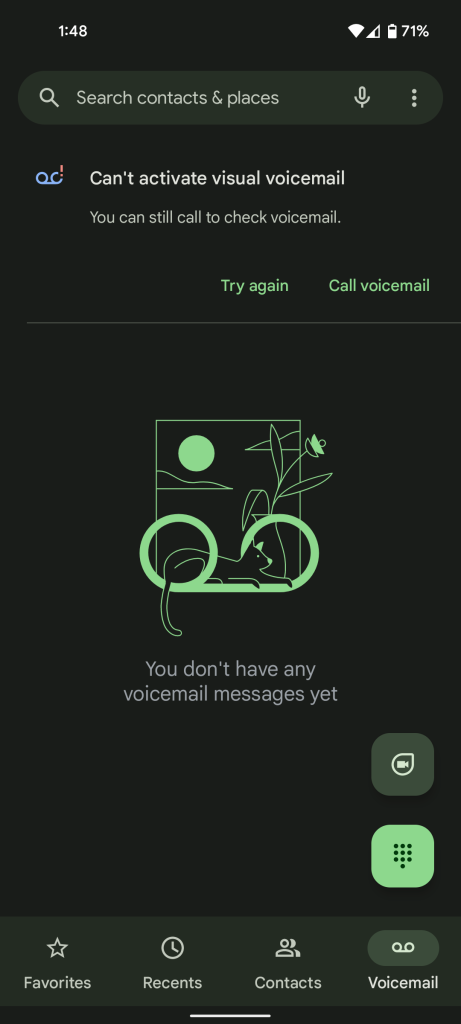
Update 9/17: Over the past few days, Google has gradually rolled out support for dynamic colors in the Phone app to those on Android 12. Where previously the app was a static shade of blue, now there is a greater palette of colors available.
So far, this seems to be the first instance of Google separating the rollout of a Material You redesign from the availability of dynamic colors. To that end, some members of our team got dynamic colors the day after the redesign, while others are still presently stuck with the all-blue theme.
Not all devices we’ve checked have received Google Phone’s Material You redesign, but between our own phones and reports from readers, it’s so far only rolling out to those on Android 12. If you’re seeing the Material You redesign on an Android 11 device, be sure to let us know down in the comments!
More on Material You:
- Google rolling out Material You for Calendar, Drive, Docs, and other Workspace apps [Gallery]
- Google teases Pixel 6 again in new image showcasing Android 12’s Material You
- Android 12 Beta 5: Material You clock widgets have arrived [Gallery]
FTC: We use income earning auto affiliate links. More.


Comments