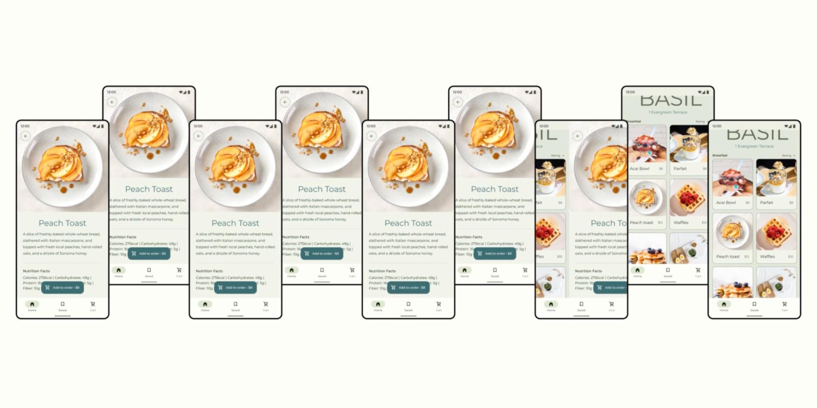
An interesting – albeit specific – user experience (UX) study from Google’s Material Design team today goes into what transition animation people prefer the most in Android apps.
Researchers on the Material team set out to “learn which transition best suited a grid of cards.” The context was specific to the fairly common interaction of using a food ordering app, but it applies to any grid view really:
Imagine you’re browsing through a restaurant menu on your phone, and you tap one of the entrees. What should happen? Should the entree’s description appear instantly, or should the card you tapped animate, expanding to show the additional detail?
Participants in the research study were asked to go through a menu with “one of seven transitions, or no transition at all (also called a jump cut).”
Google’s Material Design team found that a “clear majority of participants” prefer the container transform transition that “seamlessly transform[s] one UI element into another” so that a relationship between the two is “reinforced.”

Users liked it because the animation “evoked the feeling of picking something up to get a closer look, or pulling a menu in closer,” and that it fit the context:
Some expressed that the transition felt like it ‘fit’ the experience. The card and its details represent the same information – in this case, a particular plate of food. Having one seamlessly transform into the other helps users build a mental model of the application, so they don’t get lost. In fact, some participants expressed that it felt like they never left the page.
They used descriptors like “warm,” “inviting,” and “cozy.” Notably:
Only the container transform transition was perceived as conveying positive emotions and felt high end – as we called out above, participants mentioned it feeling like they were at a fancy restaurant.
Via material.io
While people found jump cut and fade through animations “efficient” and “quick,” most found those transitions “overwhelming” and “uncomfortable.” They “were never preferred for enhancing the feeling of an experience.”
You can preview the preferred transition in Google Keep today when opening a note card on the homescreen. That said, my colleague and Android app developer Dylan Roussel has several implementation issues with the container transform in general.
More on Material:
- Google is working to bring Material You to Chrome OS [Gallery]
- Repainter for Android hands-on: Make Material You yours [Video]
- Be sure to try these Material You widgets on your new Android 12 phone
FTC: We use income earning auto affiliate links. More.


Comments