At the start of last week, Google began rolling out the “new view” redesign of Gmail on the web. It has now hit our accounts, and here’s a look at how it works, as well as other details we’ve found while using it this afternoon.
Updates:
- 2/28 — Sidebar woes
- 3/2 — Opening chat bubbles
- 3/2 — Custom background themes
Gmail reload bug
Original 2/25: Once the redesign is rolled out to your account, Google will show a “Try the new Gmail view” card in the bottom-right corner of the screen. Clicking “Try it now” will prompt a reload, but the new design might not appear until after another manual page refresh.
If that doesn’t work, tap the settings gear icon in the top-right corner and hit “Go back to the original Gmail view.” Afterward, return to quick settings and select “Try out the new Gmail view.” This should do the trick. It rolled out to two of our Google Workspace accounts today, and none of our personal ones yet.
New view density woes
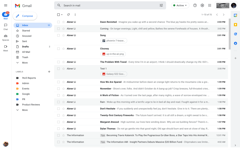
The “app main menu” at the very left of your screen is the equivalent of Gmail for Android’s bottom bar. This navigation rail — in Material Design parlance — goes hand in hand with Google’s vision for an integrated/unified Gmail that includes Chat, Spaces, and Meet. It’s supposed to let you work with just one tab open.
This means the previous sidebar for folders and labels has been moved right into what Google calls the “collapsible panel” that varies by application. In Gmail’s case, it includes the list of folders and labels. Only a subset is shown with everything else hidden by default.
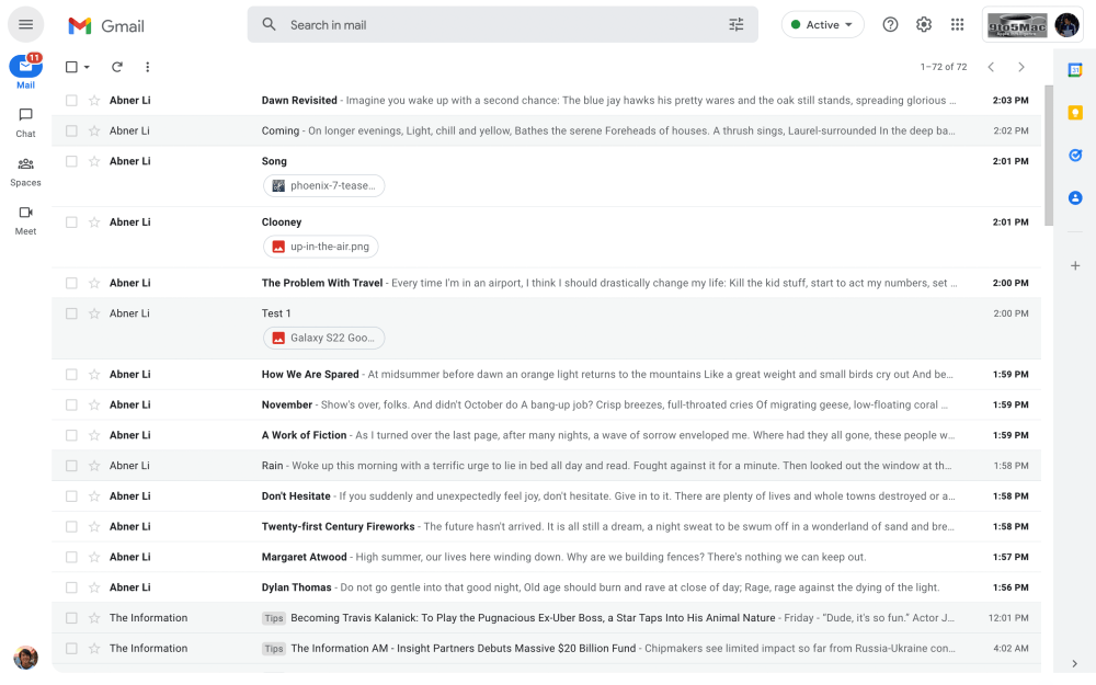
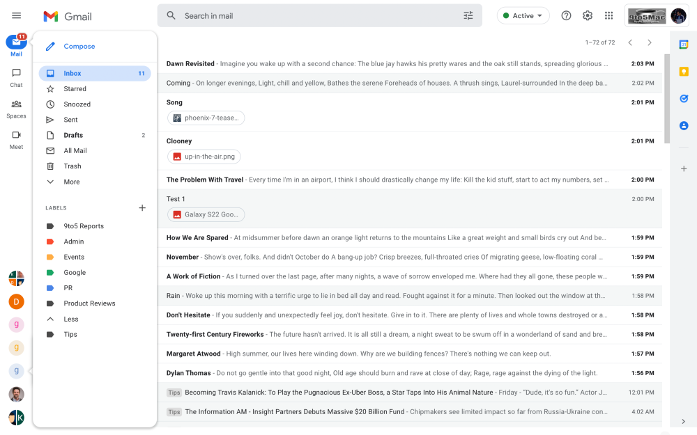
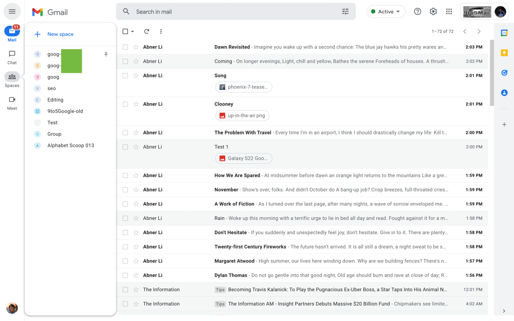
The panel can be hidden or set to always show (hamburger button), while hovering over the app icon when closed causes it to appear as a narrow floating window. The extra space introduced by the navigation rail does mean you see slightly less of the subject line. The right add-ons side panel remains and can be hidden.
The previous Gmail design only had one side panel that showed Gmail, Chat, Spaces, and Meet in one column. While quite busy and dense, it was streamlined and made for one scroll versus the new approach.


That said, one nice touch is how minimized chat windows that were previously docked to the bottom-right of the screen now appear in the navigation rail as circular avatars. It’s cleaner and doesn’t clutter up the bottom of your screen when composing emails. You can have up to six 1:1s, group chats, and even spaces appear there. This design detail is actually quite revealing. It’s a smart place to put what are effectively chat heads that reflects how the old Gmail badly needed a visual reorganization.
Update 3/2: By default, chat heads that appear at the bottom of the left rail opens in full screen mode. Fortunately, you’re able to change that behavior from Settings > Chat and Meet > Manage chat settings.
Update 2/28: After using the redesign for a weekend, my biggest annoyance is firmly with the App main menu and Collapsible panel. While the former component is relatively narrow, it’s just wide enough that having the panel of folders and labels always showing makes the list of emails (subject lines) too truncated if you don’t have Gmail open as a fullscreen window.
The workaround is to hide the panel and instead rely on how you can hover over the app icons to see the equivalent menu. I’m sure I will better familiarize myself with it over time, but I’m just frequently hovering over it by accident especially when clicking email checkboxes.
Fundamentally, I think Google made a mistake with the Collapsible panel. Your list of messages or contacts is simply a necessity for a good desktop email and chat client. It’s a core UI element and should be always visible. At the very least, it takes precedence over the bar with four apps that most people don’t use today.
Where’s the gray Gmail?
Meanwhile, the new Gmail view is missing a visual aspect that featured heavily in past screenshots. All the pictures of this redesign, since it was announced last year, depicted the app main menu, collapsible panel, and top strip as gray to differentiate Gmail’s navigation elements from the email list, message body, chats, etc.
That is not happening today, with only the right side panel gray and only a blue accent available throughout. As such, you miss the fact that the content of whatever app you’re viewing exists in a container with rounded corners that give off a modern look.
Hopefully, the light gray will make an appearance sooner than later — it could be a Workspace tier issue related with branding, but Gmail remains blindingly light until then.
Gmail’s new gray background exists on personal Google Accounts. Like we speculated, there looks to be a bug with the rollout to Workspace.
Renders vs. live
Update 3/2: Gray Gmail does consistently exist on personal Google Accounts as does support for custom themes. Whichever one you set, the floating collapsable panel adopts a dark gray background that’s more or less a dark theme.
FTC: We use income earning auto affiliate links. More.


Comments