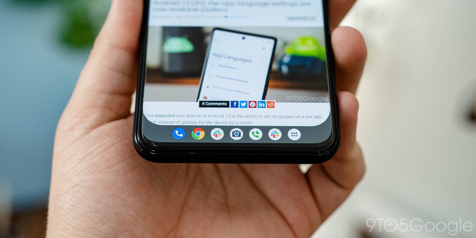
Android 12L renewed Google’s focus on big screen devices, seemingly just in time, and Android 13 is only expanding on that. In the latest Android 13 preview, we’re seeing a new app drawer on the taskbar.
Switching our Pixel 4 XL test device to a tablet-like DPI, we can take a look at what Google has changed in Android 13 for bigger screens. In the first developer preview, we noticed that the Pixel Launcher had been updated to respect two different layouts, one for big screens and another for smaller, hinting strongly at a folding Pixel phone. Now, Google has also updated the taskbar in Android 13 to support an app drawer.
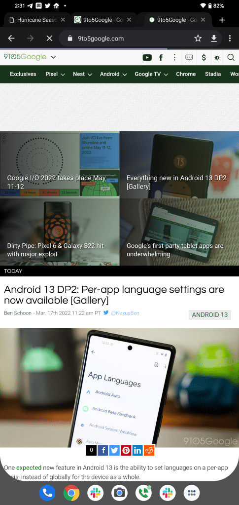
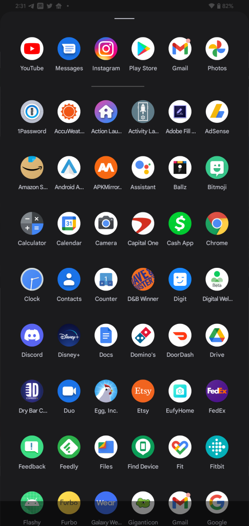
When in an app on Android 13, the taskbar now displays an app drawer icon which, when pressed, lets you access all apps on your device just as if you went back to your launcher. Notably, and sensibly, this icon only appears when you are in an app, not on the homescreen.
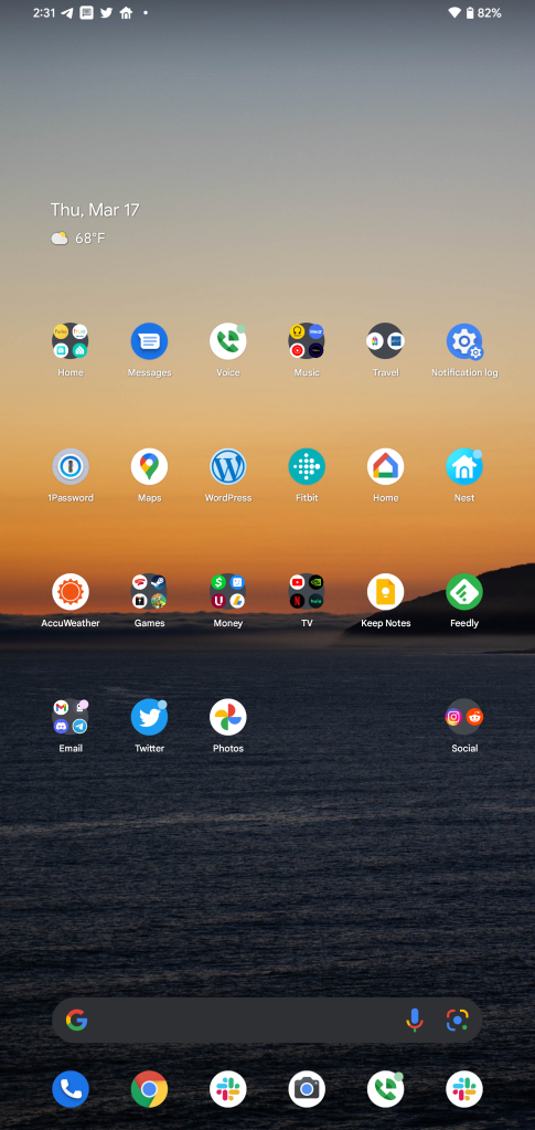
Google has also slightly tweaked the taskbar to where it now expands in width when on the homescreen, essentially hiding the dedicated taskbar and merging the icons onto the homescreen.


We’re still digging through the second developer preview of Android 13, so stay tuned for more! And let us know if you find something we haven’t in the comments below or on Twitter.
More on Android 13:
- Android 13 DP2: Google updates Quick Settings with settings and power buttons on the bottom
- Here’s everything new in Android 13 Developer Preview 2 [Gallery]
- How to install the Android 13 developer preview on Google Pixel
FTC: We use income earning auto affiliate links. More.


Comments