
Just over four weeks ago, Google announced that Photos for Android and iOS would get pretty significant updates to two core parts of the app. That Google Photos redesign of the Library tab has now been delayed.
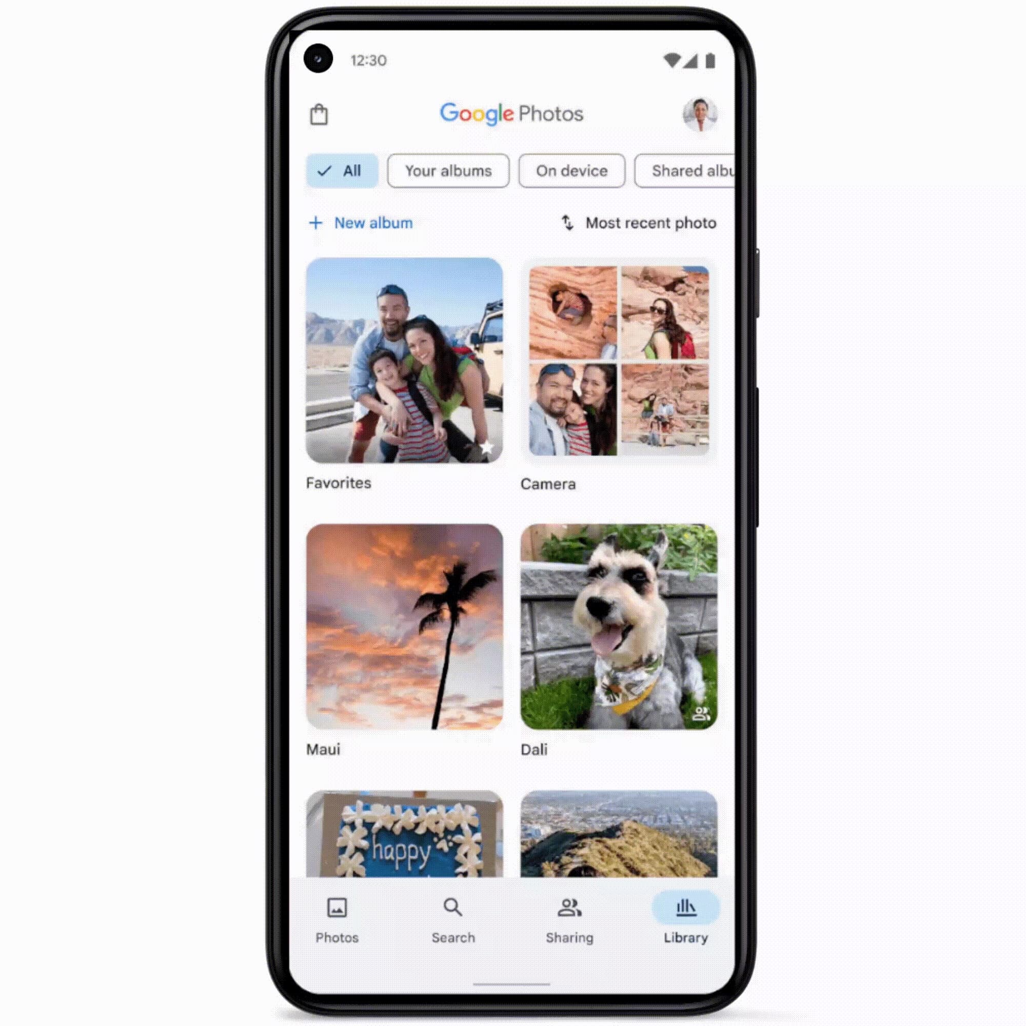
The big change to the Library tab involves Google Photos immediately showing a grid with 10 recent albums. This includes Favorites and your Camera roll, while everything else can be sorted by the carousel of filter chips: All, Your albums, On device, and Shared albums.
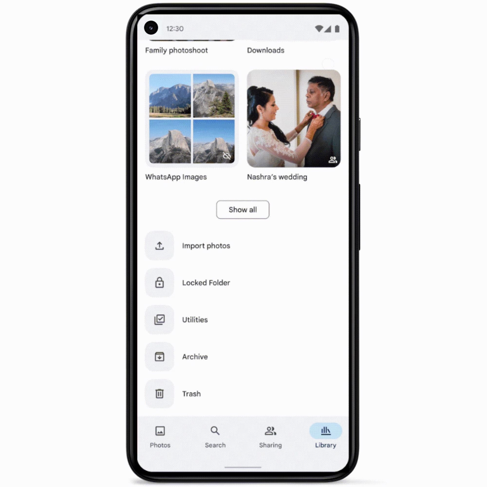
This is followed by a list to access the shortcuts (Utilities, Archive, Trash) that previously appeared at the top of your screen.
Back in March, we faulted the new design for being an oversimplification as, by default, it stopped distinguishing between folders that are located on-device and albums in the cloud.
The old design is objectively more complex with both a grid and carousel. However, I believe that people understood and appreciated the difference. Meanwhile, moving the 2×2 grid of quick actions from the top to the very bottom will make for a tedious scroll, while it’s no longer guaranteed that Favorites remains in a static, muscle memory-friendly position.
Google Photos Library tab redesign
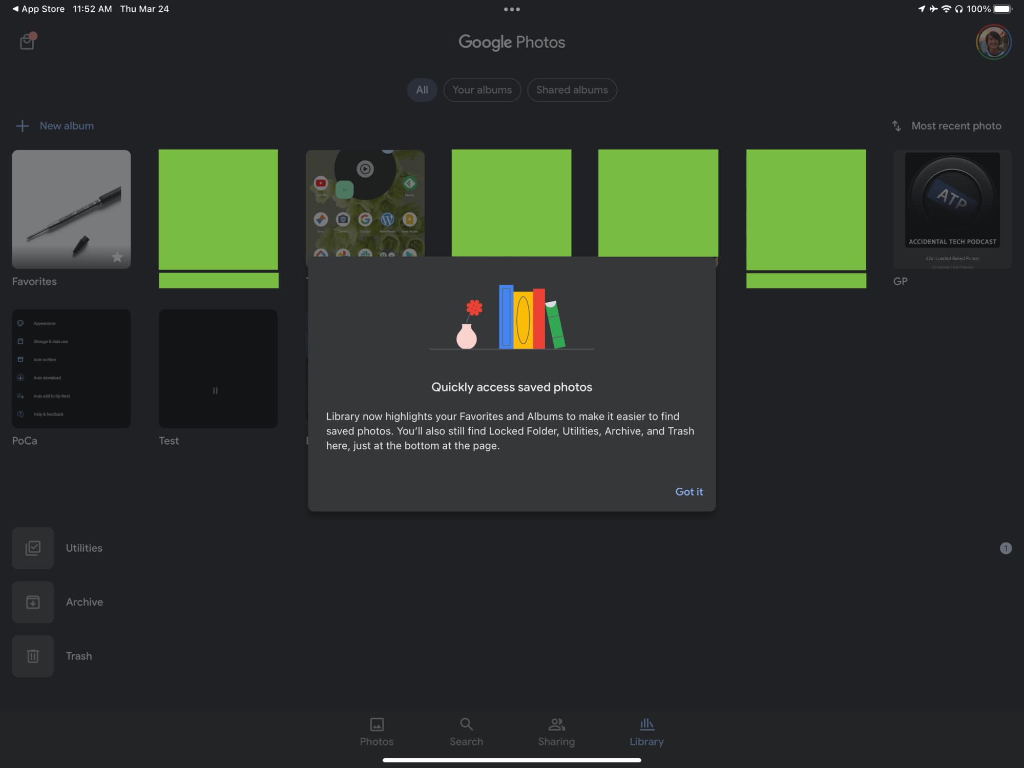
At the time, Google said this new Library design would start rolling out that same day. In fact, we spotted it on iOS later that week, complete with an explanation of the changes.
However, in recent days, the design was rolled back on both the iPhone and iPad, while — from what we can tell — it never rolled out to Android.
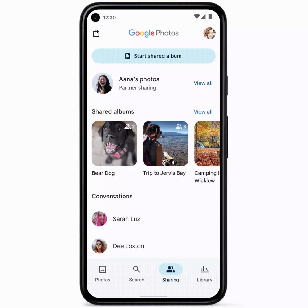
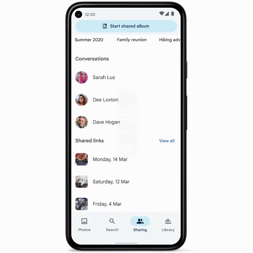
When asked for comment, Google told us today that the Library tab redesign was delayed to allow for “some additional changes.” Meanwhile, the Sharing tab — which we find to be great for bringing much needed organization and categorization — is still gradually rolling out on Android over the “next couple weeks,” with iOS following afterwards.
There’s precedent for the Google Photos team reverting changes in response to “user feedback and comments.” Last May, the Sharing tab was returned to the bottom bar after previously getting moved to the top-left corner of the app.
Redesigned Sharing tab
FTC: We use income earning auto affiliate links. More.


Comments