Playlists are undoubtedly a big part of YouTube Music’s discovery angle, and Google is now testing a big UI redesign for them on mobile.
The first two lines note who created the playlist and when it was last updated down to the date. (You only get the year today.) Cover art appears next with highlighted artist image at the left and vertical text at the right, while YouTube Music’s circular logo is in the top-left corner.
You then get the name of the playlist in a larger font size and the description. All buttons (placed within circles) appear on a single line: download, add to library, play, share, and the overflow menu. Share previously used to be in the top-right corner next to Cast and search (which are unchanged today). Lastly, this top area uses a blurred background of the cover art.
There’s notably no button for shuffling, while the list of songs stays the same. Google curiously does not note how many songs are in the current collection.


So far, only one (French) user has received this YouTube Music playlist redesign on a tablet (Galaxy Tab A7). They said it just appears for playlists and not albums. It’s not clear if that’s just the case in early testing, or whether the new look is only intended for playlists. Both views getting the same visual update would make sense as they are identical today.
Update 5/9: This revamp also applies to user or community-generated playlists. Your YouTube profile is named at the top, while there’s an edit button instead of add to library and shuffle over play. The latter makes sense as you can just start by tapping the first song in the playlist.
We’ve yet to see it on several devices we checked this morning. This YouTube Music redesign puts greater emphasis on playlist cover art, while having controls all on one line could be ever so slightly more convenient. The previous look was getting a bit long in the tooth.
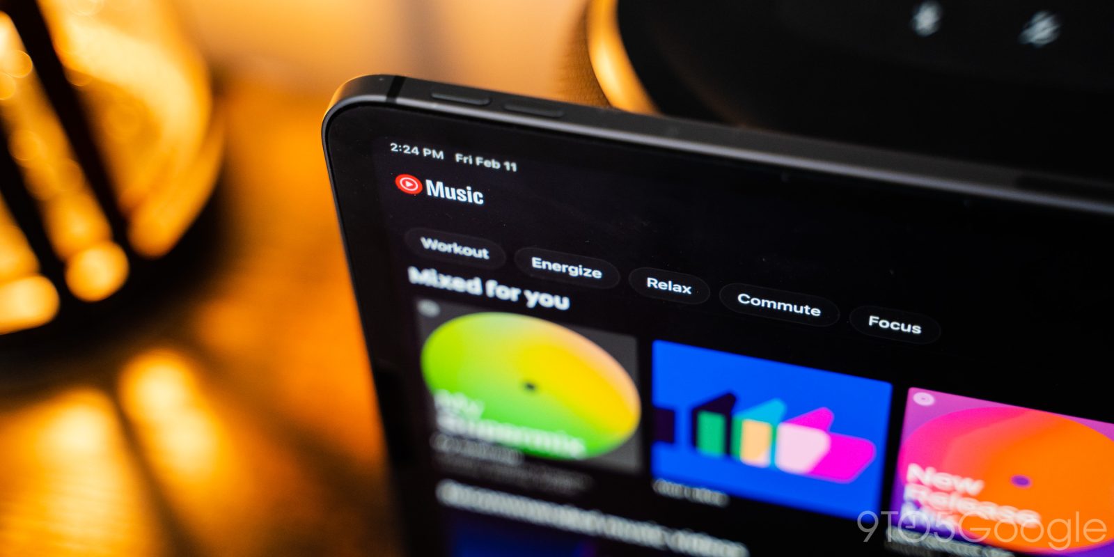
This joins other recent YouTube Music UI changes like last week’s splash of background color, new “Mixed for you” cover art, new smart downloads icon, and revamped “Add to playlist” screen from February.
More on YouTube Music:
- YouTube Music ‘Listen again’ shelf drops carousel for denser grid [U]
- Latest YouTube Music addition makes the ‘Explore’ tab pretty redundant [U: Tweaked]
- YouTube Music getting a new way to promote albums in the Explore tab
- YouTube Music improves radio algorithm to show more artists, adds Family shelf and Wear OS shuffle
FTC: We use income earning auto affiliate links. More.


Comments