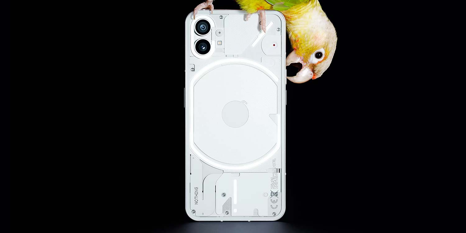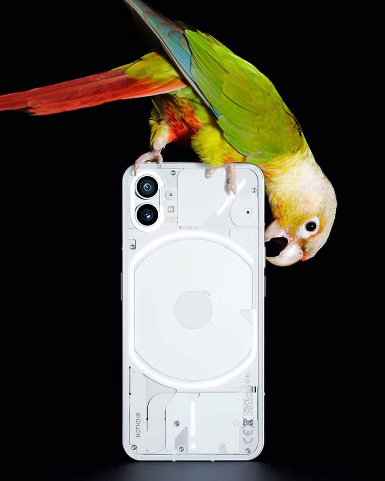
While we await the full unveil of the Nothing Phone (1), we now have our first look at the highly touted “transparent” design of the upcoming Android phone.
In typical Carl Pei fashion, almost every little detail is being drip-fed ahead of the official keynote in a bid to ramp up the hype surrounding this new Android entrant. While the internals are not yet known, courtesy of Nothing, we’re getting to see the first official images of the Phone (1) design — with extra parrots.
[Update 06/16]: Nothing hosted a special event in Basel, Switzerland, where selected media and online influencers were able to see the device in the flesh for the first time. This included a demo of the light bars on the backplate, which appears to be covered in a thin glass panel as showcased by Swiss publication Das Kann Was’ Lorenz Keller, who was able to uncover further details about the device design — which you can see below:
The camera nodules appear to jut out in a similar manner to the iPhone series, which combined with the flat sides and even button placement is fairly similar to Apple’s 12 and 13 series devices.
Shared in multiple posts across Instagram, Twitter, and the nothing.tech site, there is certainly an iPhone-like boxiness to the Nothing Phone (1)’s design, but this certainly isn’t the revolutionary or groundbreaking look that some would have you believe ahead of the official unveil.
“Bold,” “warm,” and “full of soul” are certainly not descriptors we would use for this mostly white industrial backplate. However, there is one interesting design choice as the Nothing Phone (1) comes with light-up strips. It’s unclear if these are simply reflective or will use battery power to glow.

As per the original teaser glyphs, you can see the wireless charging pad or coil with the upper-left dual camera setup. It’s hard to truly call this a “transparent” design when so few of the internal components of the Nothing Phone (1) are actually visible. It appears that many of the internals — including the battery — are kept hidden behind what amounts to a white backplate with what we believe is a glass covering atop.
Nothing has released a YouTube detailing the story behind Phone (1) with gratuitous teasers littered throughout the first episode. The design of the Nothing Phone (1) was blurred throughout, but likely to stay ahead of any leaks, the firm has decided to reveal the biggest talking point almost a month ahead of the launch keynote.
Hot or not? Let us know what you think of the design down in the comments section below.
More on Android:
- How to downgrade from Android 13 Beta 3 back to Android 12 on Google Pixel [Video]
- Android apps on Windows 11 will soon be running on Android 12.1
- Android Auto for Phone Screens is officially dying for everyone
FTC: We use income earning auto affiliate links. More.


Comments