The Google Phone app that handles calls and the dialer for Pixel phones appears to be testing a redesigned in-call UI that has a sort of “bottom bar” interface.
Earlier this year, the Google Phone app rolled out a new dialer design that had clear Material You inspiration, but the app has been mostly silent in the months since. Now, another design update seems to be revamping the in-call UI.
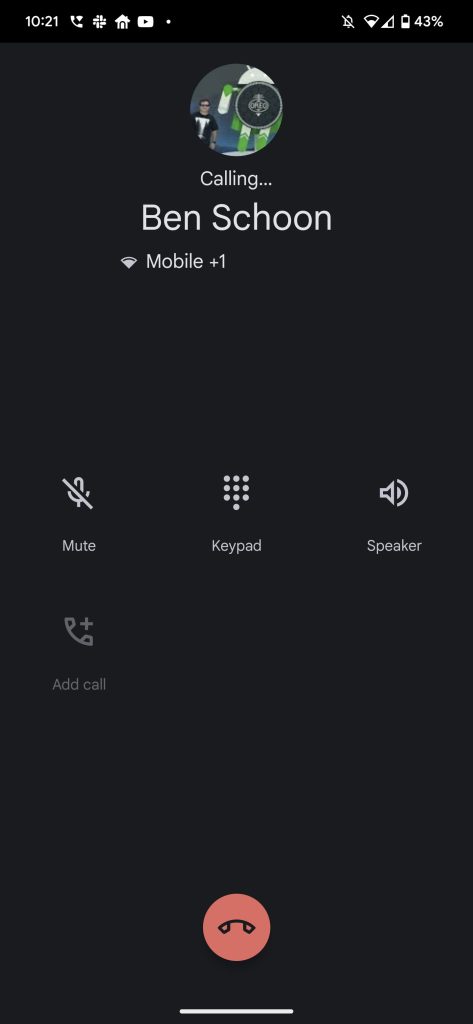
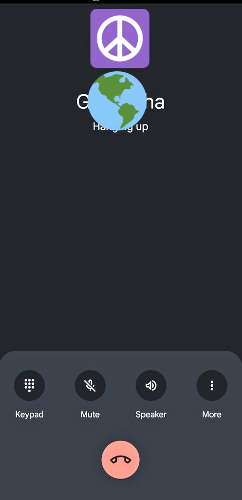
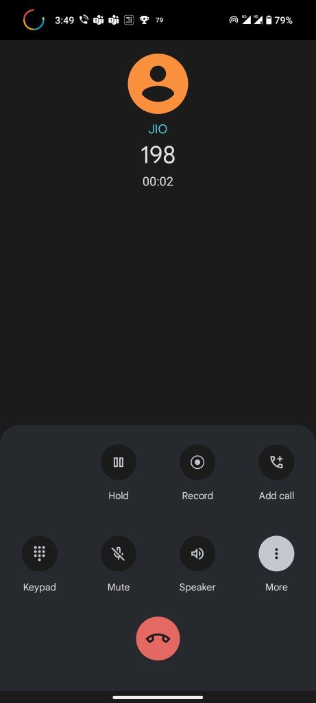
As some readers have found in the past 24 hours, Google Phone’s new in-call UI adopts a sort of “bottom bar” UI. The use of a bottom bar is pretty common in Google apps, but it’s a distinct change from Google Phone’s previous grid of icons that appeared much higher in the UI.
By default, the new UI shows buttons for the keypad (dialer), mute, speaker, and a “more” option along the bottom of the UI, just above the button used to end a call. Tapping the “more” option reveals hold, record, and add call buttons, just like the current UI.
Top comment by GoldWeights
While this new UI looks great overall, it doesn’t appear to be widely available. The change seems to come with Google Phone v90.0.475844574, which is currently available in public beta. However, this does appear to be a server-side change, as we’re not able to see the same UI despite being on that version. The UI is showing on at least one Pixel device, but it seems reasonable to expect it could also be rolling out to other Android phones using Google’s dialer – so far, though, we’ve only been able to verify it on a Pixel device.
Related: How to join Android app beta programs on the Google Play Store


Are you seeing this new UI? Drop a comment below and let us know!
More on Google:
- What to expect from Google’s hardware event: Pixel 7, Pixel Watch, and Nest [Video]
- Pixel 7 pops up on Amazon, confirming price and mid-October release date
- Android Auto 8.2 beta begins rolling out, tweaks dock of ‘Coolwalk’ redesign
FTC: We use income earning auto affiliate links. More.


Comments