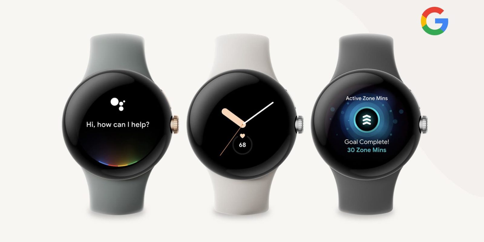
Smartwatches are very personal devices and, as such, how they look is very important to many potential buyers. With the upcoming Pixel Watch, the screen bezels have become a polarizing design element – even a deal breaker for some.
The Pixel Watch has a pretty unique design in the smartwatch space. Unlike the classic looks of smartwatches from Fossil or the utilitarian middle-ground of Samsung’s Galaxy Watch, Google’s first smartwatch is a somewhat futuristic-looking device with a dome of glass that makes up the entire face of the watch. It’s a great look, but some are turned off by how it looks once the display is switched on.
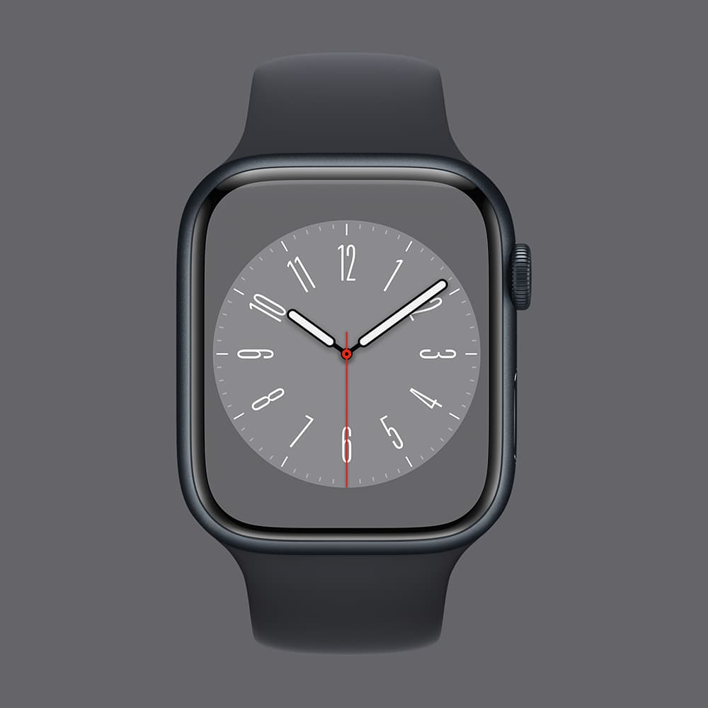
Throughout renders and teasers we’ve seen to date, the Pixel Watch has seemingly shown that the bezels around its display are not exactly tiny. Some people seem fine with it, while others poke fun at how far Google’s design seems to be behind the current generation of Apple Watch.
This matter reached a head last week as Google showed off a design video about the Pixel Watch where the bezels seemed to be incredibly thick compared to past renders. Reactions varied from worry to mocking. But days later, the same design video was uploaded again, and bezel sizes effectively shrunk. You can see the comparison below.


That prompted us to wonder: Are the bezels on the Pixel Watch actually a deal breaker for anyone?
As it turns out, the answer is definitely yes.
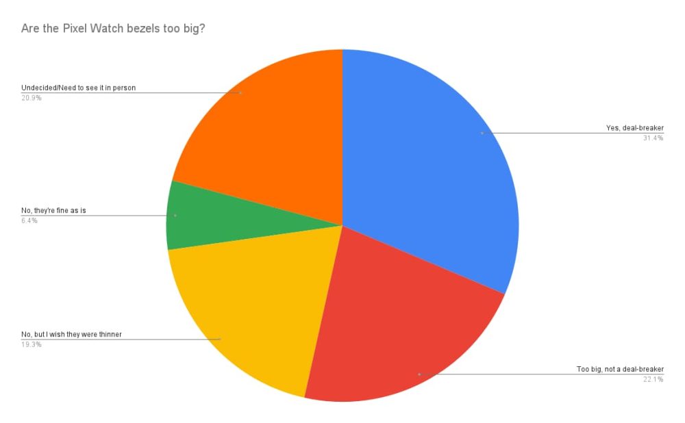
In a poll of 9to5Google readers, over 50% of respondents said that the bezels on the Pixel Watch are too big, and over 30% considered it to be a deal breaker and that they wouldn’t purchase the smartwatch as a result; 19% said that they wish the bezels were thinner but that they weren’t actually too big, while around 21% said they need to see in-person pictures to reach a verdict.
Here’s my take. The bezels shouldn’t matter, at least not to this degree.
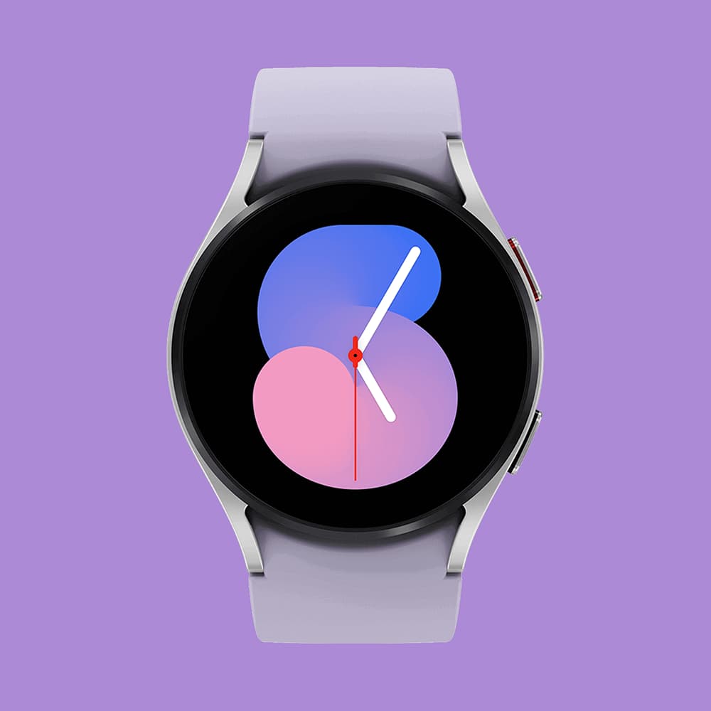
Like I said, smartwatch design is a very personal thing, so it’s valid if you think the Pixel Watch bezels are too big. But in terms of the design of the watch and its functionality, the current look is not a hindrance, in my eyes. The bezels appear to be roughly the same size as on Samsung’s Galaxy Watch 5, which no one seems to have a problem with.
Why is it such a polarizing issue on Google’s smartwatch? I think it comes down to the scrutiny that Google’s devices are always under. Like Pixel phones, the Pixel Watch will surely be picked apart by avid fans, and anything less than perfection will see outcry.
Top comment by Whispy_Snippet
That’s not to say there won’t be valid complaints on the software, performance, and battery fronts. There absolutely will be.
But the bezels on the Pixel Watch are tame, and expected, to say the least. Apple deserves a lot of credit for pulling off its edge-to-edge display on the Apple Watch, but it’s something the brand has pulled off after several years of building its own smartwatches, and it also comes at a higher cost than what Google will be charging for the Pixel Watch.
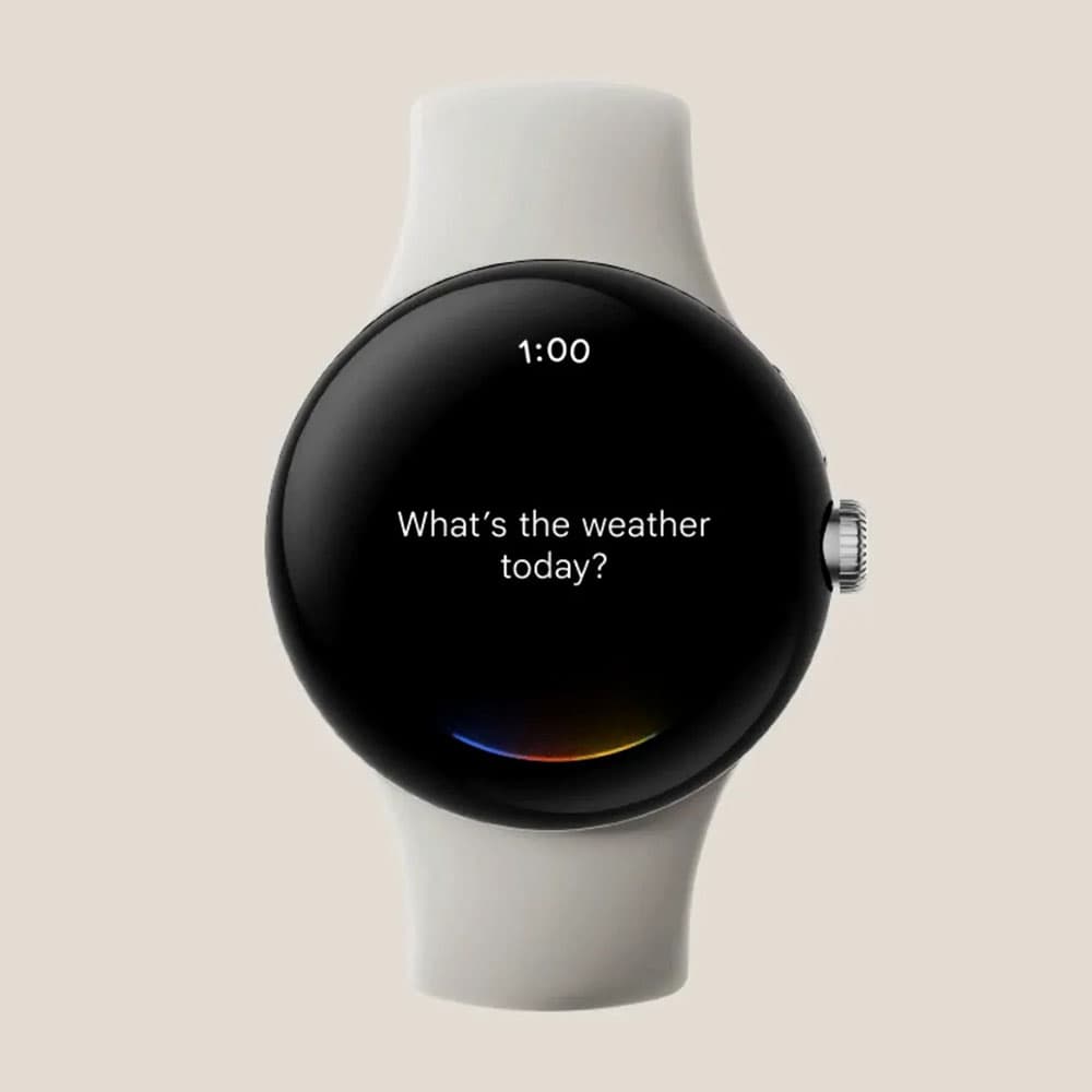
I’ll personally be very curious to see how this looks in person and if that changes my mind. But as of right now, I don’t think the bezels, of all things, should be a deal breaker for Google’s first smartwatch.
Do you disagree? Explain in the comments below!
More on Pixel Watch:
- Source: Google Pixel Watch to start at $349.99 in these colors
- Pixel Watch retail box emphasizing ‘with Fitbit’ leaks
- Google is hindering Fitbit’s smartwatches to make the Pixel Watch look better
FTC: We use income earning auto affiliate links. More.


Comments