The Material Design team has an interesting blog post into what it calls the “24-hour Clock Design Challenge” that chronicles Google’s work creating a time picker for those that use a 24-hour format clock on their Android devices.
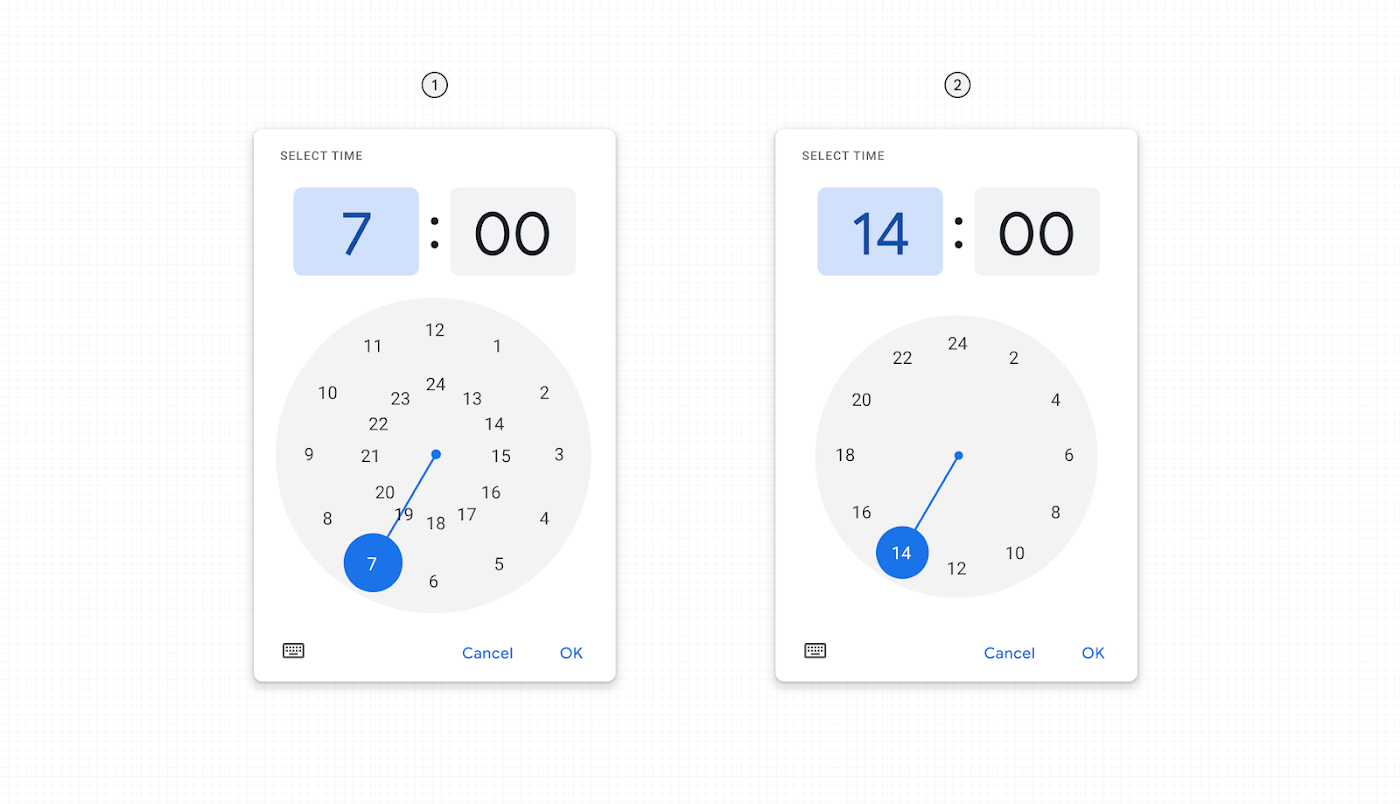
The first Material Design 24 hour clock (diagram 1) was released in October 2020 and featured two rings – an inner and outer ring each representing a set of 12 hours to total to the full 24 hours in a day.
Google set out to “address a handful of concerns related to accessibility and collision points of inner ring numbers,” which looks hectic for those more familiar with a 1-12 clock with AM/PM button.
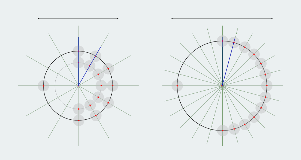
Diagram 2 shows a single-ring design that goes from 2 to 24 with only even numbers represented, but odds still accessible and represented by the “space in-between.” (“Upon setting the hour, the clock then switches to a minute mode to set the minutes.”)
Upon release, people complained about the 24-hour dial and wanted back the “system’s two inner & outer circles.”
Users who commonly use 24 hour selection were having difficulty using the new Time-picker’s 24hr single-ring dial. Users had become accustomed to the dual-ring design, this new convention didn’t follow the user’s anticipated mental model, and at first glance it wasn’t clear how to select odd numbers which were represented by spaces in-between the even numbers that were displayed.
In response, Google explored and prototyped “over 50 unique designs not just exploring different visual treatments (single and dual ring), but also interaction such as long tap/hold, sliding, ring swaps, etc.”
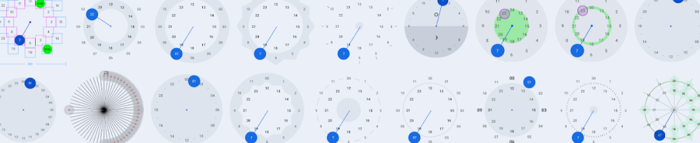
After narrowing to “4 optimal designs that capture the spirit of Material 3,” Google conducted two mixed-method research studies with a focus on usability that compared the proposals to the digital input clock design. This involved 50+ people in Brazil, France, Germany, India, Indonesia, and the UK.
To evaluate this we asked participants to set the clocks to different times throughout the day (10am/1000, 5:30pm/1730, 2am/0200) on each version. Success rates were collected along with observational data as we watched participants set the times and recorded delays in setting the time. We also gathered rich qualitative data of the perceived negative & positive aspects of each design as well as which design was considered least confusing.
The results included:
- “Even participants who currently use 24 hour clocks found all 24 hour analog designs unfamiliar and confusing.”
- “Considering the analog clock designs, participants made the widest range of errors with the single ring design and only 4% of participants called it the ‘least confusing’ design.”
- “However, even the dual ring designs also resulted in errors as users were uncertain how to select time throughout the day.”
Google’s takeaway was that “direct-input digital format” was the easiest time picker for the 24-hour format:
Since Material has historically offered an analog option still in use by many today, we will move towards the digital input by default for 24hr users while still providing the option for users to enable the 24hr analog (dual-ring) presentation if desired. We also will use the user’s input to impact the default. That means if a user manually switches to the new 24 hour analog clock it will remember that preference the next time the app is opened and will default to it.

FTC: We use income earning auto affiliate links. More.


Comments