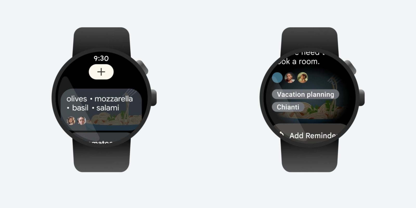
Following two new tiles for sunset/sunrise and favorite contacts, Google Keep for Wear OS is beginning to roll out its updated notes feed.
Keep saw a Wear OS 3/Material You redesign in September that greatly modernized the app’s look. Google is now building on that by making the notes feed richer, which starts by reflecting the background color or preset image you’ve set in the phone app. As such, the feed is no longer monotonous gray cards on a black background.
The color/theme is also reflected when you open a note, though it’s more muted here. At the bottom, just before the Add reminder, Pin, and Archive actions, you’ll now see when something was edited and labels you’ve applied, as well any collaborators.
Old Google Keep
The latter can also appear on the main feed, which has boosted the preview so you can read more of a note before opening. You now get three to four lines of text instead of just two, though you see less notes per screen as a result.
Google Keep 5.22.482.00.97 for Wear OS 3 brings the richer notes feed, though we didn’t see these changes immediately after updating on our Pixel Watch. This new version is not yet widely rolled out via the Play Store.
Additionally, images are broken in this release and do not get previewed in the main feed. The card remains blank, but opening will show any attached pictures. Google Keep should be getting the ability to preview two images side-by-side.
New Google Keep
More on Google Keep:
- Google Keep dual-pane redesign for Android tablets rolling out
- Google Maps and Keep support Wear OS 2 again after temporary removal [U]
- Rumor: Google working on Gmail and Calendar apps for Wear OS, Pixel Watch
- Workspace branding comes to Keep and other Android apps
FTC: We use income earning auto affiliate links. More.


Comments