
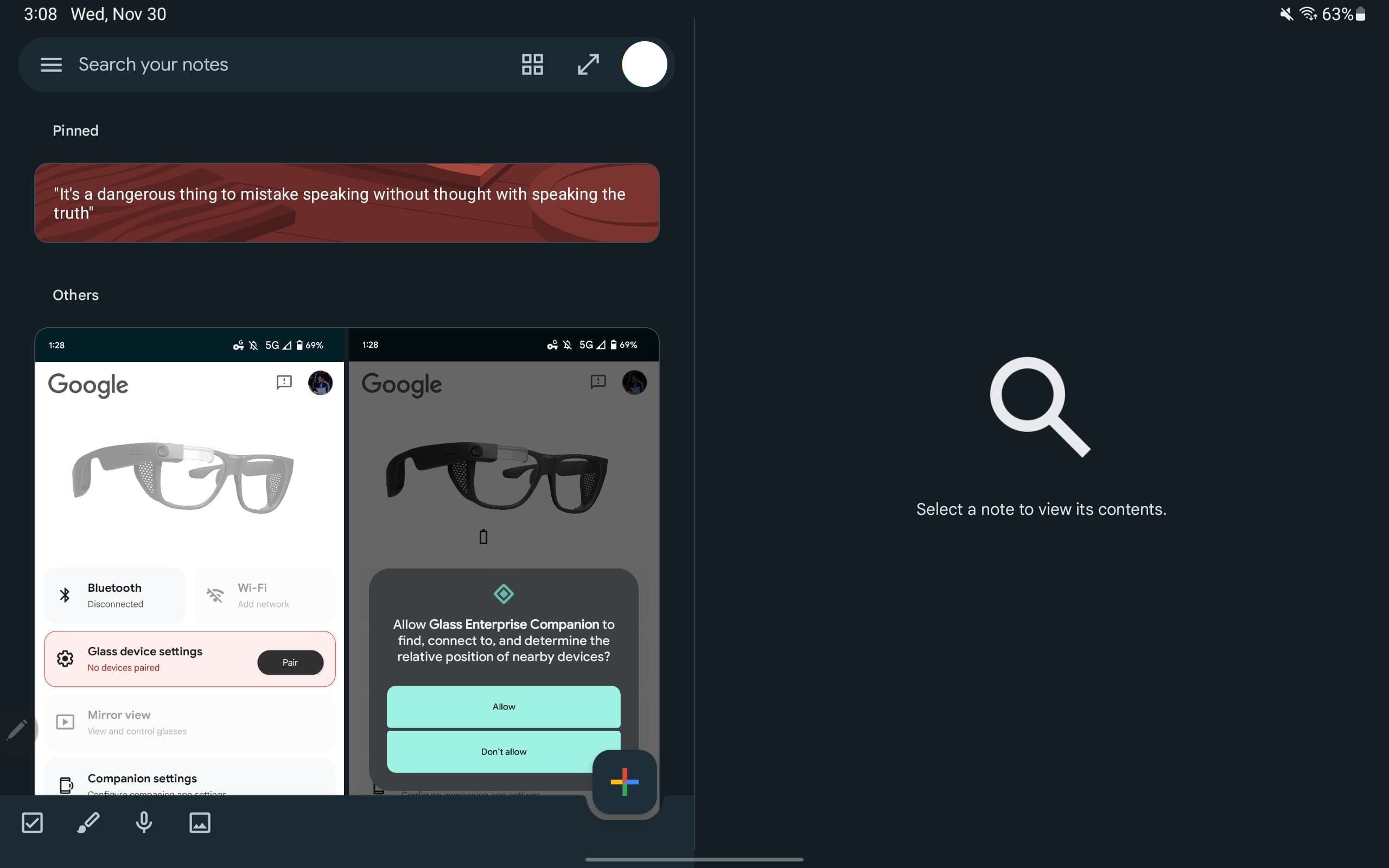
Back in September, Google announced that Keep was getting a dual-pane view and it’s now more widely rolled out on Android tablets.
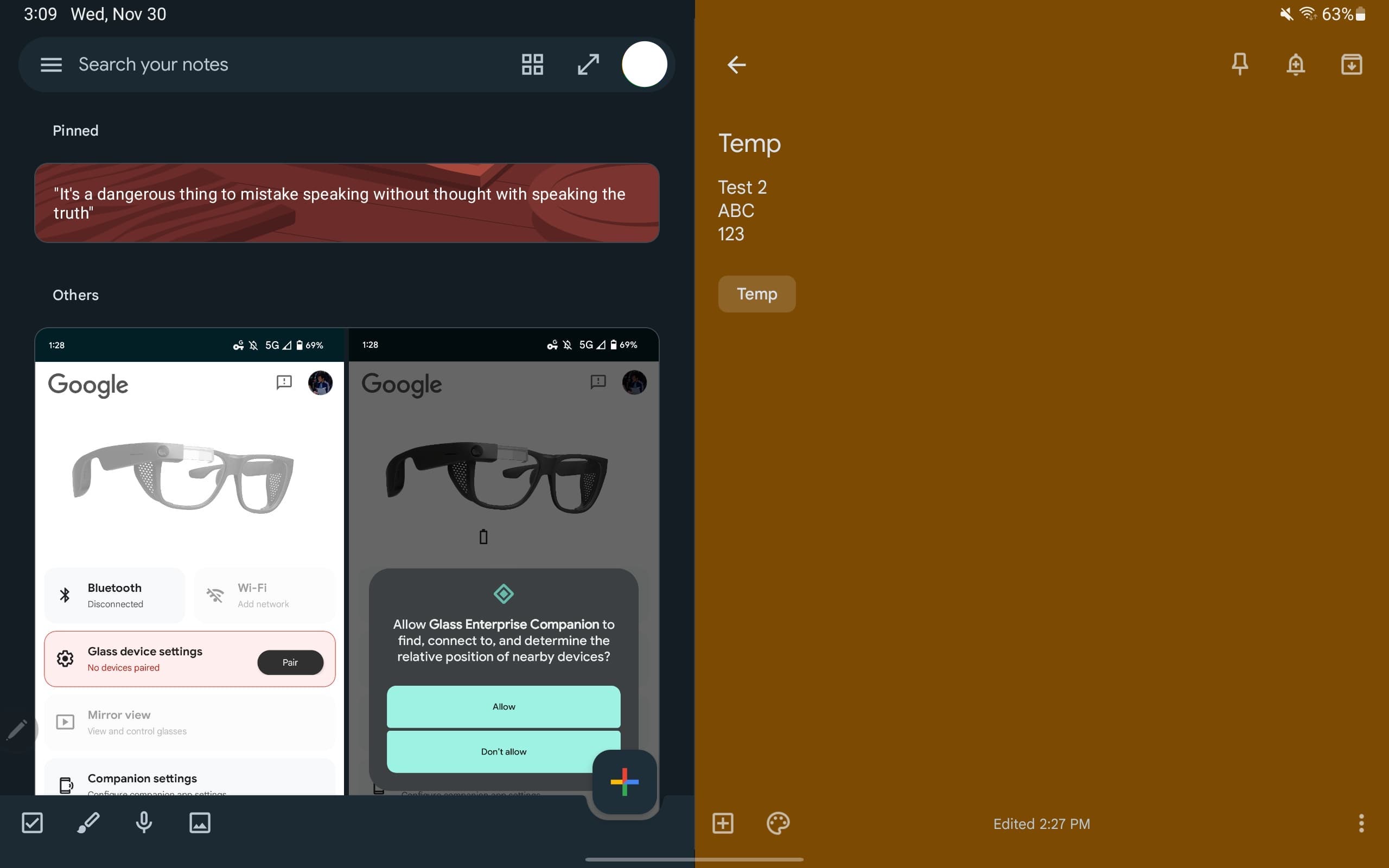
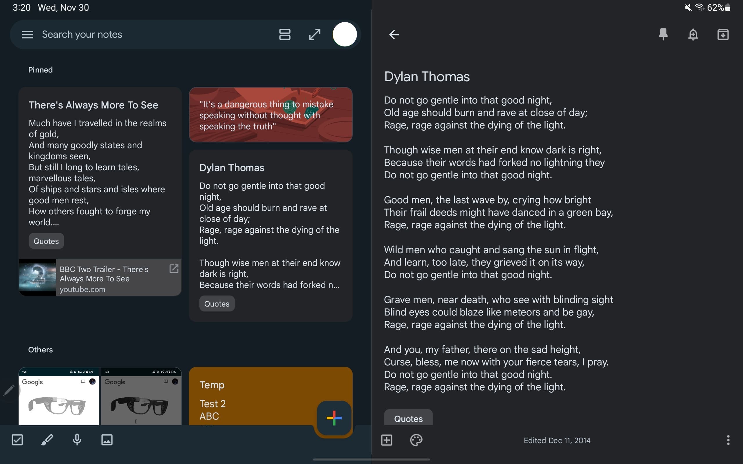
This two-column view lets you see a list (or grid) at the left, while the actual note appears at the right. Previously, notes would open overlaid against the grid, which remained visible in the background.
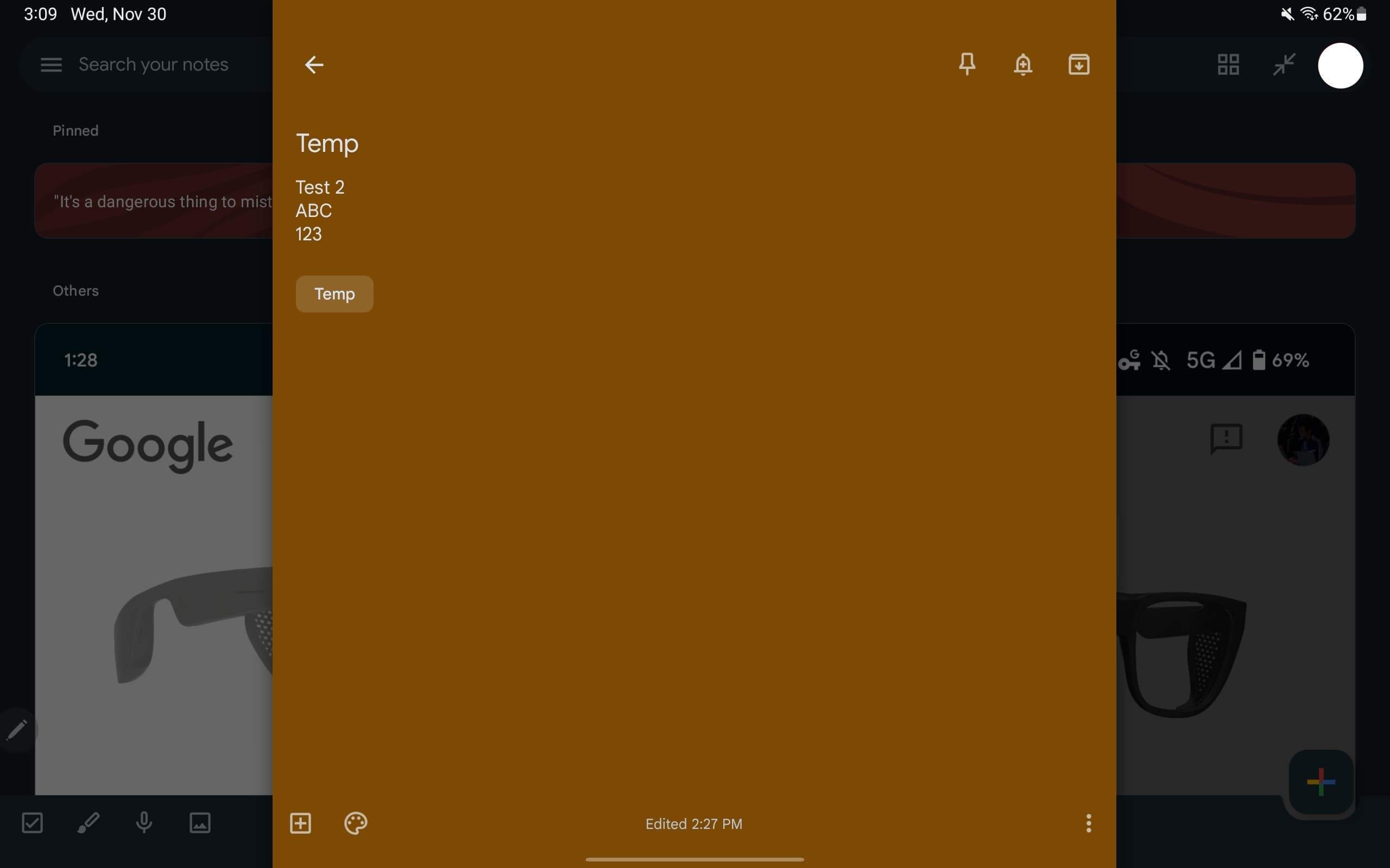
Google has made an important tweak since the September announcement. In the “Search your notes” field, there’s now an expand/contract button to the left of your profile avatar. This lets you switch between Full screen and Dual pane. The former remains useful if you want to see all your notes or concentrate on a particular one.
The Google Keep website should really get this feature.
We’re seeing this dual-pane redesign rolled out with version 5.22.452.00.90 of Google Keep on an Android 13 tablet (Tab S8) after previously only encountering it on a Chromebook running the Android app.
It was a much needed redesign that makes Keep one of the more optimized Google tablet apps. Meanwhile, Google Keep recently received updated keyboard shortcuts that “better align with the web experience.” You can view them from the bottom of the overflow menu with a physical keyboard.
More on Google Keep:
- Google names best Wear OS, Chromebook, and tablet apps of 2022
- Samsung tablets on Android 13 still don’t have a two-column notification shade
- Google Keep are no longer available on Wear OS 2 watches
- Google optimizing widgets for Android tablets, starting with Drive and Keep
FTC: We use income earning auto affiliate links. More.


Comments