YouTube Music has been working on a big redesign of the Library tab on Android and iOS for quite a while now. Ahead of that widely rolling out, YouTube Music on the web is getting some Library tweaks.
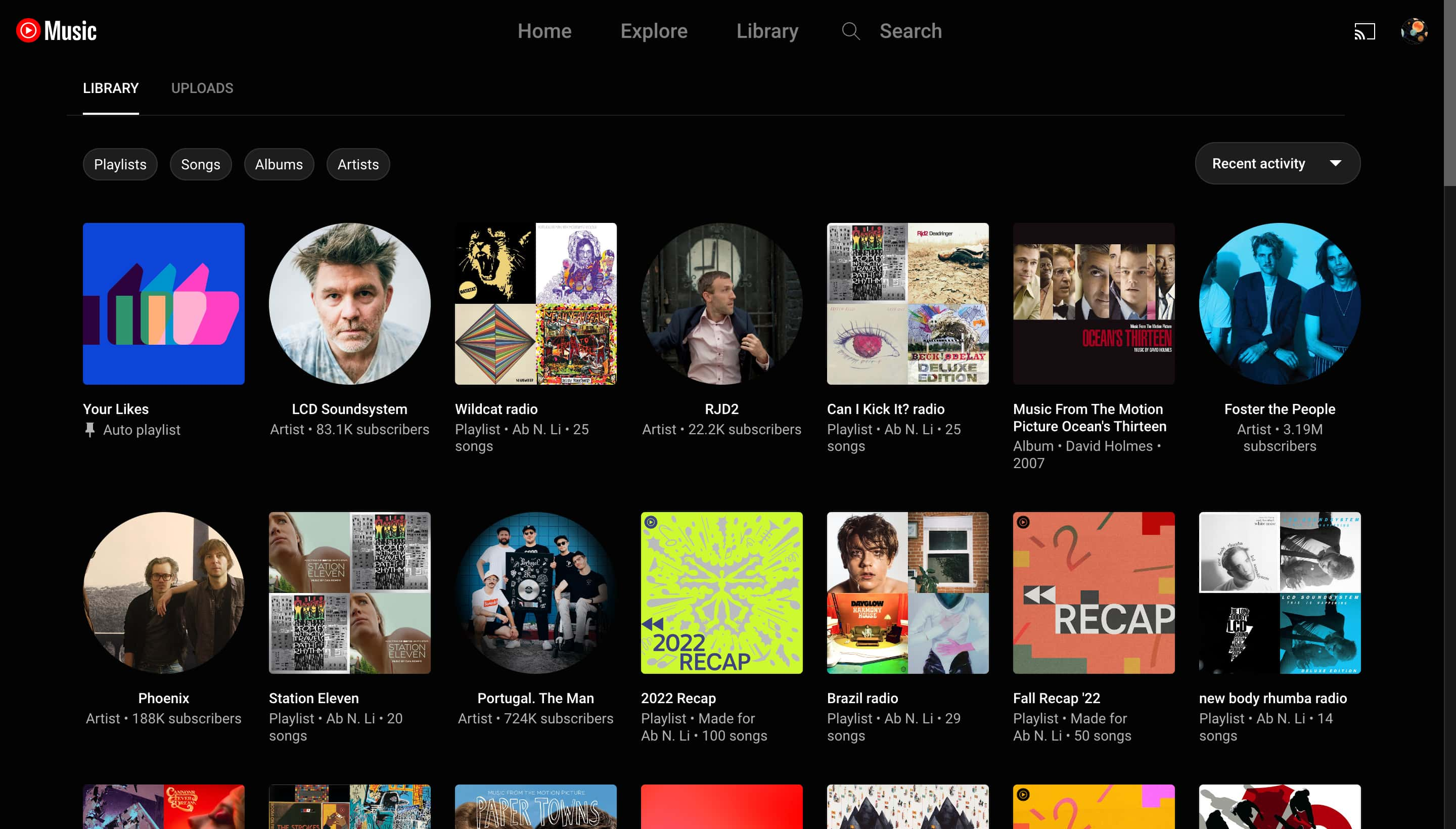
Like on the upcoming mobile revamp, the “Last played” carousel at the top of Library is gone. You immediately get tabs for “Library” or “Uploads” (if available). This is followed by filters for “Playlists,” “Songs,” “Albums,” and “Artists,” with one selectable at a time.
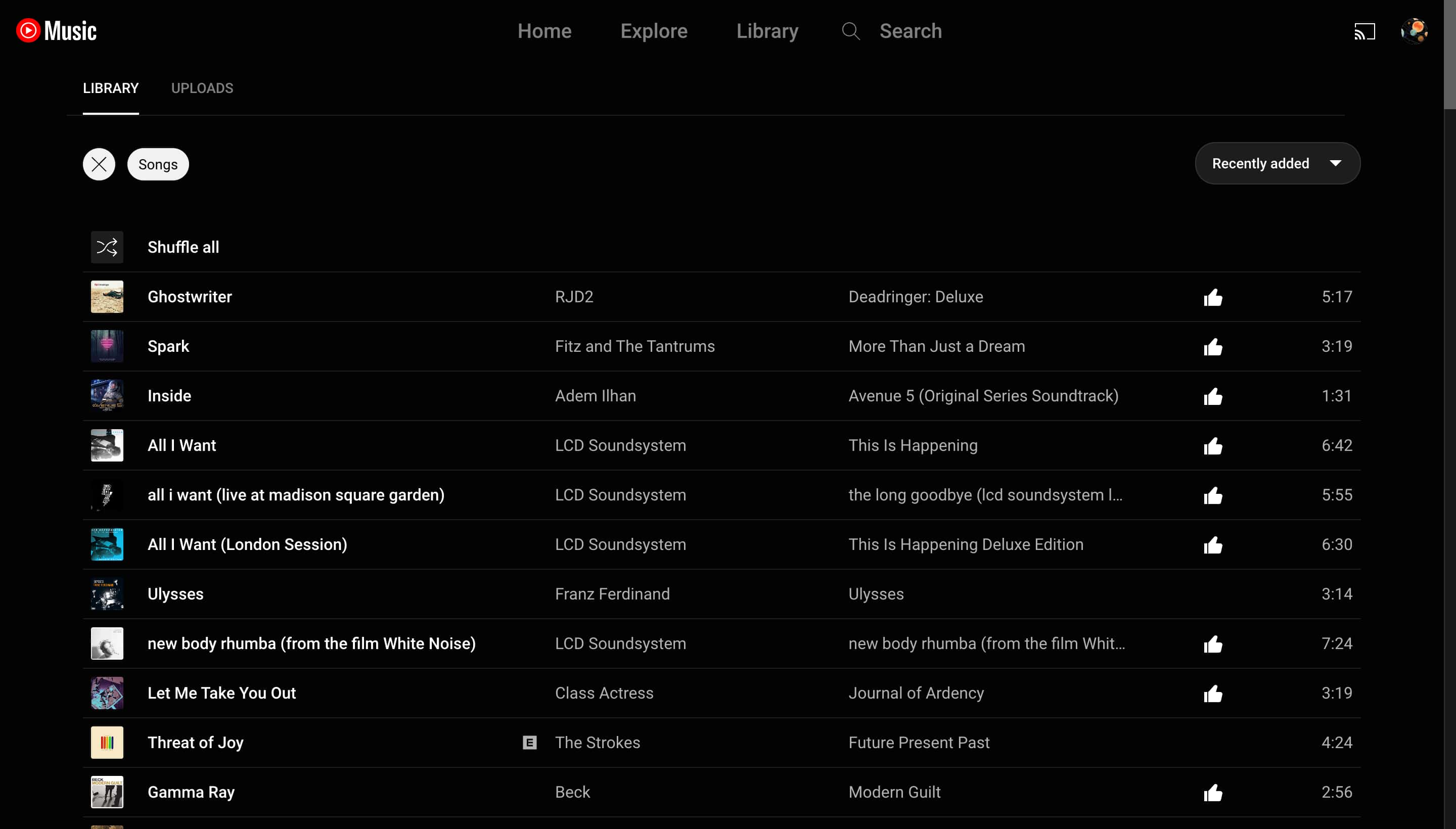
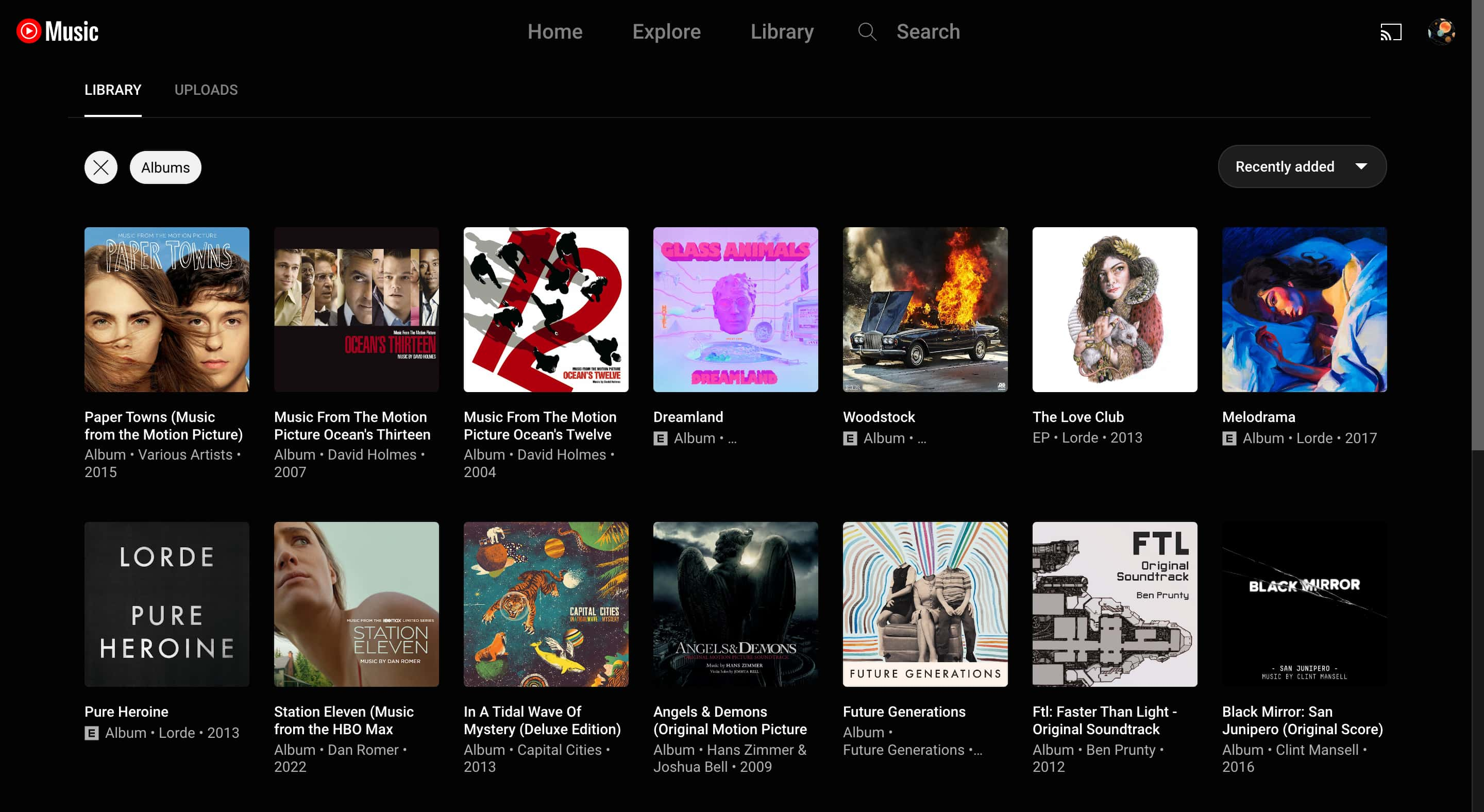
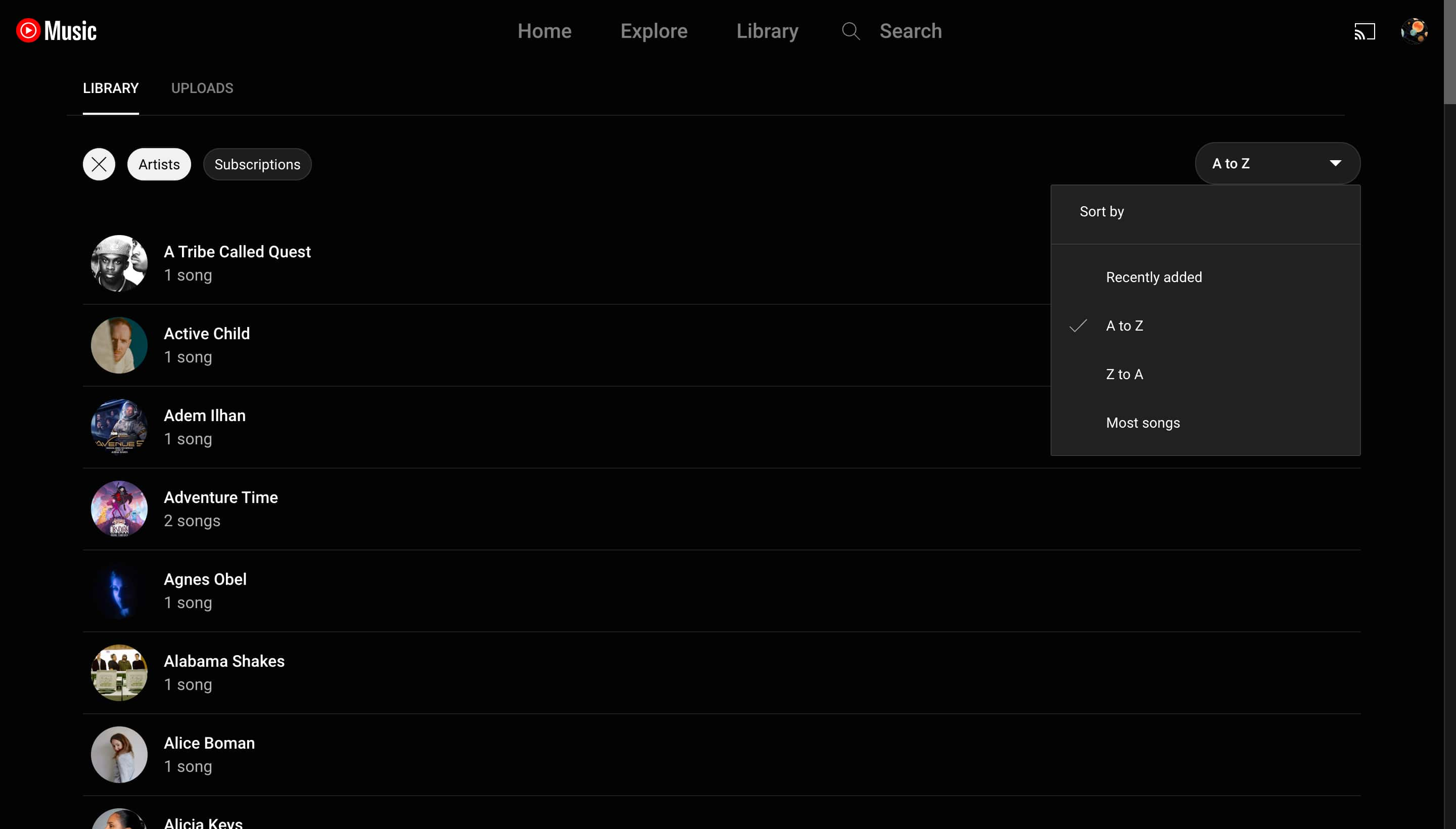
Playlists and Albums stick with the grid view, while everything else switches to a list approach. Opening Artists gives you an additional “Subscriptions” filter. Lastly, you get a “Sort by” filter at the right, including Recent activity, Recently added, or Recently played.
Compared to before, it’s faster to start browsing, though the fullscreen grid of artists, albums, and playlists is slightly overwhelming at first. This UI has remained mostly the same since YouTube Music’s relaunch.
The new Library on Android and iOS is slowly rolling out as of late, but far from widely available. This has been one of the weirder feature rollouts for YouTube Music, as it did seem like there was large-scale availability for a few weeks last year before it was unceremoniously pulled.
It certainly felt feature complete at the time, and there weren’t any pressing bugs. There should have been much better communication on Google’s part. Hopefully, an official launch is coming sooner than later at this point.
Meanwhile, YouTube Music has recently widely rolled out the playlist cards to the main Home feed. These cards show the first few songs of a playlist and are quite nice to interact with. It surprisingly changes the feel of the app and makes everything less siloed.
More on YouTube Music:
- YouTube Music poll lets you vote on what free feature you most want [U]
- YouTube Music tests live lyrics with newer Casting UI
- YouTube Music gets hashtag pages, less repetition in radios, playlist cards, and more
FTC: We use income earning auto affiliate links. More.


Comments