In addition to Material 3 actively rolling out to Drive, Docs, Sheets, and Slides, Google Trends is now the latest first-party website to get a redesign.
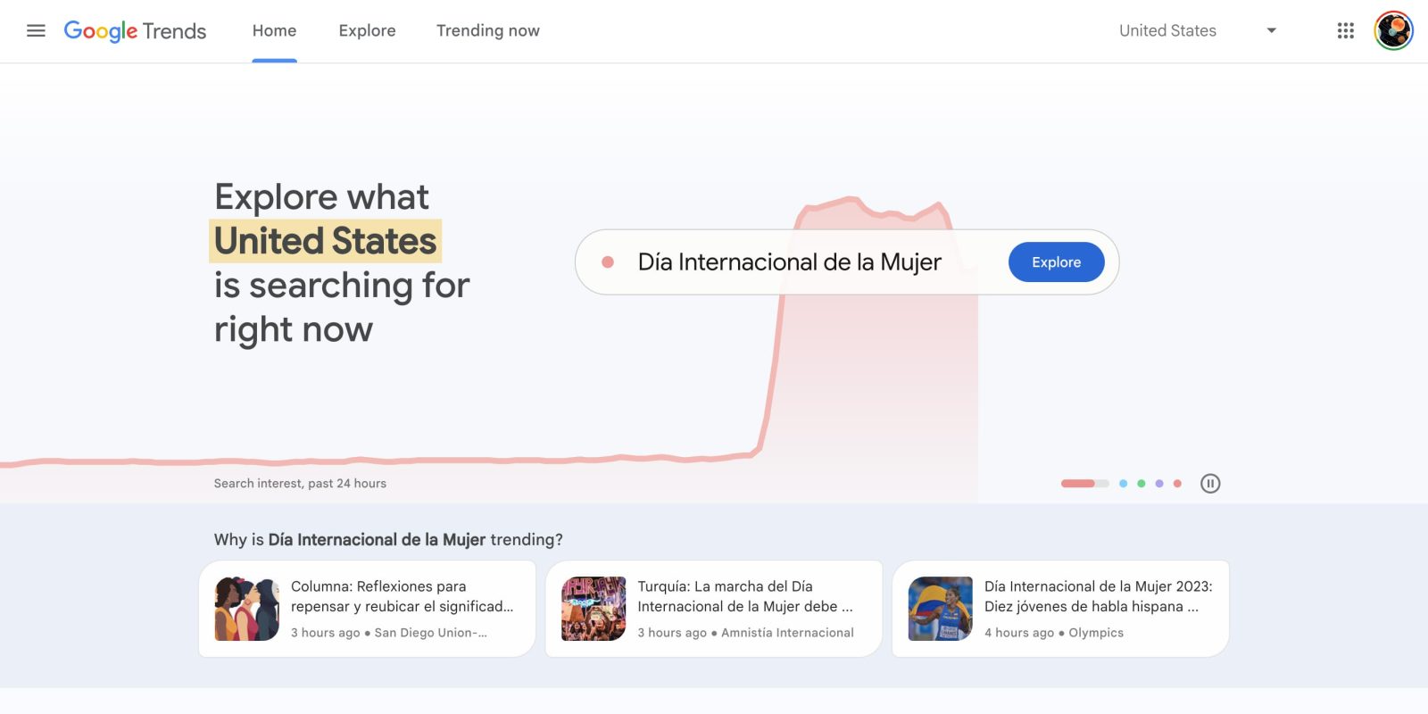
The “new and improved” Google Trends starts on the homepage where you “can now explore real-time trends” that are updated hourly with “links to relevant news articles, so you can learn more about the trending topic.”
Google will also highlight “what’s trending in your local country or region – and sparks your curiosity by sharing trends from around the globe.” The editorial team is also featuring dedicated trends pages.
Another goal of this redesign is prominently linking to getting started tutorials, like Basics, Advanced, and Understanding the data.
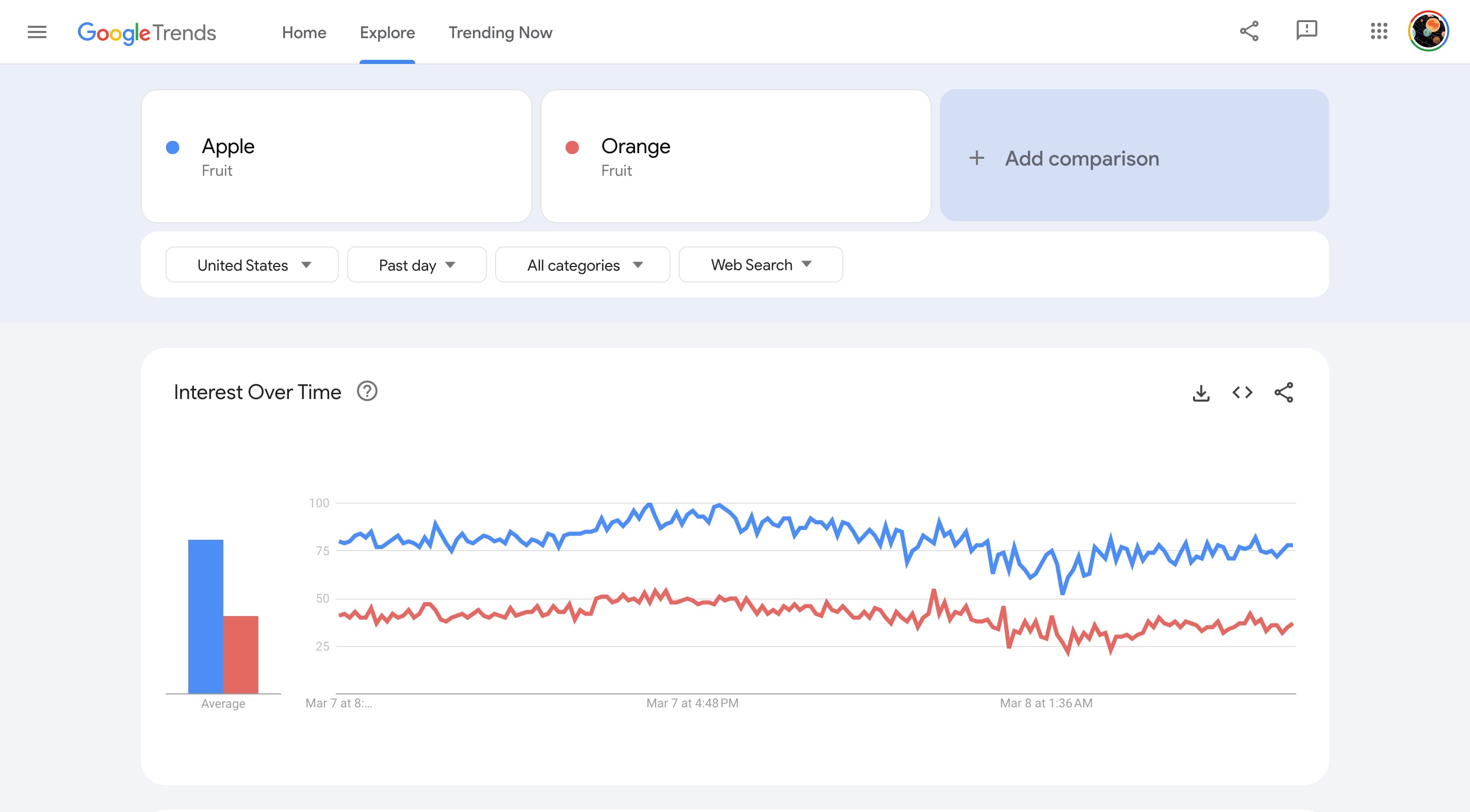
From a visual standpoint, the blue accent color is dropped for a pretty light UI. At the top, you get tabs for Home, Explore, and Trending Now with a country switcher at the right. The hamburger menu makes use of pill-shaped buttons that are aligned with Material 3.
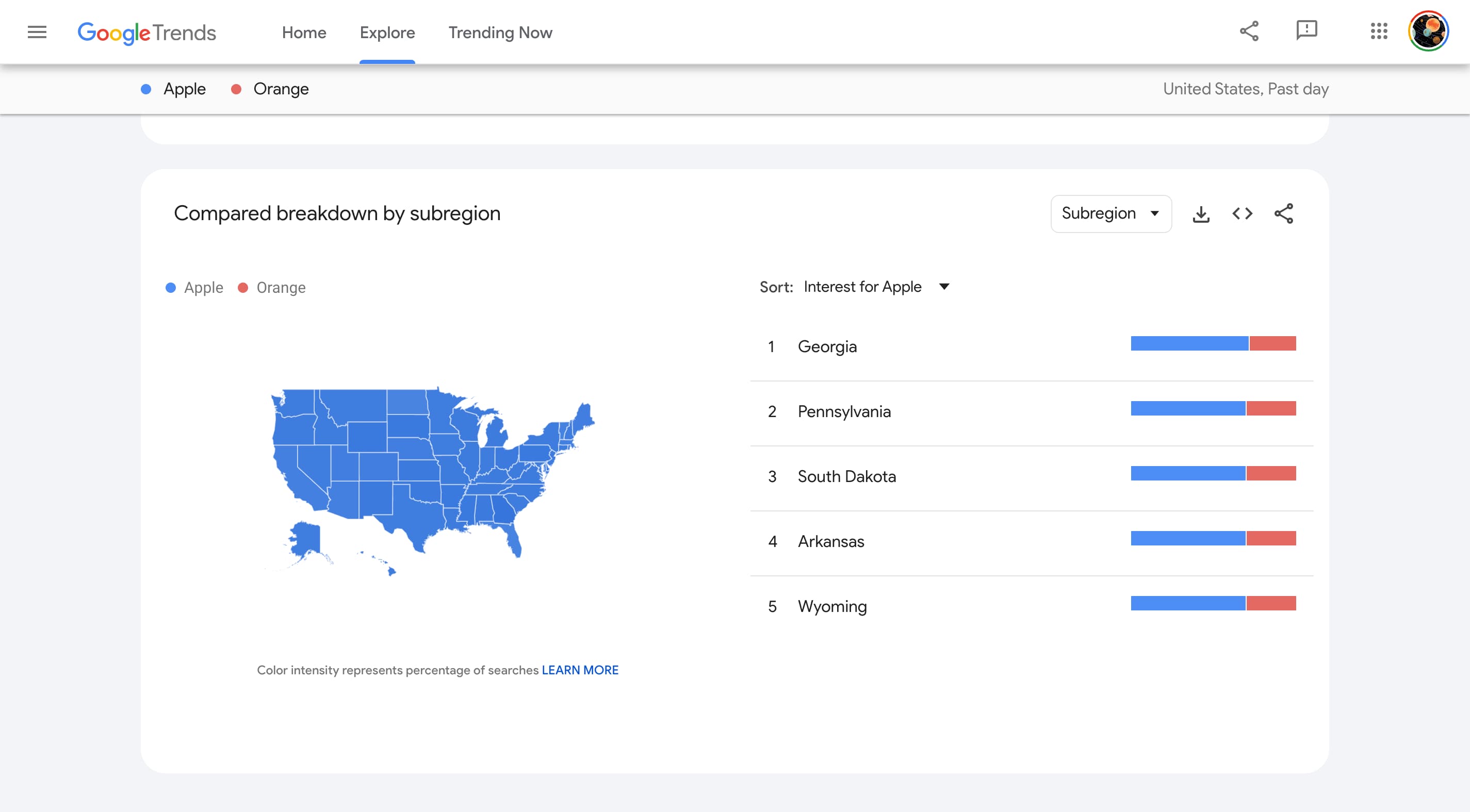
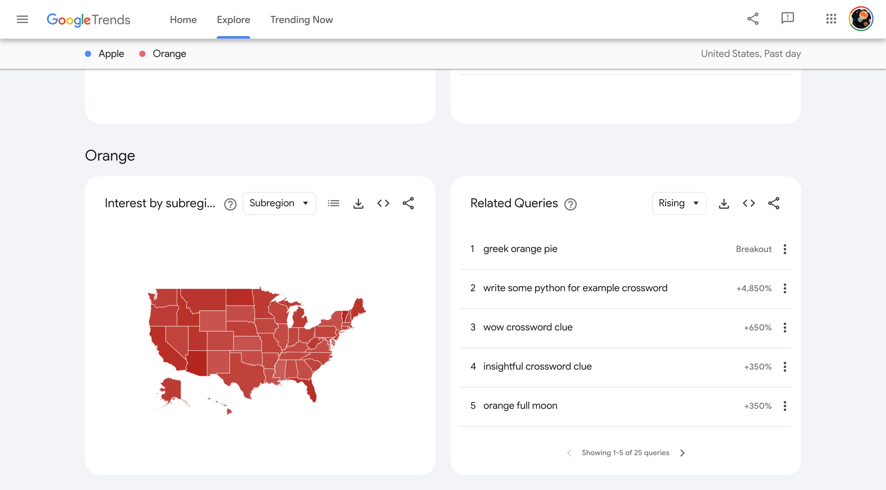
The actual trends page sees the light blue background that’s used when there’s no Dynamic Color, while cards leverage rounded corners
The goal of this Google Trends redesign is to make it “easier than ever to access the breadth of resources we have to offer,” and it’s widely rolled out today.
Google Trends joins the Search Console, Gmail, Drive, and Docs/Sheets/Slides. Otherwise, Google has been slow to bring its latest design language from Android to the web.
FTC: We use income earning auto affiliate links. More.


Comments