In February, Google announced that its expansion of Material You would finally expand to Google Drive and its various tools on the web. Now, that rollout is happening widely.
9to5Google has a rebooted newsletter that highlights the biggest Google stories with added commentary and other tidbits. Sign up here!
The redesign of Google Drive’s web apps with Material You is relatively subtle on the whole, with the home page showing files and folders on a grid of blue tiles. The section of the page with files and folders has a white background, which is swapped for a background with a blue tint along the left side and top. There are also larger header styles and a new look for the “New” creation button at the top left of the interface that’s similar to a floating action button (FAB) common on Android and other Google apps.
Notably, Google’s original reveal of this redesign showed new buttons to filter files by type and changing the sorting, but those are not showing on any of our accounts just yet.
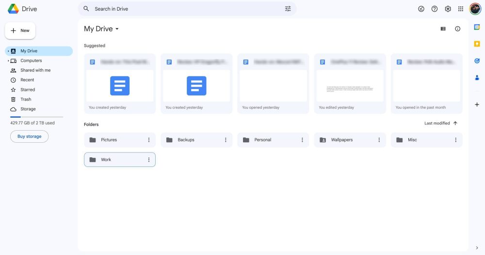
The redesign here appears to be rolling out widely as of the past few days, but has been appearing for some users for a little over a week now.
Notably, this follows Google’s rollout of Material You to Drive apps, such as Docs, Sheets, and Slides. Our Kyle Bradshaw first reported on that rollout earlier this month, and those redesigns also seem to be more widely available at this point to both Workspace and standard Google Drive users.
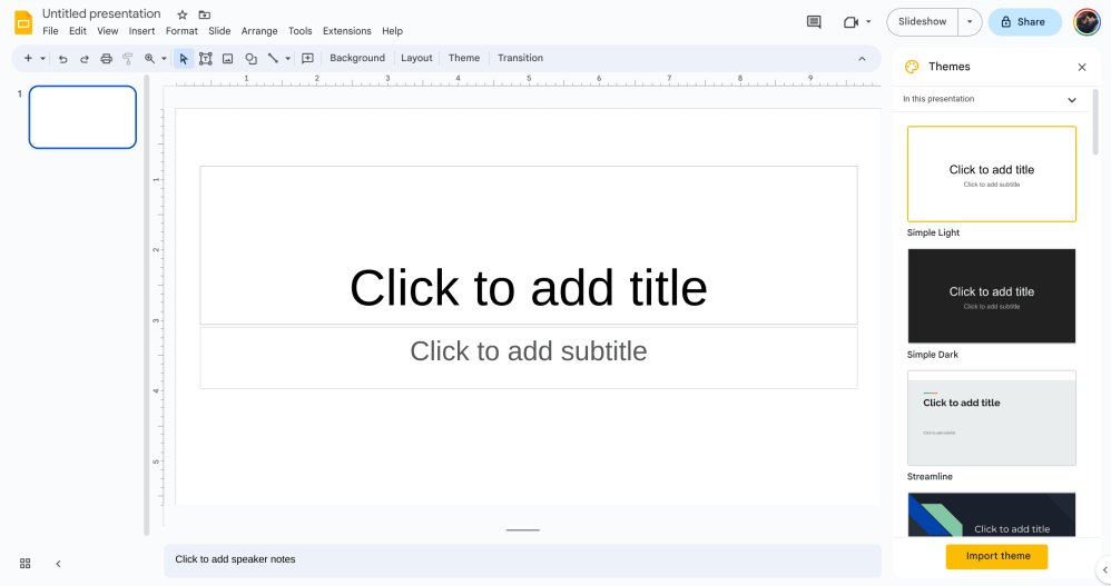
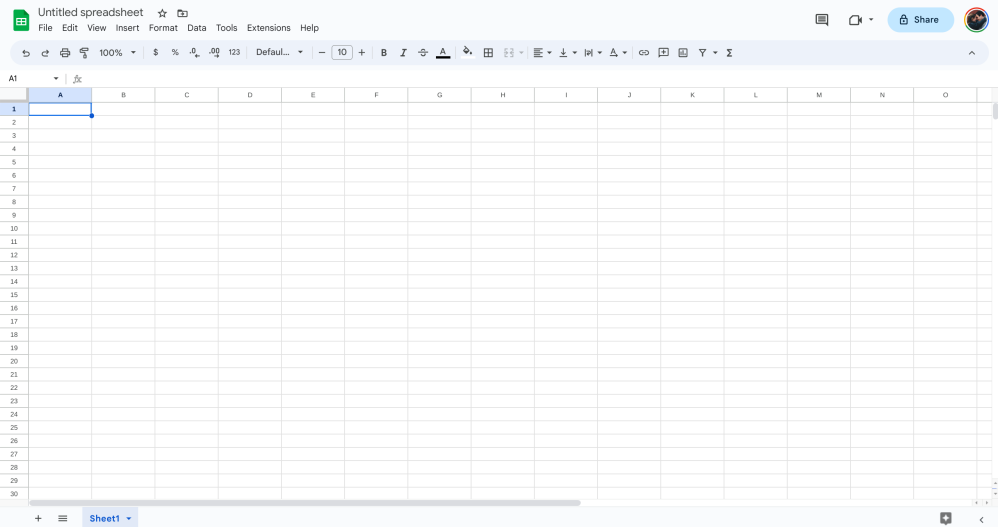
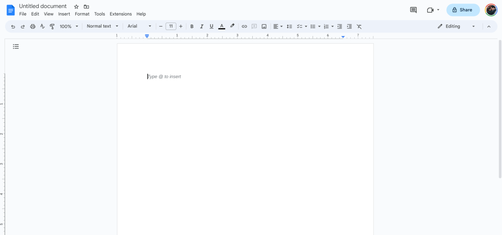
Google originally said the rollout would occur over the “coming weeks.”
More on Google Drive:
- Google Drive adding PDF annotation with stylus or finger on Android
- Gmail, Google Docs, and more are getting ChatGPT-like generative AI features
- Google Drive for Android rolling out PDF drawing and highlighting
FTC: We use income earning auto affiliate links. More.


Comments