The last major update to Pixel Recorder in December introduced Speaker Labels, and Google has since refreshed the website with some quirky Material You tweaks.
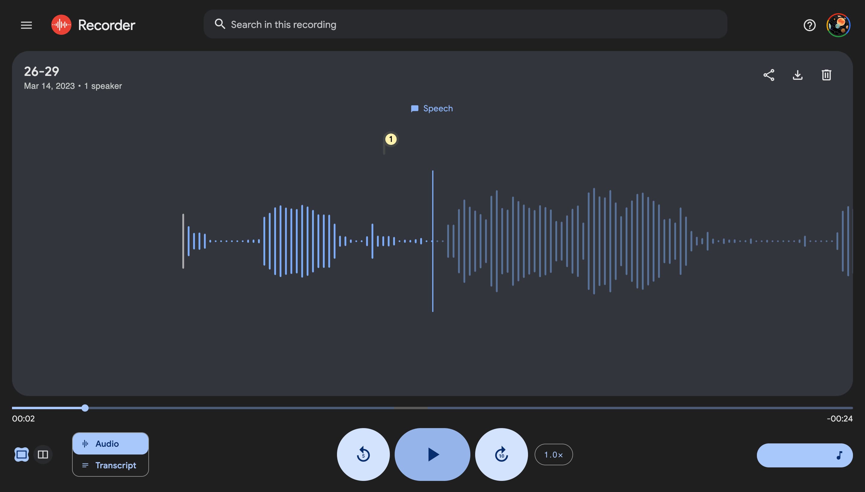
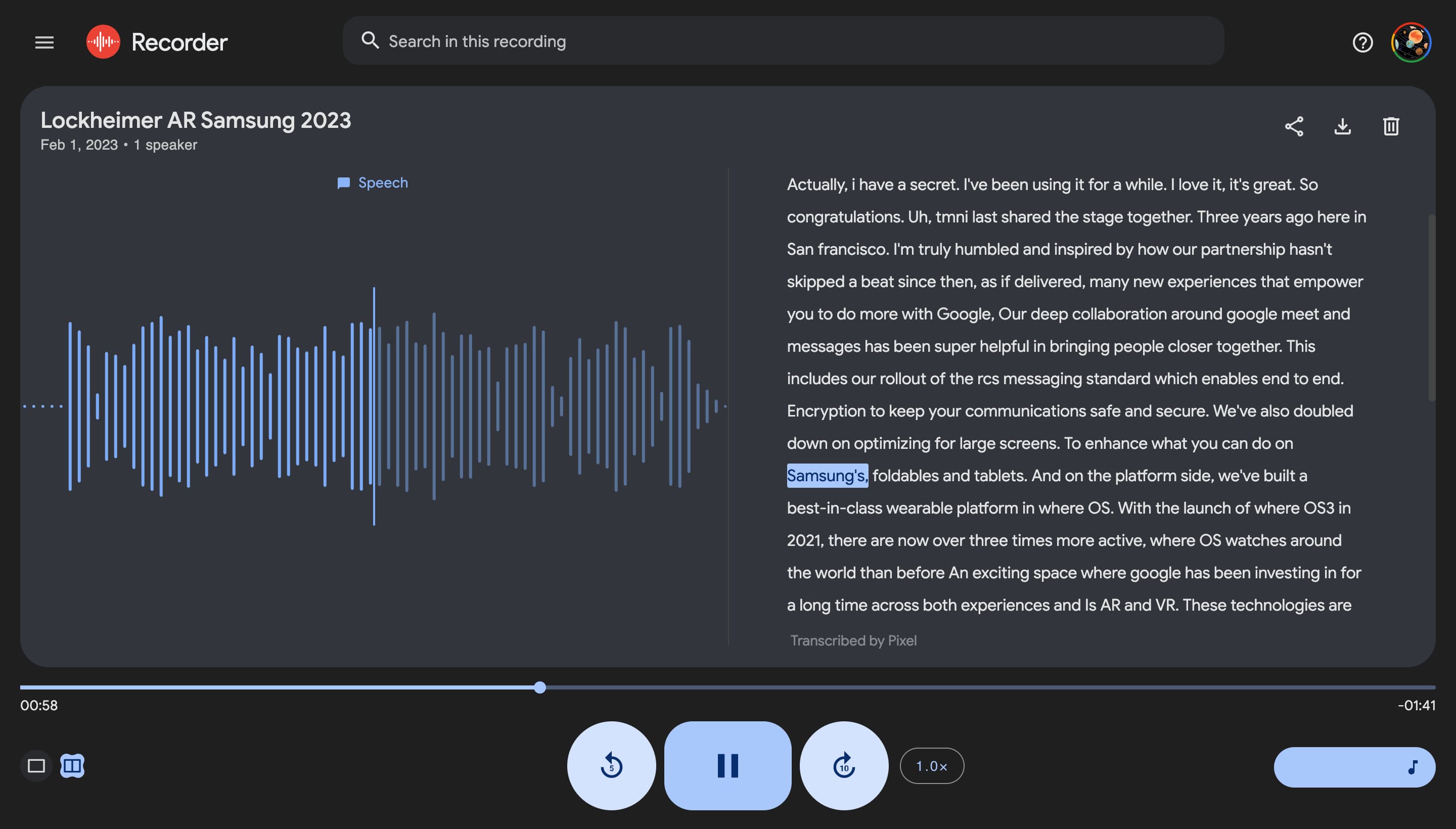
The changes to recorder.google.com start with the bottom row of controls. The play button is a pill, while pause is a rounded rectangle complete with an animation when moving between states. This is flanked by 5-second rewind and 10-second forward in circles, just like the Android app.
You can switch between the single and dual-pane views at the left. Material You’s flower – a “clover” officially – shape is leveraged here with “Audio” and “Transcript” appearing as a toggle. At the right, you get playback speed and a volume slider that’s right at home on Android 12/13.
Meanwhile, the audio waveform/transcript is housed in a light blue container, which is the accent color used throughout. This more expansive use of color livens up the app, which was quite muted and serious before.
Pixel Recorder joins Gmail, Drive, Docs/Sheets/Slides, and Trends as one of the few Google web apps with a Material You redesign.
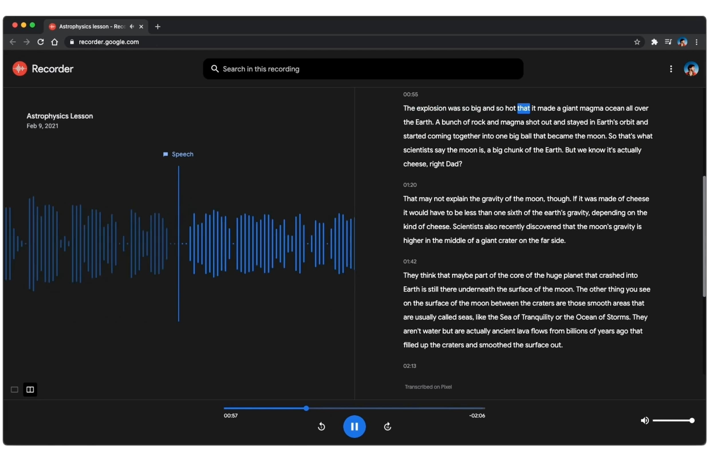
Old vs. new
More on Material You:
- Google Play switches from tall to short Material You bottom bar
- Google Contacts rolling out two new Material You widgets
- Google Translate for iPhone gets Material You redesign, Lock Screen widgets
FTC: We use income earning auto affiliate links. More.


Comments