In recent weeks, the Android 14 Beta has steadily tweaked the share sheet to look cleaner and show more options.
Despite being a central component of Android, the share sheet has long been one of the weaker points of Google’s mobile operating system. The share sheet has gone through numerous iterations over the years, each one aiming to make it faster or better in some way, though sharing on Android still remains surprisingly slow.
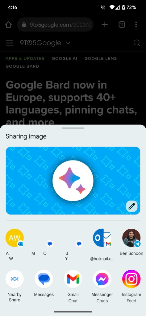
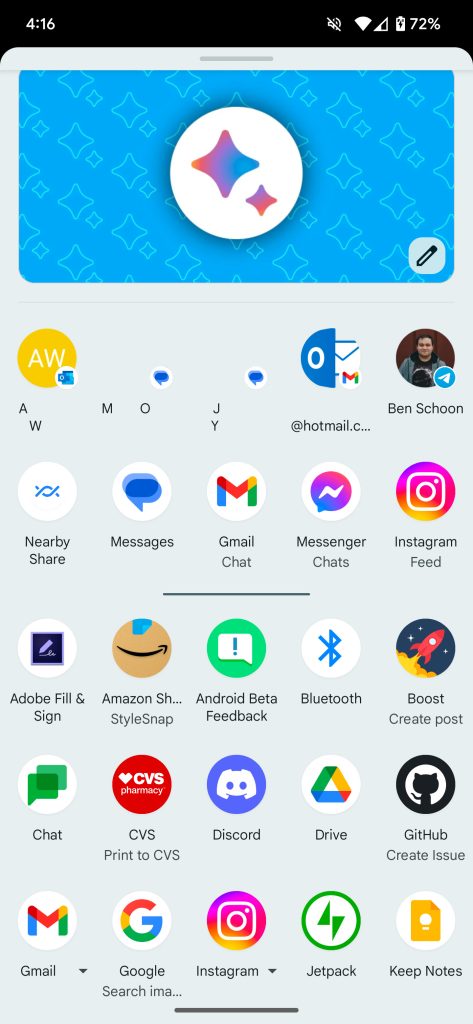
Over the course of the Android 14 Beta, Google has made some changes to the share sheet. One more noticeable change, arriving with Beta 3, is that the share sheet is now five icons wide (up from four) on typical phones. This makes more options visible on screen at a time and is a shift toward more density rather than the extra blank space that some Material You designs have opted to take. As always, you can scroll the sheet to view the full list of available share targets.
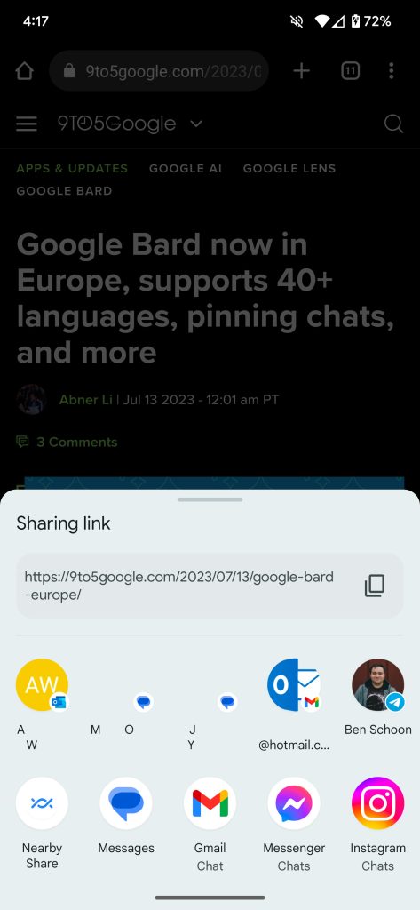
Meanwhile, another tweak arrived with this week’s Android 14 Beta 4 release. The sheet now also includes a title that explains what you’d actually be doing. For example, if you choose to share a website from Chrome, you’ll see “Sharing a link” with the actual URL below it.


If you’re sharing any text, a shortcut to copy it to your clipboard will appear on the right-hand side. Similarly, when sharing an image, you’ll be offered an option (pencil icon) to first edit it in Markup.
More on Android 14:
- Here’s everything new in Android 14 Beta 4 [Gallery]
- Android 14 easter egg blasts off with space-themed minigame [Gallery]
- How to install the Android 14 Beta on Google Pixel
FTC: We use income earning auto affiliate links. More.


Comments