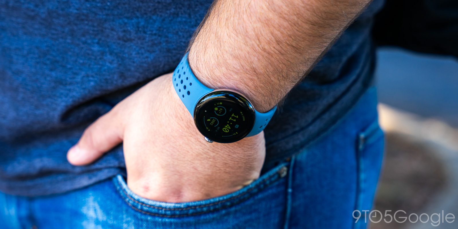
The Pixel Watch was, in my eyes, better than I expected it to be. But, ultimately, it was still far from being as good as the competition. With the Pixel Watch 2, Google hasn’t gone back to the drawing board, but a collection of small tweaks add up to a much better overall product.
Why an initial review?
Like other media outlets, 9to5Google was given six days to review the Pixel Watch 2 ahead of today’s embargo. As such, we’ve opted to hold a finalized verdict until we’ve spent more time with the smartwatch, especially in the context of its fitness features and battery life. Stay tuned for more in the weeks to come, and please leave comments for any questions you might still have!
Table of contents
Hardware & display
The same, but different
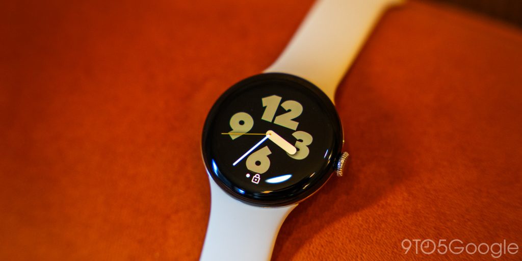
At a glance and on the wrist, the Pixel Watch 2 is virtually identical to the original model. And, in my eyes, that’s not a bad thing. Google is taking a truly beautiful timepiece design and just making it better.
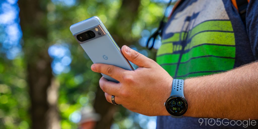
On a hardware level, that starts with the chassis itself. The stainless steel is replaced with aluminum, which is less premium on paper. However, visually, I can’t tell the difference, and it feels no different on the wrist. The only way you’d be able to tell is that aluminum has much less heft. I think that’s an overall win for the feel, especially given the health focus. But, at the same time, I wish there had been a choice. I would have loved a “Pro” with stainless steel and maybe a different size, but it’s good as-is.
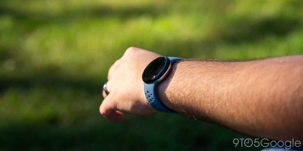
That’s my opinion at least. Our editor-in-chief Abner Li says that it feels cheaper because it’s too light now, and the different feels notable when you put it on your wrist. So, really, this comes down to a a matter of preference.
My only request would be, given we’re dropping stainless steel, to maybe also ditch the polished look for the silver model. It’s a little much, and a sandblasted look would be pretty sweet.
A great display that you’ll either love or hate
Also unchanged is the display size, much to the dismay of some folks. The 1.2-inch OLED panel is still quite tiny by modern smartwatch standards and is still surrounded by a very thick bezel. As I said last year, I think the bezel disappears in normal use, and I don’t mind it even a little bit. In the current design, I think having a much smaller bezel might actually be a negative as it would require the display to curve.
The display is upgraded, though. It’s now brighter, and I certainly did notice that in outdoor use.
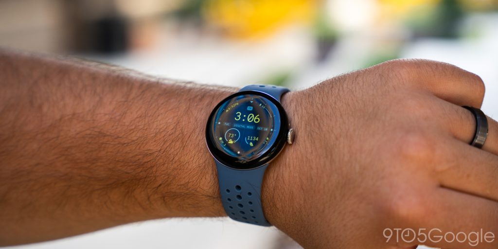
Something that the updated panel didn’t fix, though, is the image retention when using the always-on display. It’s very subtle and not a problem, but I am surprised Google didn’t solve this.
But, ultimately, you’re either going to love this display or hate it. Some folks will inevitably hate the bezels or the lack of a bigger size option. I’ve grown to love this smaller size, even as someone who used to exclusively wear big watches, but I get it. Google needs to make a bigger size for Pixel Watch 3 but somehow manage to do that while keeping the same band mechanism, too.
We need repair options
With my first Pixel Watch, breaking the device was something I was regularly worried about. From day one, it was abundantly clear that repair options were virtually non-existent, and Google made that explicit later on. I ended up scratching the watch heavily on a vacation and would have much rather just eaten the cost of repairing the screen than struggling to keep a screen protector installed (which had to be replaced on multiple occasions).
Pixel Watch 2, it seems, also won’t have any repair options, at least at launch. There is a new insurance policy with replacements, but it’d be really nice with Google’s whole DIY repair push for Pixel phones if I could just replace the display as needed.
The band situation has been largely resolved
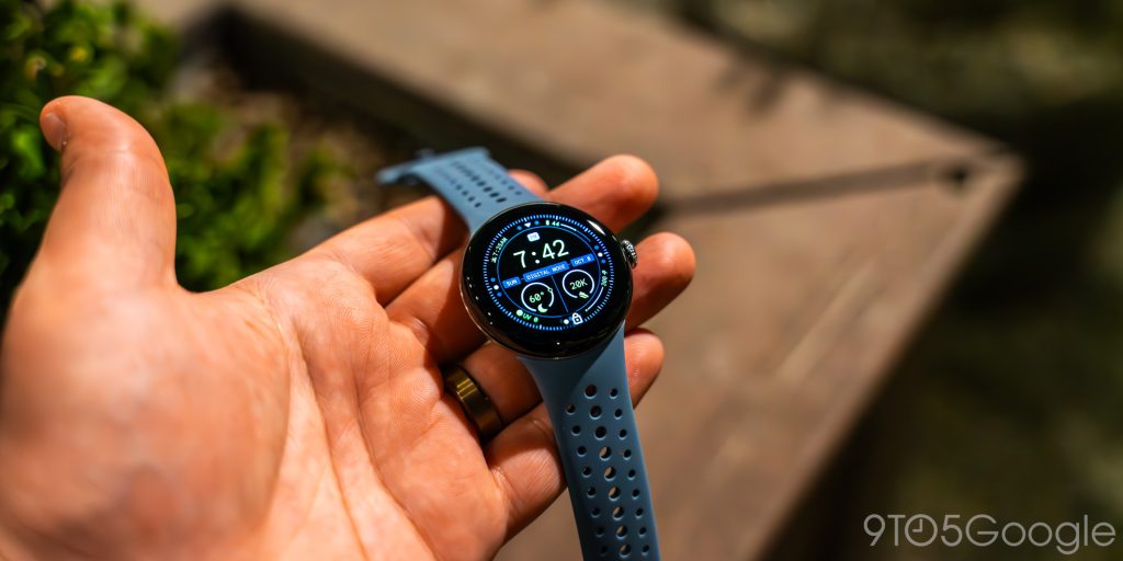
Like the first Pixel Watch, the sequel has a proprietary band mechanism. This turned out to not be a big deal – Google’s first-party bands were quite good, and third-party options didn’t take too long to hit the market. But still, it was a bit of a struggle for a little while, especially for those of us who simply wanted a brown leather band.
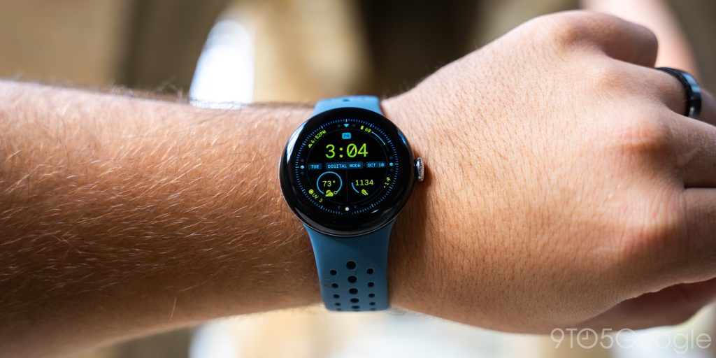
At the time of the launch of Pixel Watch 2, this entire “problem” has largely been resolved. Google continues to expand its own lineup of bands – I’m loving all of the blue hues this year – and there are hundreds of third-party options that are easy to find, often of decent quality, and quite affordable, too.
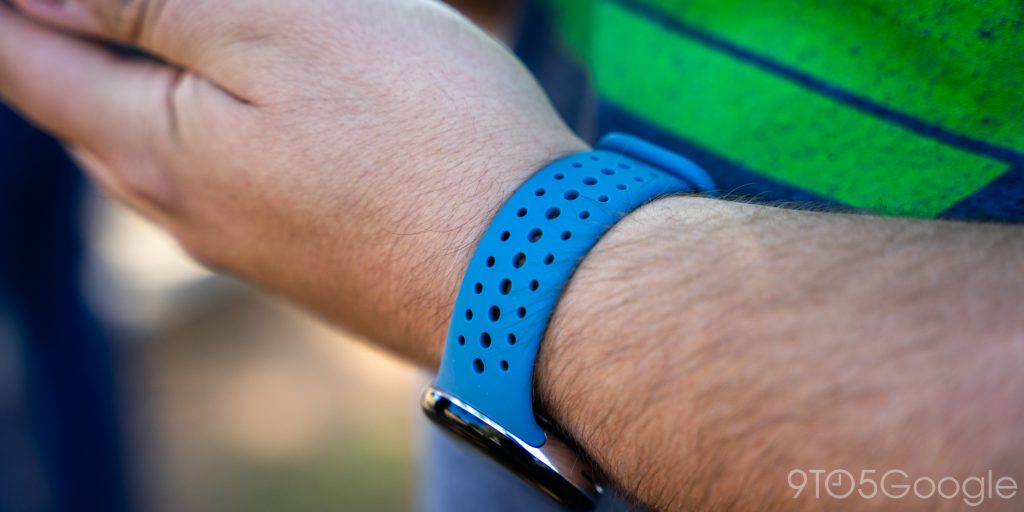
I spent most of my time with the new Active Sport band in “Moondust” blue, which is a great color and a great band. It’s super light, very comfortable, and a pleasure to wear at all times.
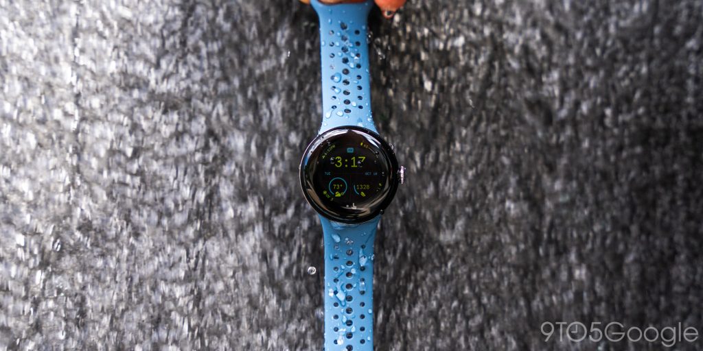
Something interesting, though, is the connector. Google seems to have tightened things up this year, which leads to bands sitting more snugly but also making them slightly harder to remove. I swap my bands a lot, so I’m hoping this will loosen up just a tad over the weeks to come.
Drastically better haptics & crown
Perhaps the single biggest year-over-year update in Pixel Watch 2 comes from the haptics and the crown. The first is something quick and simple to talk about. Google has dialed up the motor to be stronger, and you feel it throughout the software and when notifications arrive. It’s a welcome upgrade.
Beyond that, the crown is also upgraded, mostly for better, slightly for worse. The mechanism is now much smoother when scrolling, which feels wonderful. It’s overall an absolute win, as the prior model felt a bit gritty at times when scrolling. It remains to be seen how this will age, but it immediately feels better than the first one ever did. The software also better uses the crown, with inertial scrolling found throughout Wear OS 4. It’s a big upgrade, especially if you’re trying to run through the app drawer.
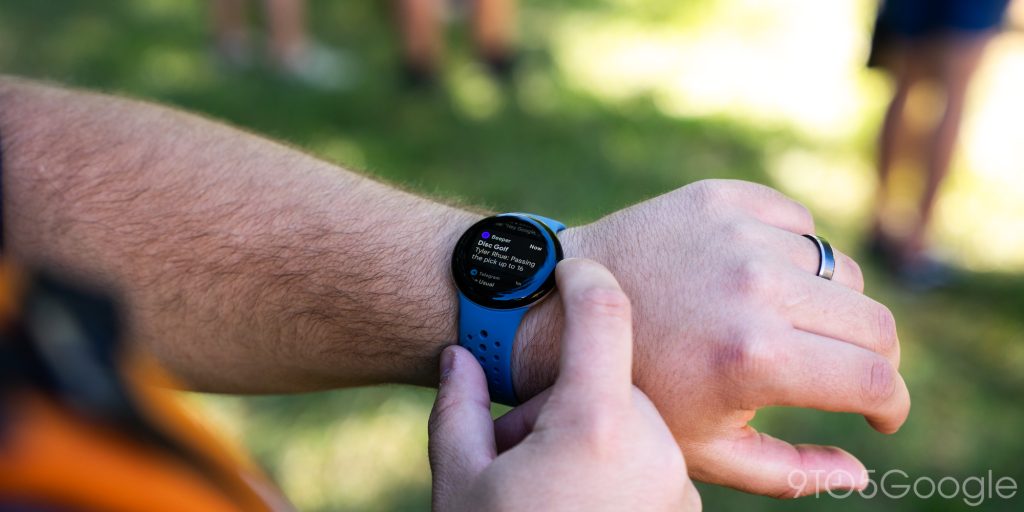
The only downside to this new crown is that it isn’t as immediately responsive compared to the first model. This is especially apparent from the watch face, where there’s a slight delay when moving into the quick settings or notifications. It almost feels like the tolerance for the crown scrolling is just higher, likely because the smoother feel makes you more likely spin the crown unintentionally.
Software & performance
Not reinventing the wheel, just smoothing the bumps
Wear OS 4 on the Google Pixel Watch 2 is not really breaking new ground. Largely, the software feels the same as it did on the first Pixel Watch, which is to say that it’s fast, fluid, and overall a pleasure to use.
New changes this year are, for the most part, pretty minimal.
There are lots of new apps on Wear OS at this point, and many existing releases just keep getting better. Over the past few weeks alone, we’ve seen new releases such as Audible and Pocket Casts, as well as Gmail and Calendar apps from Google. The added boost of Samsung in the Wear OS ecosystem has really gone a long way to close the app gap, and it’s something that Pixel Watch 2 customers will directly benefit from.
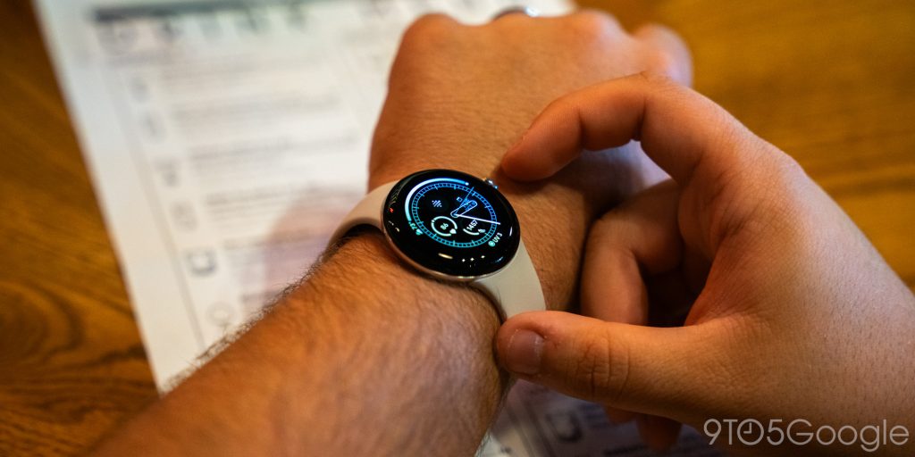
Some other things that Google has done to improve the software experience lie behind the scenes. For instance, the new Pixel Watch app is improved and supports syncing Do Not Disturb and Bedtime modes, and the Fitbit app has gotten way better at transitioning to a new device (it still only supports one at a time). Wear OS 4 also introduces the ability to transfer your watch to a new phone instead of resetting it – something I’ve not yet tried in the few days I’ve had the watch, but I am quite excited to check out.
Overall, Wear OS just feels more mature on the Pixel Watch 2 and less rough around the edges.
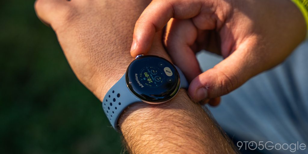
Google has also expanded its selection of watch faces with a few new options, with the big highlight being the addition of “arc” complications. These sit around the edges of the watch face and can show data such as steps, battery, weather, and more. These are really well done and can help create some very info-dense faces. I’m typically in favor of very simple watch faces, but these have absolutely piqued my interest.
Qualcomm’s latest chip leaves the Pixel Watch 2 running fast
Something that also helps the software experience is the performance, which has been dialed up quite a bit. The Snapdragon W5 Gen 1 is a speedy, 4 nm chip that is four years newer than the chip found in the Pixel Watch 1. Of course, with smartwatches mostly being used for simple tasks, this won’t present itself through things like games or whatever.
Rather, the new chip shows its strength in just general use. The first Pixel Watch wasn’t exactly slow or laggy most of the time (occasionally in heavy load situations and the exercise UI), but the sequel is smooth and speedy throughout, and a noticeable improvement. I’ve not noticed any hiccups in scrolling or moving through apps, which is unprecedented for me on a smartwatch. I think Qualcomm’s chip paired with Google’s experience really speaks for itself, as not even the TicWatch Pro 5 I used earlier this year could match the same level of smoothness.
Fitness & health
This is a real Fitbit now
Health tracking is perhaps the most important part of modern smartwatches because the fundamentals are hard to screw up at this point.
To accomplish that goal, Google scooped up Fitbit a few years ago for over a billion dollars, but it has taken until the Pixel Watch 2 for that purchase to really feel like it’s stuck the landing. The first Pixel Watch was packed with Fitbit tracking, but it also felt shoehorned in and trailed behind the dedicated Fitbit smartwatches out there. The Pixel Watch 2, thanks to adding new sensors, lives up to the Fitbit legacy – it’s a real Fitbit now.
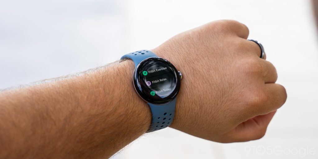
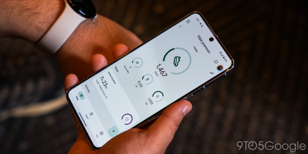
The core of the Fitbit experience is in general health tracking. Heart rate, sleep, steps, and more will all track by default and do so passively as you wear the watch. It works like a charm but won’t feel very different from the first version in general use. My results on heart rate have been perfectly in line with the first model in terms of passive activity tracking. I’ll call that a win, as the first Pixel Watch was really good at that job.
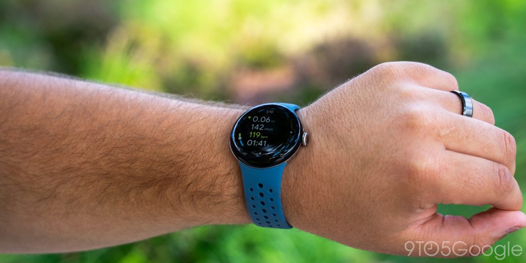
On the Pixel Watch 2, the new heart rate sensor is said to be 40% more accurate, and that’s largely visible during workouts. Frankly, I’ve not exactly had time for proper workouts in the six days Google gave us with the Pixel Watch 2 – after all, I’ve got to sit at a desk to actually write these reviews – but I have really enjoyed diving into the new workout UI a bit more. I think the new interface is much easier to understand at a glance, with it showing your heart rate on a vertical scale rather than just the number. It’s an easy way to get a sense of how intense your activity level is. I also think target heart rate zones are going to be super useful for me in the coming months as I try to up my workout schedule.
Auto-start/stop for workouts is also in place this year, but it didn’t trigger for me with a generic workout (used for a round of disc golf). I’d assume it works better for more specific workouts, like walks, runs, etc. More to come on that in time.
The other big new addition is stress tracking, which uses a cEDA sensor on the bottom of the Pixel Watch 2. This can detect microscopic amounts of sweat on your wrist, which is a sign of the body undergoing stress. When this is detected, a pop-up appears asking you to log your mood, which can help give you further insights over time as to what might cause your stress. But, ignoring the insights, I just find it helpful as it gives me a second to reflect whenever I am feeling stressed, because, as the Fitbit Sense/Sense 2 also did with the same sensor, this thing is scary-accurate at knowing when I feel stressed.
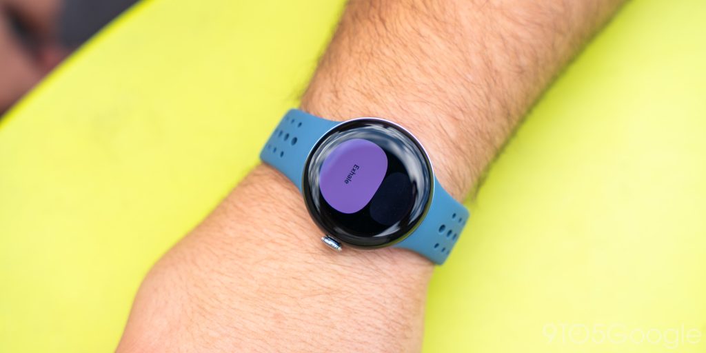
Another useful stress-related feature is the new “Fitbit Relax” app which is a guided breathing session to help you calm down. This can be as short as a minute or as long as 15, but a delightfully simple UI and the use of the watch’s haptic motors make this a really effective way to focus on your breathing and tune out the world for a moment.
My main complaint is that stress tracking isn’t enabled by default. Rather, you need to dive into the Fitbit app to manually enable it, something I forgot to do the first couple of days.
Fitness tracking can be simple
For me, the biggest thing I love about the Pixel Watch 2’s (and by extension Fitbit’s) approach to fitness tracking is that it’s just simple.
I really couldn’t care less about getting every little detail out of a workout. I just want to know basic trends that I can use to learn more about what works for me. I want to know if my resting heart rate is going up. I want to know how I’m sleeping. And I want some basic guidance on workouts to help me improve my overall health, like seeing if my heart rate is in a zone that’s actually going to do some good.
I’ve always found Garmin, as just one example, and similar brands out there to be overwhelming. I just want to get more active, lose some weight, and be healthier. Fitbit helps me do that, and given the success of the brand before Google bought it out, I’m not alone there.
Of course, I’d love to see Fitbit offer the more in-depth stats that so many folks are looking for. The Apple Watch seems to strike a good balance between the two approaches. But, on the whole, I strongly feel that Fitbit does more than enough and does it in a way that’s encouraging instead of overwhelming.
Battery life
The biggest problem is largely fixed
Ok. Let’s talk battery life.
The Pixel Watch suffered from poor battery life that even with always-on display turned off could barely last a full day. The Pixel Watch 2, thanks to the new Snapdragon W5 chip under the hood, manages to effectively double the battery life, give or take.
Most of my testing over the past six days has been with the always-on display turned on, and I’ve been seeing around 18 or so hours of endurance on a charge. Starting the day with a 95% charge around 8:30 or 9:00 a.m., I’ve been ending the day around 35% by 11 p.m. That includes hundreds of notifications and passive fitness tracking. In my book, that’s totally passable, as a 20-minute charge before bed meant there was plenty of juice left to handle sleep tracking overnight.
With always-on display turned off, my unpopular preference, that total quickly rises. I’m still testing the endurance as this review goes live, but day one saw the battery drain very slowly, with over 75% left after about seven hours. It’s a good sign.
Pixel Watch 2 battery life is still not great, especially by comparison to the Galaxy Watch 6 series, but it’s no longer bad.
The new charger is both good and bad
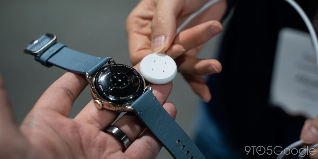
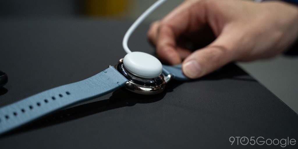
There’s also a new charger in place on Pixel Watch 2. Wireless charging is ditched for contact-based pins. Four small pins charge the watch with Google claiming up to 50% in 30 minutes, and 100% in 75 minutes. Charging certainly feels faster compared to the original while in the lower percentages but tapers off as the battery fills up. It also feels a little faster than Google’s estimates, at least anecdotally.
I think that the switch is overall a positive, as the contact-based charging largely eliminates heat while charging, and the new charger has a stronger connection with better magnets. The only downside, at least in my eyes, is that you now have to deal with alignment. You can’t just hover the watch over the puck to start charging. It has to be in the right position, which is a little annoying.
Again, the new charger is an overall win, especially given it means you can take advantage of existing Fitbit Sense/Versa accessories. It is a bit of a headache for existing Pixel Watch owners, though, as upgraders now lose their spare chargers and any other accessories.
Tidbits
Safety features
One of the big new focuses of the Pixel Watch 2 is safety, and the features Google is bringing to the table are genuinely really cool.
Safety Check, for instance, lets you share your real-time location with selected contacts if you don’t check in at the end of a timer. Your contacts are notified when this starts but won’t get your real-time location until the timer goes off. It’s a really neat addition and one I can see myself using on public transit when on trips, just as one example. When the timer enters its last minute, it will ring on your wrist (vibration only) to remind you that it’s time to check-in, and it will start sharing if you don’t respond.
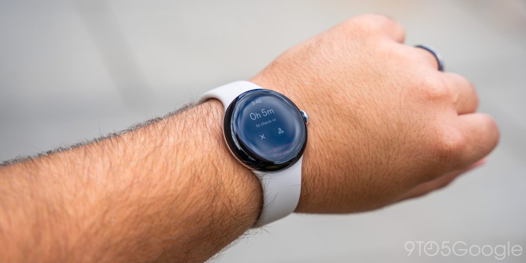
Emergency services also remain just a few clicks away, with a few consecutive clicks of the crown starting a call to 911. You can also input your medical information and any concerns in a menu that’s easily accessible via the power menu. Google also now offers a little loop that tells responders how to access this information in the case you’re found incapacitated.
This isn’t something I’ve really had much of a chance to test over the past few days, but in playing around with the feature, I’m really digging Google’s implementation. I do just wish that, like calling emergency services, there was a faster way to jump into Safety Check. As it stands right now, you have to go through the Personal Safety app and tap a couple of other options to actually start the timer.
LTE
LTE on smartwatches remains something you either know you need or don’t care about. I’ve fallen into the latter camp for the past year, as I was perfectly happy with a Bluetooth-only Pixel Watch. But on the Pixel Watch 2, LTE is more compelling as you get access to safety features over LTE bundled into the cost of Fitbit Premium (you also get six months free). I think that might be worth the cost of entry on its own for some folks, especially given it means you almost always have 911 strapped to your wrist. This does need to be turned on after setup, though, via the Safety app.
The Active Sport band
As mentioned earlier, Google is debuting a new first-party band style this year in the “Active Sport” band. It switches from fluoroelastomer to silicone, and the Active Sport band is easily the most comfortable silicone band I’ve ever worn. Google hasn’t published weight specs, but it feels roughly half as heavy as the default Active band, which makes this a perfect choice for, well, being active and playing sports. I’ve been wearing it almost full-time over the past several days, and it’s been super comfortable, and the “Moondust” color is a solid middle ground between blue and grey, too.
It’s not cheap at $50, but I think it’s a great option.
The verdict, so far
The Pixel Watch 2 is the best smartwatch you can get on Android, at least for me. But that’s the thing about smartwatches, they’re incredibly personal. Some people want every little tiny detail of their workout. Some want a really big screen. Some want to avoid charging for several days at a time. It really all depends on what matters most to you.
Top comment by bambobo
Curious that turning off AOD increased battery life as usually the tilt-to-wake feature is the bigger battery consumer-- at least on the previous watch. Maybe that feature uses a low-power core now or handles the wake response differently? Would love a deep dive post on that alone: battery life with AOD versus with tilt-to-wake versus with both off.
But if you want simple and easy health tracking, wide support for apps, clean and fast software, and a day’s worth of battery, I think you’ll be super happy with the Pixel Watch 2.
And if you’re upgrading from the original Pixel Watch (a jump that I feel is worthwhile if you can score a trade-in), you’ll be getting a much better version of the watch you’ve already been enjoying.
Pixel Watch 2 starts at $349 for the Bluetooth/Wi-Fi version and $399 for the LTE model.
Where to buy Pixel Watch 2
- Google Store (Trade-ins available for Fitbit, Pixel Watch, etc)
- Best Buy (Up to $360 in trade-in)
- Amazon
Andrew Romero and Abner Li contributed to this review.
FTC: We use income earning auto affiliate links. More.


Comments