
Ahead of this year’s expected arrival of Wear OS 5, Google is finally preparing to launch Material You color theming alongside a hint at a redesign for the app launcher.
About APK Insight: In this “APK Insight” post, we’ve decompiled the latest version of an application that Google uploaded to the Play Store. When we decompile these files (called APKs, in the case of Android apps), we’re able to see various lines of code within that hint at possible future features. Keep in mind that Google may or may not ever ship these features, and our interpretation of what they are may be imperfect. We’ll try to enable those that are closer to being finished, however, to show you how they’ll look in the case that they do ship. With that in mind, read on.
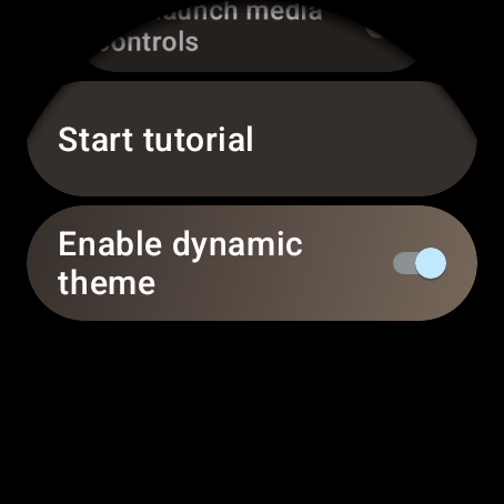
Dynamic color for wearables nears launch
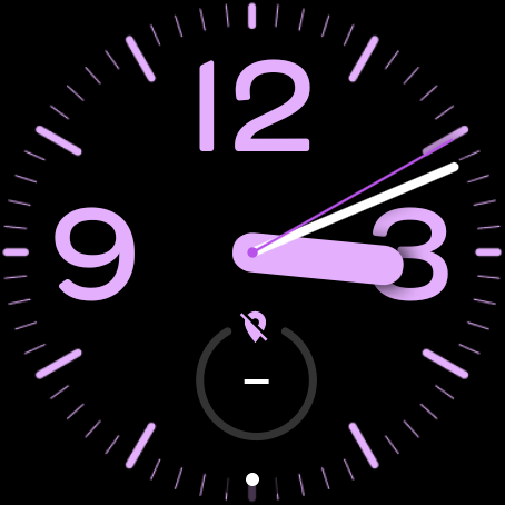
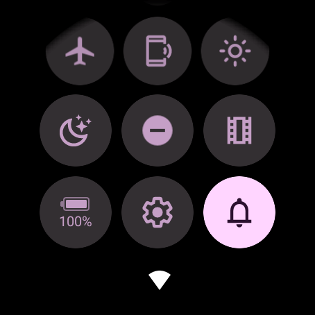
For months now, we’ve been tracking Google’s progress on bringing a full Material You coloring overhaul to smartwatches running on Wear OS. We even showed an early look at how your watch face’s colors would extend into the Quick Settings area as well as certain apps like the Play Store.
More recently, some Pixel Watch owners saw the usual white accents of Wear OS get replaced by the blue hues that Material You’s dynamic color system uses by default. This seemed to signal that the Pixel Watch, and perhaps other Wear OS watches, would be gaining dynamic colors in the near future.
Digging into the latest updates to the on-watch “Wear OS” app, our team has found a welcome notification seemingly intended to let people know that dynamic colors had arrived.
🎨🤩 New theming options are here!
Your system theme now automatically matches the colors of your watch face!
Try changing your watch face or selecting a color theme in settings.
In addition to Wear OS being able to respond to your watch face’s color, the message confirms that you’ll be able to select a theme color manually through the Settings app. This should come in handy for any third-party watch faces that may not properly support supplying a dynamic color. According to another bit of text, the options should appear under a new “Watch face & style” section of Settings.
We’ve also uncovered what looks to be the initial list of colors, all of which should look familiar to anyone who has played with the Pixel Watch’s customization options.
- Almond
- Pomelo
- Champagne
- Limoncello
- Lime
- Pear
- Mint
- Jade
- Spearmint
- Sky
- Sapphire
- Flamingo
- Melon
- Dandelion
- Aqua
- Lilac
Wear OS ‘Grid view’ launcher
Meanwhile, Google also appears to be preparing a new design for your Wear OS watch’s app drawer. For years now, Wear OS has stuck to a simple scrolling list of apps, displaying an icon and name.
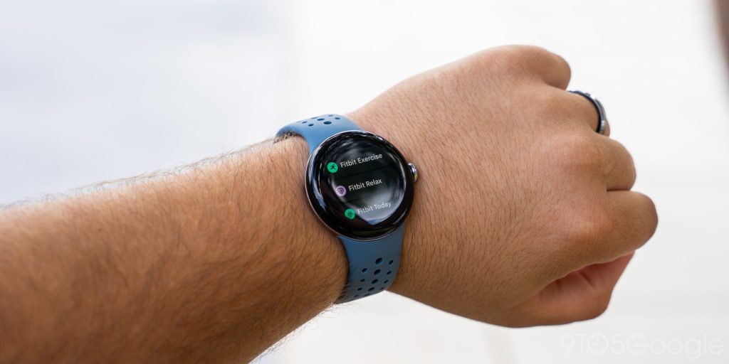
According to new code, you’ll soon be able to swap between that original launcher (referred to as “List view”) and a newer “Grid view” option.
<string name=”pref_launcher_ui_mode_dialog_message”>App view</string>
<string name=”list_launcher_ui_mode_pref_entry_name”>List view</string>
<string name=”grid_launcher_ui_mode_pref_entry_name”>Grid view</string>
It’s not yet clear whether Wear OS’s grid of apps will look similar to the Apple Watch’s original “honeycomb” layout or a squared grid like what you’ll find on Android phones and tablets.
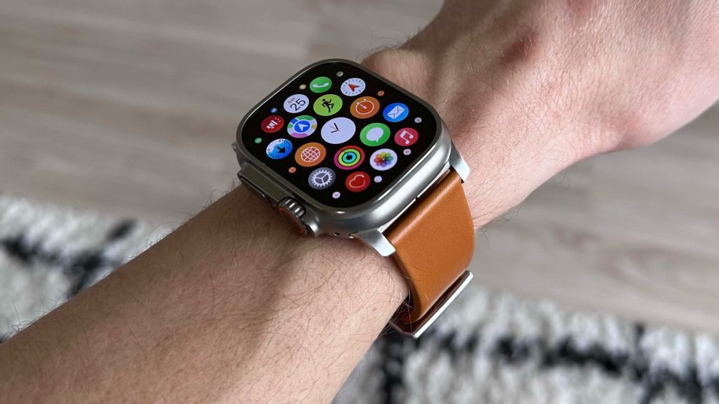
The only other detail we’ve found is that an early version of this redesign refers to it as a “three-column grid launcher.”
<string name=”three_column_grid_launcher_ui_mode_pref_entry_name”>Grid view</string>
Thanks to JEB Decompiler, from which some APK Insight teardowns benefit.
More on Wear OS:
- Fossil is officially done making Wear OS smartwatches
- Samsung and Google are preparing Wear OS 5 based on Android 14
- Google News Tile for Wear OS 2 is shutting down soon
FTC: We use income earning auto affiliate links. More.


Comments