Google is preparing to launch Wear OS 4 this fall, and one of the most significant additions is Material You, which makes your smartwatch more colorful to match your current watch face.
Wear OS has been seeing rapid improvements in recent years, beginning with the launch of version 3. Samsung has been a major factor in this shift, as the popular Galaxy Watch series moved from running Samsung’s Tizen to using Google’s Wear OS.
Where previously the only major difference between watches was in the hardware and watch faces – with Google requiring a standardized UI – now OEMs are able to be more expressive in wearable software design. Watchmakers are also able to leave behind Google’s generic “Wear OS” phone app to provide a bespoke and branded experience.
Of course, all watches start from the same baseline (Android-powered) Wear OS software that Google provides. That being the case, to help watchmakers and developers get ready for this fall’s Wear OS 4 release, Google has provided an early preview of the update, available in the Android Studio emulator.
However, Google didn’t share much about the practical improvements of Wear OS 4 when it was unveiled earlier this month. We know that the upgrade will bump watches from Android 11 to Android 13, and Google talked briefly about battery and text-to-speech improvements. The company also unveiled a new standardized “Watch Face Format” that should make new designs more standardized and efficient.
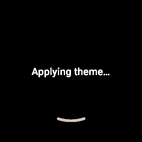
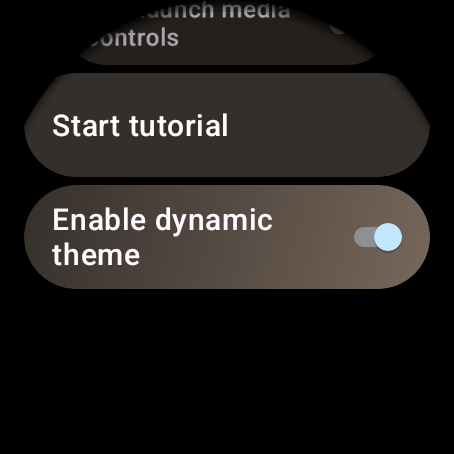
Our APK Insight team took a closer look at the preview software and found that Google has at least one major design change planned for Wear OS 4 – Material You. We managed to forcibly enable a new “Enable dynamic theme” toggle in the Settings app, which, as you might expect, applied Material You’s signature color scheme to many parts of the smartwatch experience.
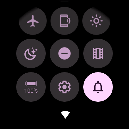
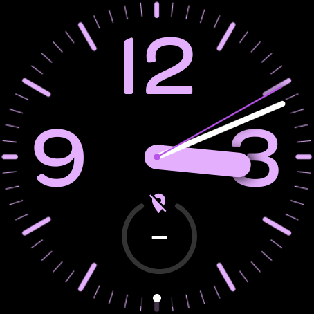
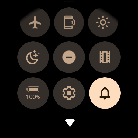
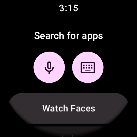
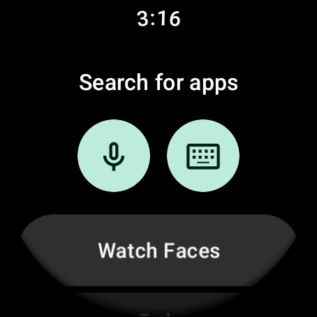
The most prominent shift in colors can be found in the Quick Settings area, with each available toggle being tinted to complement your current watch face color. For example, the “Honey” shade of yellow results in golden brown accents, while “Lavender” brings a boldly pink tint.
Notably, when using a watch face from the Play Store, Wear OS 4 defaults back to a shade of blue. It’s possible this will be addressed for watches that use the standardized Watch Face Format, but we were unable to test that theory.
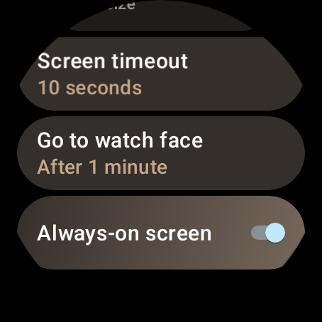
You’ll also find these new colors applied in a few other places, such as the Settings app, but most instances we’ve seen have been subtle accent colors rather than anything overt. It seems that Wear OS 4’s dynamic theme colors may also be available to app developers, as elements of the Google Play Store were also recolored to match the watch face.
In all, the introduction of Material You dynamic colors to Wear OS 4 is far from groundbreaking, but it’s great to see Google offer a sense of consistency between one’s phone and smartwatch. Plus, considering fashion is a significant part of wearing a smartwatch, having your watch face’s color appear throughout the experience is a subtle but meaningful touch.
What do you think of what we’ve seen of Wear OS 4 so far? What color would you want your Material You theme to be? Let us know in the comments.
Dylan Roussel contributed to this article.
FTC: We use income earning auto affiliate links. More.

Comments