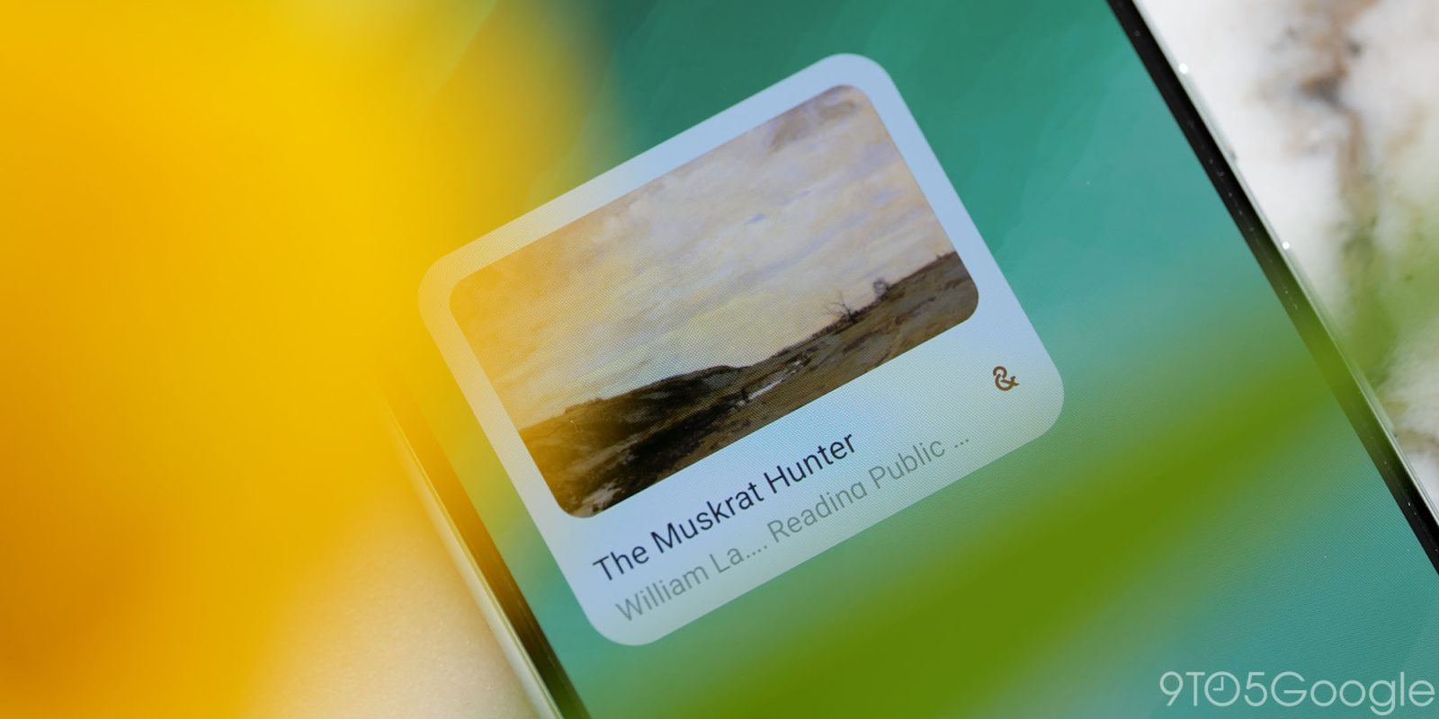
With Google Arts & Culture getting a dark theme today, one of the last first-party holdouts has folded.
The app previously only offered a light theme that made use of a nice gradient — green in “Explore” and blue in “Play” — at the top of the two main feeds (the third “Inspire” tab has a story-based layout).
The dark theme removes that effect but themes the title, buttons, and filter chips appropriately in a nice touch. Otherwise, this is a pretty straightforward night mode implementation, with the splash screen also updated to match. It helps match the dark ‘&’ logo introduced last year.
There’s already a Material You (last August) bottom bar and a pretty nice homescreen widget, but the app is still using the old account switcher style. Arts & Culture uses that menu to access favorites and preferences.


In Settings, you’ll find a new Theme menu where “System default” is already set, but you can manually switch to Dark or Light. This update also introduces Material 3 switches to this page.
Version 10.9.x of Google Arts & Culture is rolling out with a dark theme on Android and iOS.
With that out of the way, all eyes are on Google Opinion Rewards (Fitbit already said a dark theme is coming). It’s one of the last remaining apps and — for some — is something they open daily to get Google Play credit. The “Rewards” app has over 50 million downloads (to Arts & Culture’s 10 million) and clearly something Google is committed to operating given its utility. Hopefully, a dark theme is on the docket.


More on Google Arts & Culture:
- Google’s Art Selfie 2 puts you in famous painting styles using gen AI
- Google’s AI-powered game teaches you how to write image prompts
- Google Arts & Culture gets Material You redesign, adds AI Poem Postcards
FTC: We use income earning auto affiliate links. More.


Comments