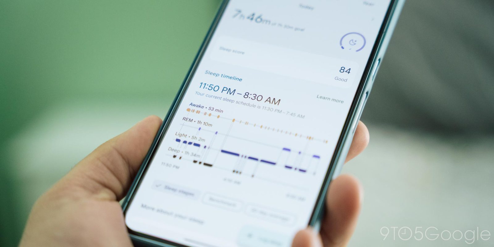
Earlier this month Fitbit started rolling out a big redesign to the sleep page and, now that it’s widely available, it seems like everyone hates it. So, what do you think?
The new Fitbit app launched last year as a total overhaul. The app was given a totally fresh new look that aligns much better with Google’s typical design language and the Pixel Watch, and just felt more modern on the whole. But portions of the app weren’t given the same treatment, such as logging food and your sleep data.
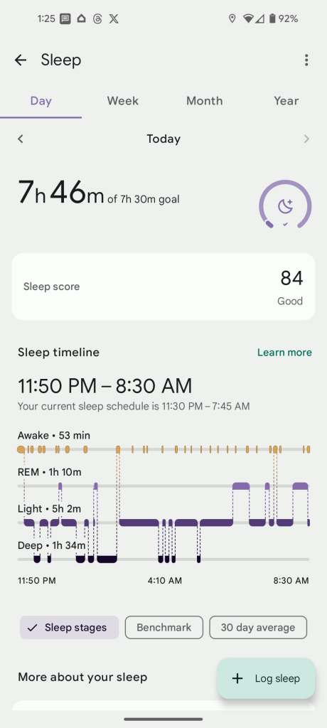
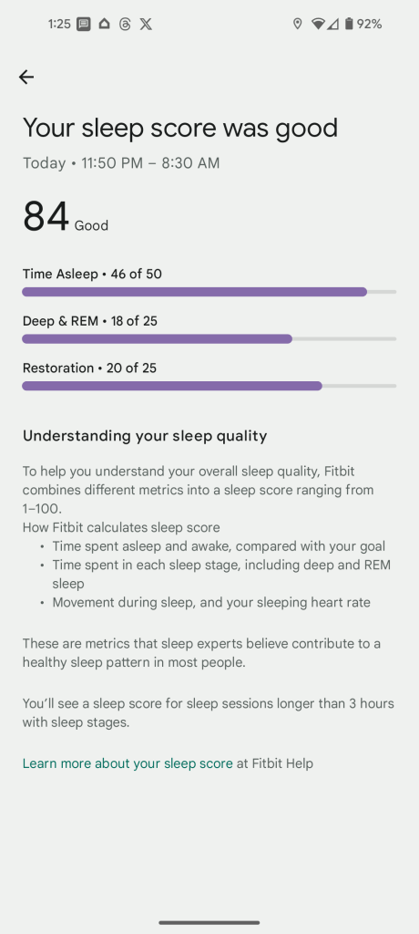
Just this month, Fitbit started rolling out a revamped page for sleep data.
The new page is redesigned to match the rest of the app, with data reorganized and a simpler white theme throughout.
Top comment by Stephaine Johnston
I do not like it. This is not user friendly anymore. I canceled my premium membership. I do not wish to pay for this scaled down version I am thinking about changing to a galexy watch. Furthermore if they have to take a poll they already know the answer and that there is a problem.
But, thus far, reception from the Fitbit user base has been pretty negative. Through our own comments, Reddit, and Fitbit’s forums, users are not happy with the redesign. One of the main sticking points seems to be that the positive and congratulatory design around a good night’s sleep has been removed. Others seem frustrated that the new graph designs are harder to read.


Personally, I don’t really dislike the new design, but I agree sleep stats aren’t as “glanceable,” and the new look doesn’t have the same charm either.
But how do you feel? Let’s discuss!
More on Fitbit:
- Fitbit Dashboard on the web blank amid shutdown fears
- Fitbit wants to give you insight & actionable information, not just stats
- Google Home routines can now include your Fitbit stats
Follow Ben: Twitter/X, Threads, Bluesky, and Instagram
FTC: We use income earning auto affiliate links. More.


Comments