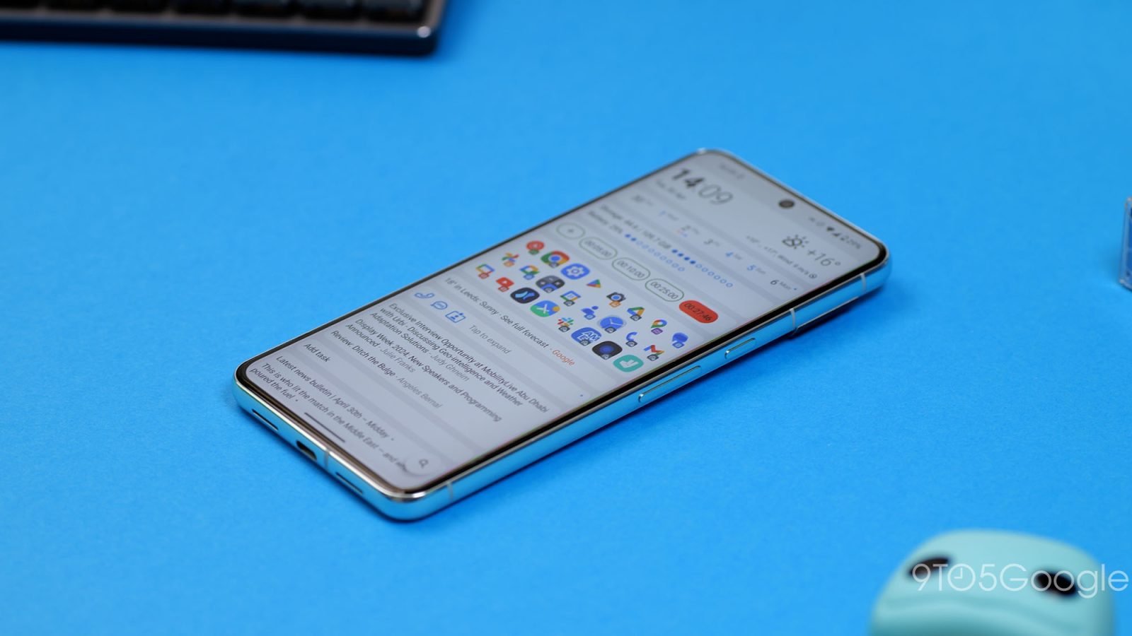
Customization is still at the heart of Android, and a custom launcher is a great way to personalize a device. Here are some of the best options you should try in 2024 and beyond.
The beauty of Android is that, often, no matter what phone you have, you can fully tune it to look just how you want it to. Third-party launchers offer options you might never have tried. Icon and widget packs can take the “default” experience to another level, and you can even mimic other devices if you really want to.
Table of contents
Total Launcher
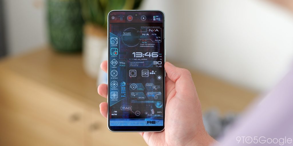
Total Launcher for Android caters to users who crave extensive customization and unique layouts. Unlike some launchers that completely overhaul the home screen, Total Launcher lets you tweak every aspect to your liking.
The general consensus is that Total has more in common with KLWP rather than most of Android launchers. While it goes way beyond the norm, it has a steeper learning curve. You can make your phone look exactly how you’d like it to. Or, you can do what I have done and test-driven some of the community themes that you can grab from the Play Store. If you’re happy to pay for themes, then you can get some insane layouts that otherwise might take days to replicate.
As fun as it is to tweak and tune, Total Launcher might not be the best option for everyone. The highly configurable nature means that if you can really make your device your own unlike anything else I’ve tried for a long time.
Niagara
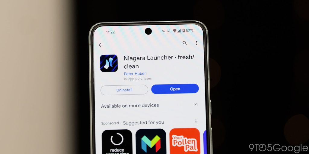
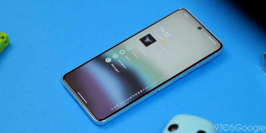
Niagara Launcher breaks the mold when it comes to Android launchers. Forget the familiar grid of icons – Niagara offers a completely different approach. It merges your app drawer and home screen into a single vertical feed, focusing on your most used apps for easy one-handed access. This minimalist design is a breath of fresh air, but it’s definitely an acquired taste.
Instead of a cluttered screen, Niagara relies on a curated list of “Favorites” that you choose. These sit prominently at the top, followed by an alphabetical list of all your apps. A customizable widget section above the list displays upcoming events, weather, and battery stats. Despite the minimalism, Niagara feels functional and efficient. Notifications appear directly on the home screen, saving you trips to the Quick Settings panel.
An alphabetical sidebar lets you quickly jump to any app, keeping everything within reach. Swiping on apps reveals shortcuts and individual notifications. Folders become “Pop-up folders” that integrate seamlessly into the list, housing your favorite apps without cluttering the view. This unique approach might not be for everyone, but Niagara offers a refreshing alternative for Android users. The free version provides a solid foundation, while the Pro version unlocks a weather and agenda widget, custom fonts, and more for $5.99 per year.
Nova
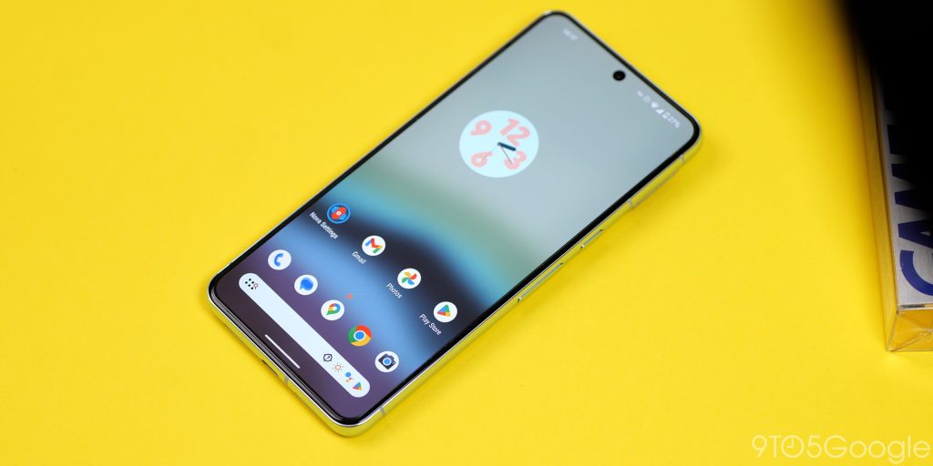
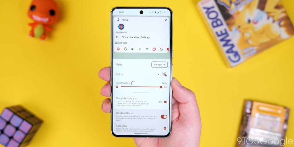
Nova Launcher isn’t just another name on the list of Android launchers – it’s the reigning champion. For over a decade, it’s been the go-to option for users who crave customization. The latest Nova Launcher 7 takes things to a whole new level.
Gone are the days of feeling limited by your stock launcher. Nova 7 empowers you to completely transform your home screen experience. It’s faster, lighter, and absolutely packed with features. Want to go beyond the basic theming options offered by your phone? Nova lets you personalize every aspect of the UI, from folder pop-outs and grid layouts to icon fonts and size. The level of control is staggering.
You can disable animations for a streamlined feel, add quick access options to app pop-up menus, or leverage the enhanced search functionality that surpasses anything built-in. Nova Launcher 7 isn’t just a launcher – it’s a gateway to a truly customized Android experience. A free version offers a generous set of features, with Nova Launcher Prime unlocking the full potential for a one-time purchase.
Flow Minimalist Launcher
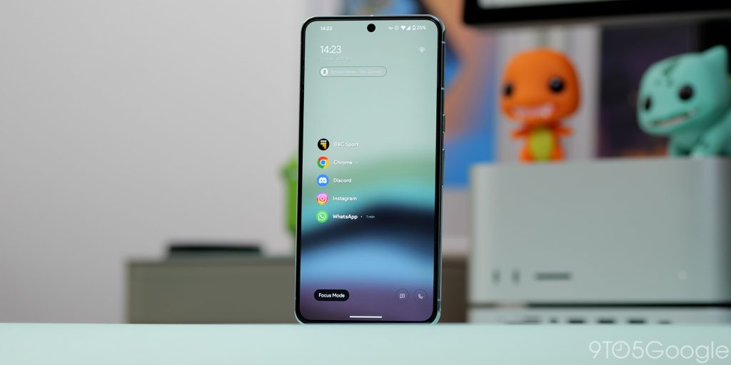
Flow Launcher emphasizes minimalism for Android users seeking a decluttered and focused experience. Unlike launchers that bombard you with icons, Flow prioritizes a clean and functional layout.
At the core of Flow Minimalist Launcher lies a curated list of “Favorites” that you choose for prominent placement. The rest of your apps are still accessible but tucked away in an alphabetical list for easy searching. Essential widgets like upcoming events, weather, and battery stats sit neatly above the app list, providing quick information at a glance. Notifications appear directly on the home screen, saving you trips to the notification panel.
Despite its streamlined approach, Flow doesn’t neglect functionality. Swiping on apps reveals shortcuts and individual notifications. Folders become “Pop-up folders” that integrate seamlessly into the list, housing your favorite apps without cluttering the view. This focus on simplicity makes Flow a refreshing alternative for Android users who prioritize a clean and organized home screen experience. The free version provides a solid foundation, with a Pro version offering additional features like a weather and agenda widget, custom fonts, and more for a one-time purchase
AIO launcher
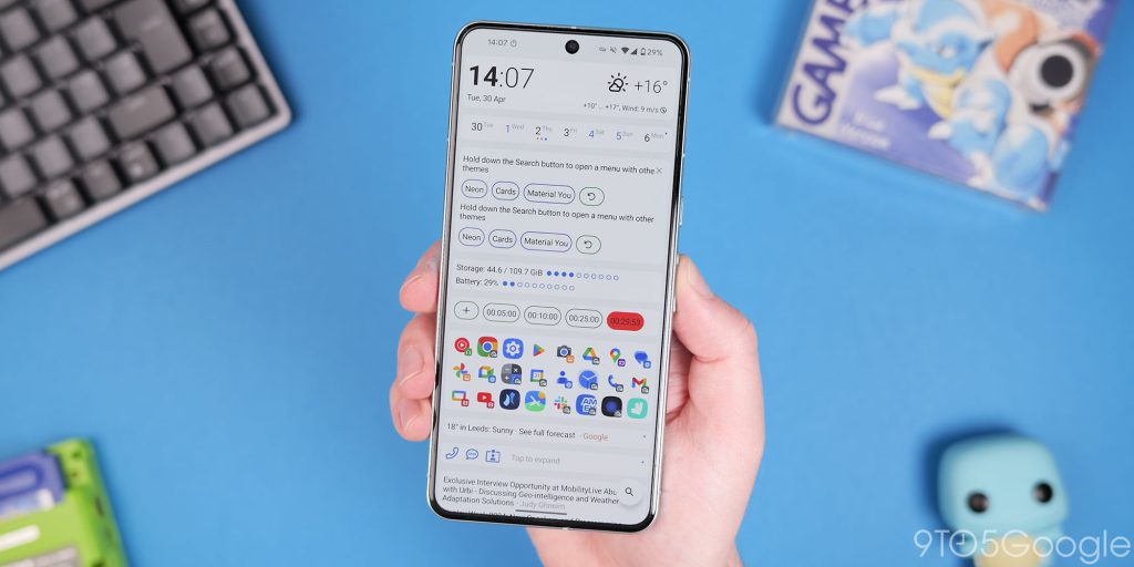
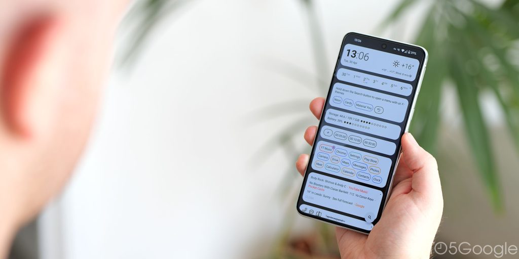
AIO Launcher opts for a design approach to keep everything you need hourly or daily within reach. Forget endless grids of icons – AIO Launcher condenses everything into a single, vertically scrolling feed.
This streamlined interface prioritizes what matters most: your most frequently used apps. AIO Launcher intelligently learns your habits and surfaces the apps you use the most at the top, keeping them readily accessible. Below your favorites lies a comprehensive list of all your apps, organized alphabetically for easy searching.
Despite its minimalist design, AIO Launcher doesn’t sacrifice functionality. Essential information like weather forecasts, calls, messages, and even music playback controls appear directly on the home screen. Built-in widgets keep you updated on important details, while notifications seamlessly integrate without overwhelming the clean aesthetic. AIO Launcher is free and offers a great solution for Android users who crave a clutter-free and efficient way to interact with their phone.
Lawnchair 14
Lawnchair 14 brings a ton of new features to the table. The star of the show is the revamped At a Glance widget. With Smart Spacer integration, you can install plugins to see all sorts of information, from Google Keep notes to Uber ride updates. You can even switch between these plugins with a swipe, making the widget super versatile. Lawnchair 14 also boasts a global search function that lets you search not just your apps but also system settings and local files. If you’re privacy-conscious, you’ll appreciate the inclusion of Startpage, a private search engine option.
On top of these headline features, Lawnchair 14 offers a bunch of customization options. You can hide the dock, create custom icon shapes, and use more fonts. The animations have also been improved, especially when switching to the recent apps menu. While there’s a rooted option for even smoother animations, the non-rooted experience is still pretty good. We can also look forward to features like multiple icon pack support and a no-app-drawer mode in future updates.
Stario Launcher
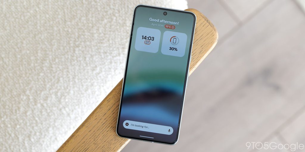
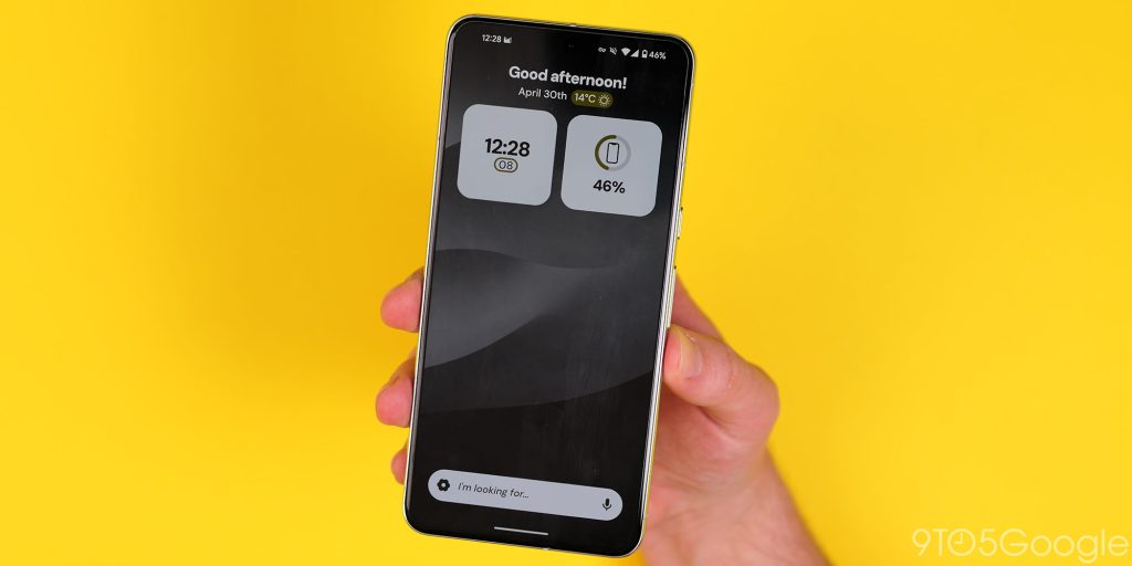
Stario Launcher ditches the traditional icon grid altogether and best suited to Android users seeking a focus on productivity and decluttering. Unlike launchers that overwhelm you with choices, Stario prioritizes simplicity and functionality.
Inspired by the minimalist phone concept, Stario keeps things clean while keeping essential features within reach. It integrates a built-in media player, note-taking capabilities, and even an RSS reader, all accessible from a central hub. But Stario truly shines in its organization. It automatically categorizes your apps, making it easy to find what you need without endless scrolling. Widget support and responsive app and web search further enhance the streamlined experience. Privacy is a major focus for Stario, with the launcher assuring it collects no app usage or personal data.
However, Stario’s focus on simplicity might not suit everyone. If you crave extensive customization options or a highly visual launcher, Stario might feel a bit too restrictive. But for those seeking a clutter-free and functional Android experience that prioritizes productivity, Stario Launcher offers a compelling alternative. Completely free, Stario lets you experience its streamlined approach without any commitment.
Kvaestiso
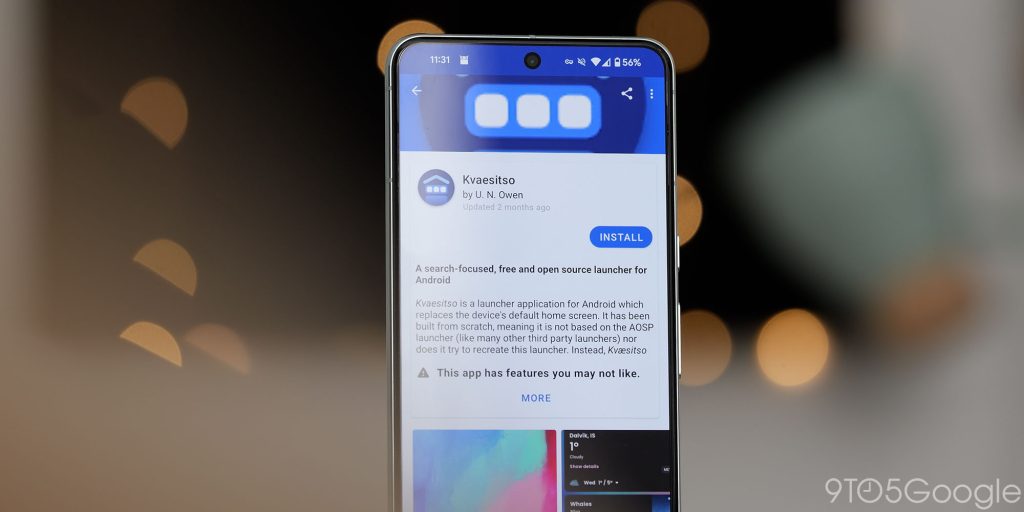
Kvaestiso launcher caters to Android users who want a widget-led approach to their phone. Instead of filling the home screen with app icons, Kvaestiso prioritizes a powerful search function, letting you find what you need quickly – which means it might not be for everyone.
This focus on search will no doubt resonate with fans who appreciate efficiency and a clutter-free experience. You can search for apps, files, calendar events, device settings, and more. The homepage relies on widgets. It’s like a merge of the iOS widget side pane but with more powerful Android widgets that you can customize.
This Android launcher is an open-source project that you can get from F-Droid. Kvaestiso offers the additional benefit of transparency and the potential for community-driven customization, appealing to users who value control and a unique look. However, it’s important to consider that updates might be less frequent than some popular launchers.
Square Home
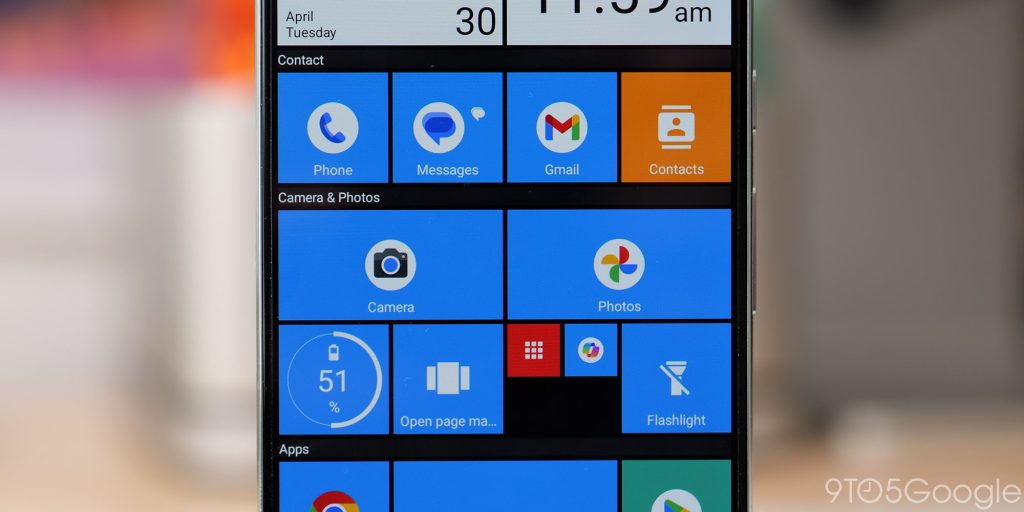
Calling all Windows Phone enthusiasts! Square Home Launcher for Android is here to bring back the familiar tile experience you know and love. Unlike most Android launchers that rely on app icons, Square Home embraces a bold, grid-based layout filled with live tiles.
This launcher transports you back to the glory days of Windows Phone. Each tile can be customized to display your favorite apps, contacts, or widgets. Glance at a tile and see the latest update from your social media feed, check upcoming calendar events, or keep an eye on the weather – all without ever opening the app.
But Square Home isn’t just about nostalgia. It offers a surprising amount of functionality for modern Android users. You can create multiple home screens for better organization, explore various tile sizes and effects, and even integrate your wallpaper for a cohesive look. Notification badges keep you informed at a glance, while vertical scrolling and horizontal page flipping provide a smooth navigation experience.
Whether you crave the comfort of a familiar interface or simply appreciate a unique and efficient way to manage your Android home screen, Square Home Launcher is a breath of fresh air. It injects a dose of Windows Phone charm into the Android ecosystem, offering a feature-rich and visually distinct alternative to traditional launchers.
Neo Launcher
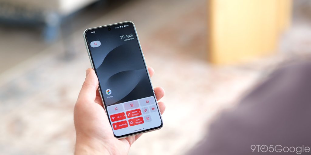
Neo is another open-source Android app that has some features I’d love to see other launchers. The “Home Screen Dash” is the killer function. Think of this as a quick access panel for toggles, but in an infinitely easier place to reach. You can almost fully customize this little pop-up panel too.
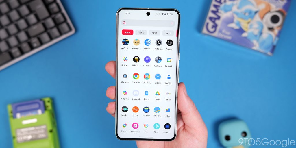
Within the app drawer you can create tabs manually or let these auto categorize so that you can quickly sort through every installed app. Custom home screen gestures are super powerful, allowing you do other things on your device quickly and seamlessly. The optional NeoFeed add-on is another amazing additional option that is like a truly customizable Google Discover. You can choose data sources with RSS feeds, which is absolutely incredible for content discovery and picking up where you left off.
Top comment by David Green
I use Microsoft launcher on S24 Ultra. I particularly find useful being able to have 3 docks one under each other. I can't use it on my Tab S9 Ultra though as the app/ folder labels disappear in horizontal mode unfortunately so I just use the stock launcher
One potential pain point is the update schedule for Neo Launcher. It hasn’t technically been updated for over a year – October 2022 to be precise. The release notes state that Neo Launcher also technically supports Android 13, but it might work on your device.
Pie Launcher
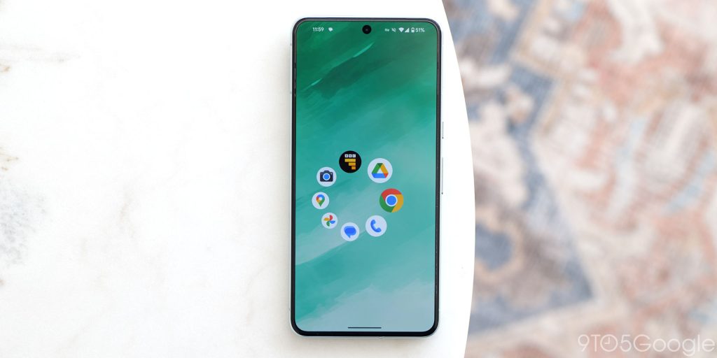
It’s hard not to love the sheer volume of options that we have on Android. In the world of Android launchers, Pie Launcher is an incredibly different experience. Instead of the usual grid of icons, Pie Launcher presents your favorite apps in a customizable circular dock when you tap the screen. You can swipe around and open a recent application from this circular floating dock. This feels so alien but it’s unique and eyecatching.
Luckily, you do still have an app drawer. Tapping the center of the “Pie” opens the app drawer. You can scroll through or tweak the settings. There isn’t much you can really do, but it’s a nice, light and strange take on the “traditional” Android launcher that you might want to try.
What is your favorite Android launcher?
The wealth of choice afforded by Android means that you don’t even need to agree with our shortlist. What is your favorite or go-to Android launcher — or launchers if you use multiple? Let us know down in the comments section what you use and why.
FTC: We use income earning auto affiliate links. More.


Comments