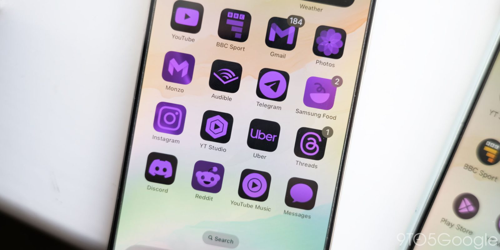
Customization was a big focus of Apple’s reveal of iOS 18 this week, and that includes updating the homescreen to be truly customizable. That includes Apple bringing a version of Android’s themed icons to iOS, but despite Apple’s being more customizable, it feels like Android made the better choices here.
First things first, we have to address the elephant in the room. iOS 18 finally lets users puts apps anywhere they want on the homescreen. No longer are iPhone owners forced into a top-down grid that’s far from ergonomic, and instead you can just do whatever you wish. It’s a way better system, and one Apple should have adopted over a decade ago.
But Apple also went beyond that.
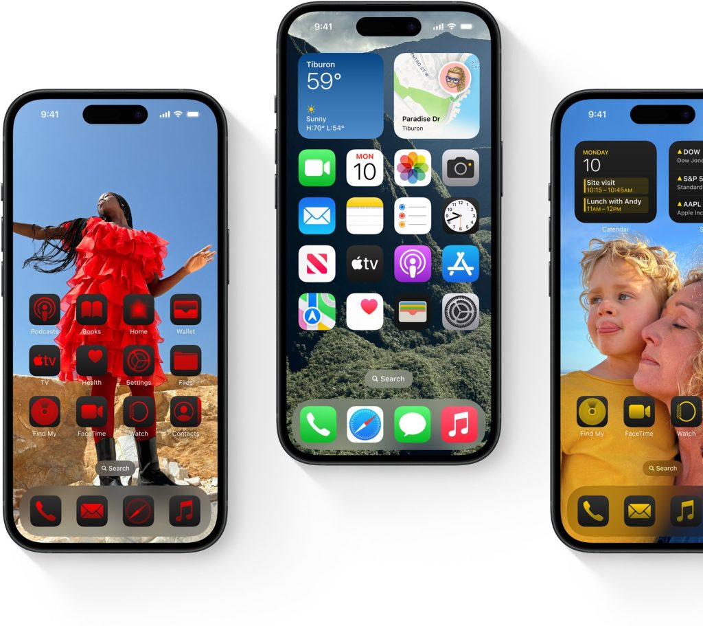
Now, the iOS homescreen also allows users to customize their app icons. A single color is picked which can be applied to all apps. The icons can also swap out colorful backgrounds for a dark theme whenever the device has dark mode activated.
It all feels rather similar to Android’s themed icons, which launched in Android 12 alongside Material You and have been built out over the years. Android’s feature, which is still in beta down to today, will apply a theme to supported apps that matches your wallpaper and other system accents. Like the rest of Material You, it uses a largely pastel color palette that tends to be fairly tame, at least on Pixel devices. Other Android brands have had adjusted the system to suit their own needs, such as Samsung which tends to employ a few more colors or some more vibrant options.
But there are two common complaints about the system. Firstly, that it only works on supported apps and, secondly, that it’s not all that customizable.
Apple, with its new icon customization options in iOS 18, “solved” both problems, but also somehow proved that they were there for good reason.
With iOS 18, Apple leaves the color of the icon fully up to the user.There’s a simple slider to pick through colors and you can also choose the tone of that color too. It’s very flexible, allowing users to pick basically any color they want. But, Apple’s examples are pretty… bad, I think is the word.
The icons all have a consistent theme which is nice, but they tend to end up looking a bit tacky. Really, they just feel like the Android icon packs I remember the Google Play Store being full of a decade ago, and I’m quite glad that we’ve moved long past that time.
Perhaps making matters worse is that, like Android, this system only works for supported apps. If an app isn’t supported, a mask is applied to the icon to make it blend in. This is something Google has also played around with, but not yet rolled out. And it’s pretty clear why. While some icons look fine with the tint applied, others simply do not. And it varies wildly depending on the theme applied.
It’s even worse for widgets, which it inexplicably applies to.
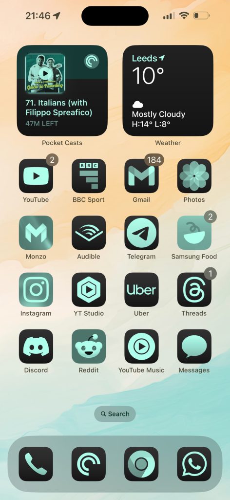
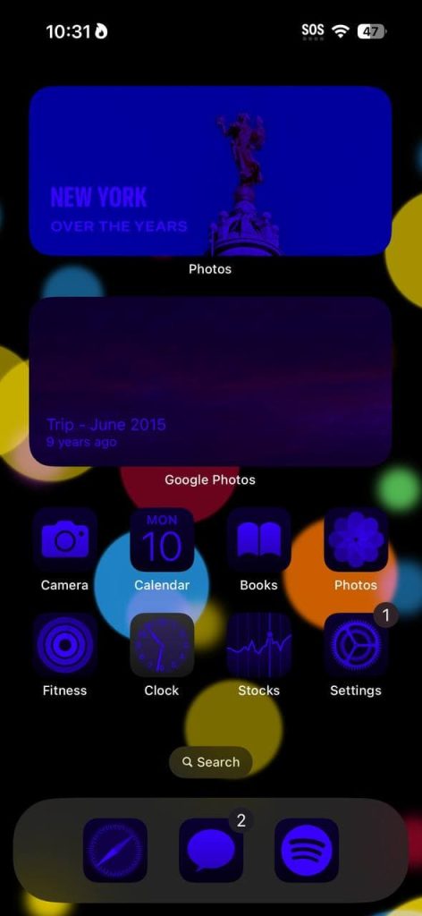
That second issue won’t be a problem for long, as developers generally flock to support Apple’s latest features, but I’m not sure the style problem will ever be fixed. The tint just goes off the rails so, so quickly.
Top comment by bambobo
I actually would prefer the full user choice option that Apple is giving; if someone wants to make their phone look like that, more power. However, I'm kinda shocked that Apple, known stickler for UX readability and "prettiness", went ahead with this implementation. Especially on the widgets, it just looks horrid.
Also, side frustration to all the Android apps that still refuse to support the feature. I hope you know that you've lost home screen placement on my phone with that decision.
After seeing examples of Apple’s system in action, I feel a new appreciation of Android’s themed icons. Android’s version of this just feels like an exercise in compromise. Google, Samsung, or anyone else could have built out a fully customizable color slider like Apple has here, but now that we’ve seen it in action, it seems like Android has made the right choice here. Where I’m struggling to find examples of tinted icons on iOS 18 that look good, I don’t think I’ve ever seen Android themed icons in action where they objectively look bad, they just have missing icons.
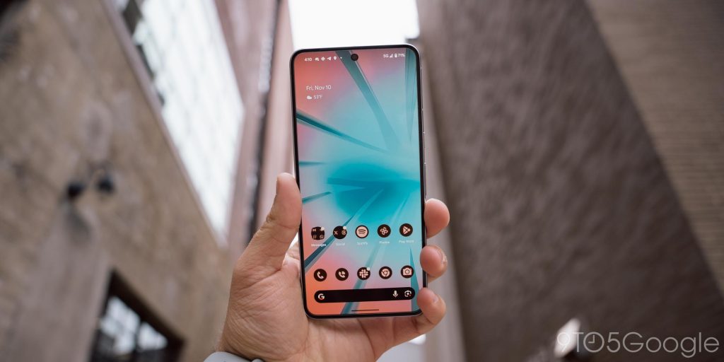
Themed icons on Android are far from perfect, and I’m not sure all apps will ever support the feature (unless Google forces it). Apple’s system solves the core problems, but it creates new ones. Can Apple fix it? Surely, but if iOS 18 keeps this system in place as it exists today… yikes.
But what does that matter? I can finally put apps on the bottom of my iPhone’s homescreen. Woohoo!
More on iOS 18:
- Where iOS 18 is playing catch-up with (and surpassing) Android
- Craig Federighi says Apple hopes to add Google Gemini and other AI models to iOS 18
- iPhone adding RCS support (and copying these Google Messages features in iOS 18)
Follow Ben: Twitter/X, Threads, Bluesky, and Instagram
FTC: We use income earning auto affiliate links. More.




Comments