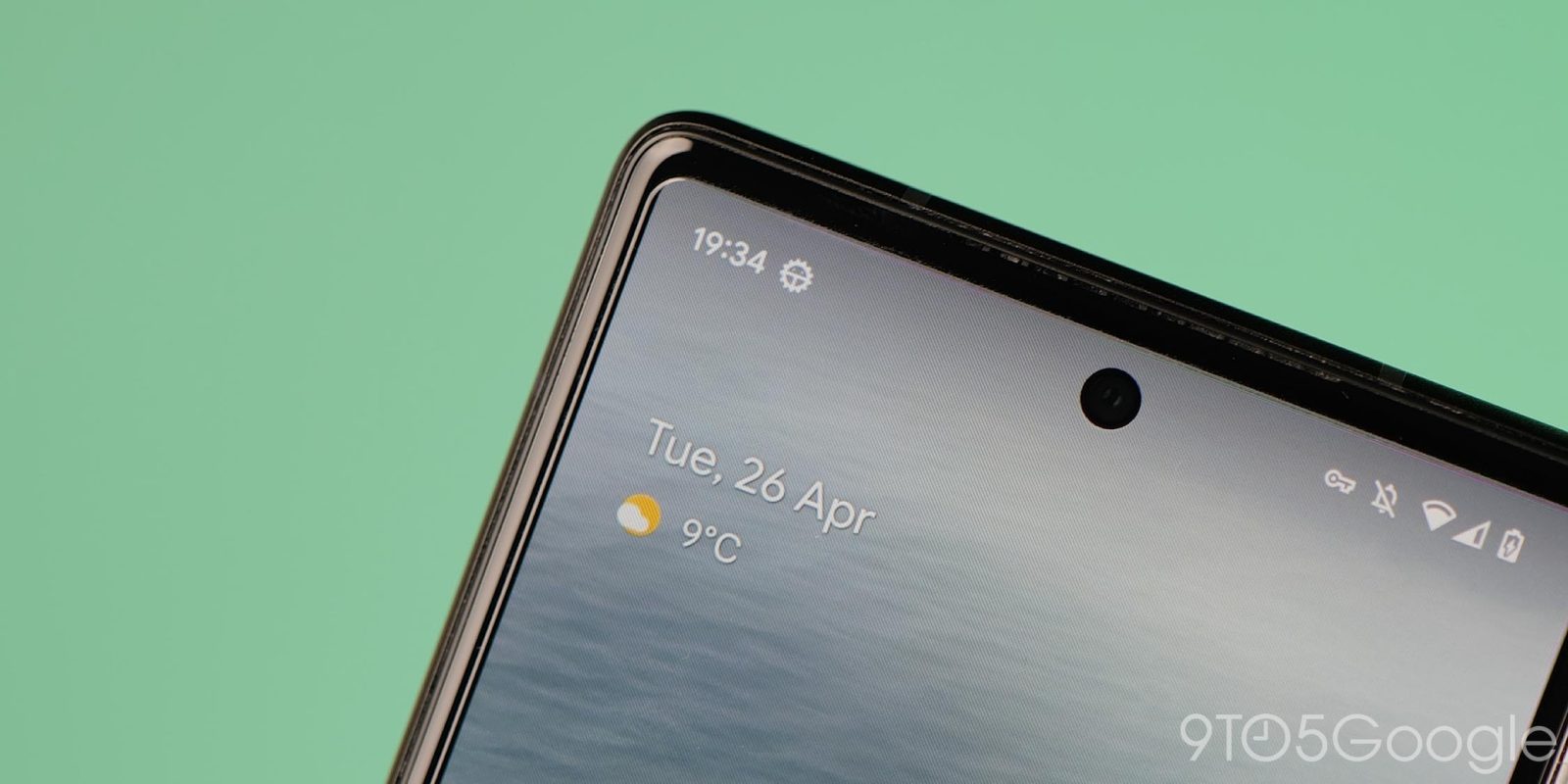
Google appears to be toying with a new take on notification icons in the status bar which, instead of the current look, would use the full-color app icons from your Android homescreen.
The Android status bar is one of the many things that set Google’s OS apart from iOS, in part because it shows a preview of the notifications you have before you swipe the full menu down. It’s handy functionality that doesn’t get in the way, but a new design tweak might make it a bit more of an eyesore.
As spotted by Android Authority, a latent experiment in Android 15 swaps out the existing notification icons in the status bar for ones that match what you’d find on the homescreen. These can be full-color or monochrome, but in both cases they look pretty rough as it stands today.
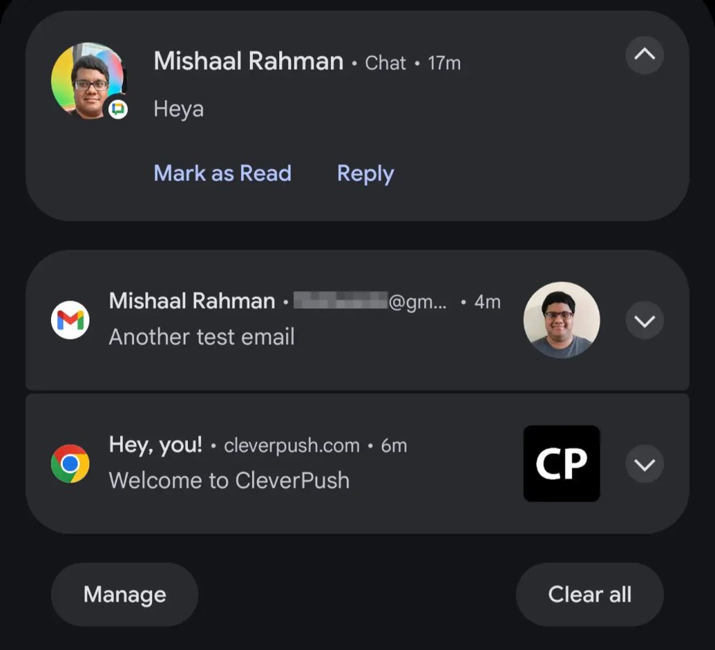
The full-color example leads to a bunch of circular icons with tiny little symbols for each app, while the monochrome example shared leaves multiple icons basically invisible. The same designs also apply to the always-on display and to the notifications themselves, with the latter actually working quite well with the full-color version.
Whether you like this change or not, it’s currently just a test, and not something that Google is definitely moving forward with. We’ll have to wait and see if the company ever decides to make this the actual behavior in Android.
More on Android:
- What’s new in the September 2024 Google System Updates
- Android apps can now force Google Play download, effectively blocking sideloading
- Motorola’s latest phone gets five major Android updates – you know, eventually
Follow Ben: Twitter/X, Threads, Bluesky, and Instagram
FTC: We use income earning auto affiliate links. More.


Comments