Earlier this year, Google Messages seemed to have settled on a new design for read receipts. The RCS app rolled that back, but is now pursuing one element of that big redesign.
The major read receipts overhaul, which first appeared in August of 2024, placed everything inside a single circle located in the bottom-right corner of the message bubble:


| Ellipsis | Sending |
| Single check with ring | Sent |
| Double check with ring | Delivered |
| Double check solid circle | Read |
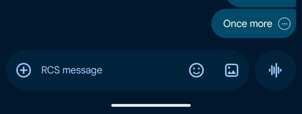
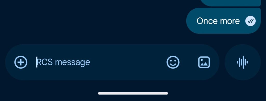
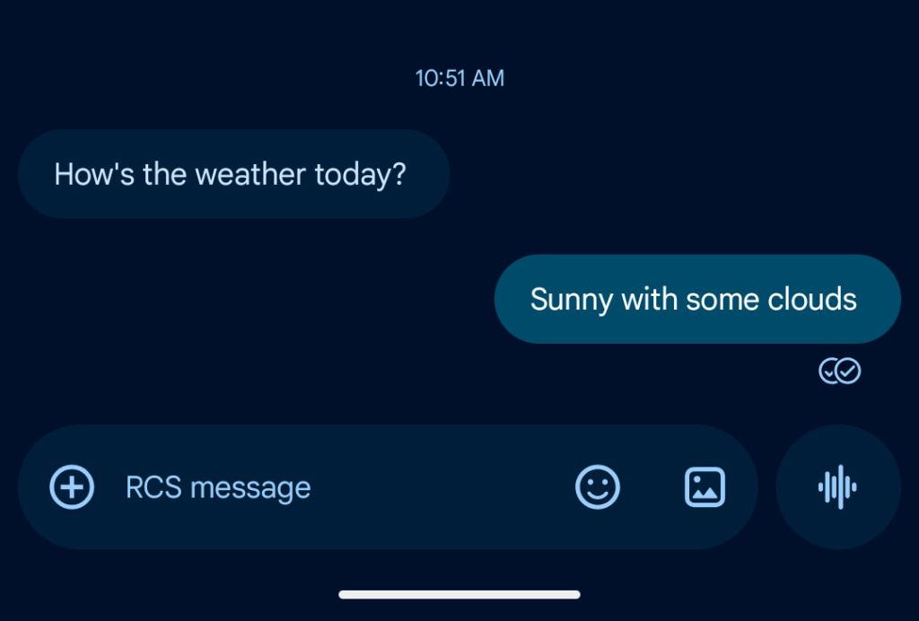
In recent weeks, Google Messages has mostly reverted to the two-circle design that appears underneath the message bubble:
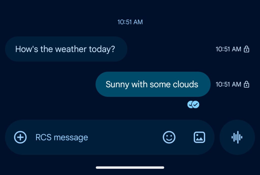
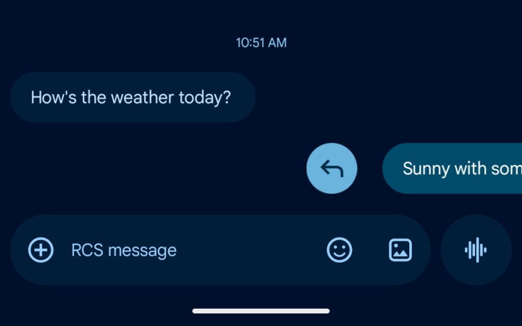
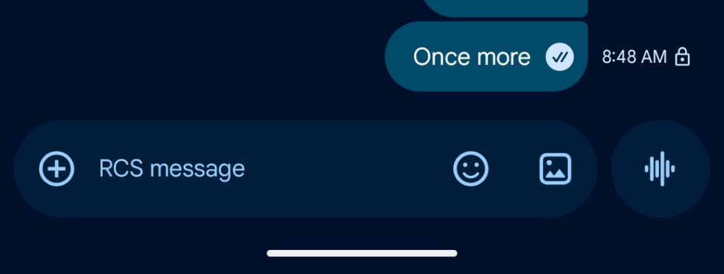
Google is now testing a variant that moves the timestamp and encryption lock icon so they no longer flank the read receipts. You now view that information by swiping left, with direct replies accessed by a right swipe. This was originally part of the big redesign and saved you from having to tap each bubble.
It’s unclear why Messages is going back and forth on the actual read receipts design. (If you go to a chat’s Details page, you’ll find the all-in-one approach widely rolled out.) Regardless, Google looks to be splitting up the changes.
This particular change is not widely rolled out and something we’ve only seen on one device running the Google Messages beta. It started appearing last week.
FTC: We use income earning auto affiliate links. More.
Comments