The YouTube app for TVs, including Google TV, is rolling out a new design for the sidebar that makes it easier to access your library while also showcasing some of your recently-watched channels.
Showing now for some users, this new sidebar design for YouTube on TV is a relatively minor, though welcome update.
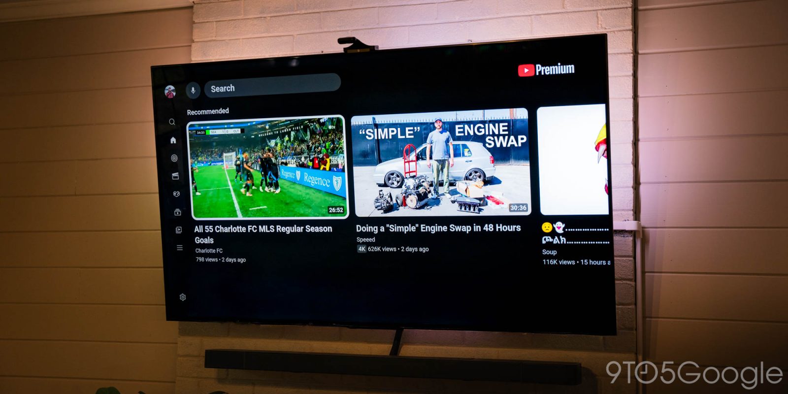
The existing sidebar, from top to bottom, has shortcuts for Search, Home, Music, Movies & TV, Podcasts, Subscriptions, Library, and a “More” overflow tab, with a Settings option at the very end. It works, but it means you have a lot of clicking around to do in order to reach your Subscriptions and Library, which are two of the most-used sections.
The new sidebar keeps Search and Home at the very top, but with a new section underneath that contains Subscriptions and Library, alongside two direct channel shortcuts – we’re not sure if these are recently-viewed, recently-subscribed, or just algorithmically-determined channels. They appear on the sidebar even in its collapsed state.
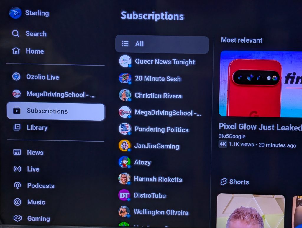
Below that you’ll see shortcuts for News, Live, Podcasts, Music, Gaming, and Sports, but this seems to change depending on your TV. A Settings button remains at the bottom.
We’ve yet to see this UI on one of our devices, but it appears to be a server-side change. One of our readers noticed the update on Google TV, while a Redditor spotted it on a Samsung TV.
Let us know in the comments if you’re seeing this change, and how you feel about the tweak.
Thanks Sterling!
More on YouTube:
- YouTube starts rolling out free picture-in-picture (PiP) globally on Android, iOS
- YouTube ads surface in subscriptions feed as side-by-side ads hit more live content
- YouTube is ditching ‘Clips,’ officially brings ‘share at timestamp’ to phones
Follow Ben: Twitter/X, Threads, Bluesky, and Instagram
FTC: We use income earning auto affiliate links. More.

Comments