Android 12L isn’t exactly packed with features and new additions and falls very much into the “refinement” category for OS updates. It is, however, worth taking a closer look at.
Anyone expecting a huge number of added extras might come away disappointed given the huge overhaul added with Android 12 late last year. It’s a case of tuning and tweaking to enhance Android 12 for the larger tablet and foldable form factor with a few little improvements to make Material You a little better overall.
If you have the Pixel 3a right through the Pixel 5a, you should be able to get updated right now. The flagship Pixel 6 series update is delayed until “later this month.” It’s not entirely clear why, but this includes some Pixel-exclusive changes saved for the first Feature Drop of 2022. Here’s every brand-new feature, function, and change we’ve found in Android 12L:
Navigate this guide
Video — Hands-on with every MAJOR new change and feature in Android 12L!
Subscribe to the official 9to5Google YouTube channel
UI changes
- Tweaked “Sound and vibration” sheet
The Sound and vibration section is now larger with greater spacing between each volume control scroll bar. Cast volume controls have also returned here too, which is not necessarily new but the controls are much higher up your display. The “See more” button is now replaced by a rounded “Settings” M3 button too.
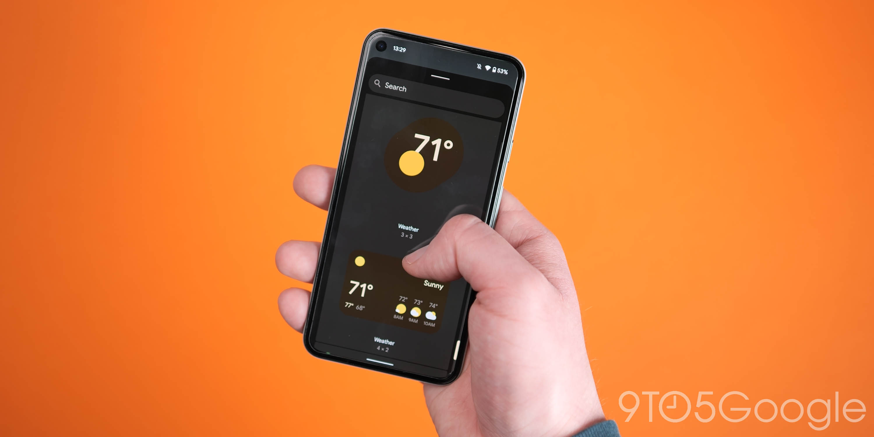
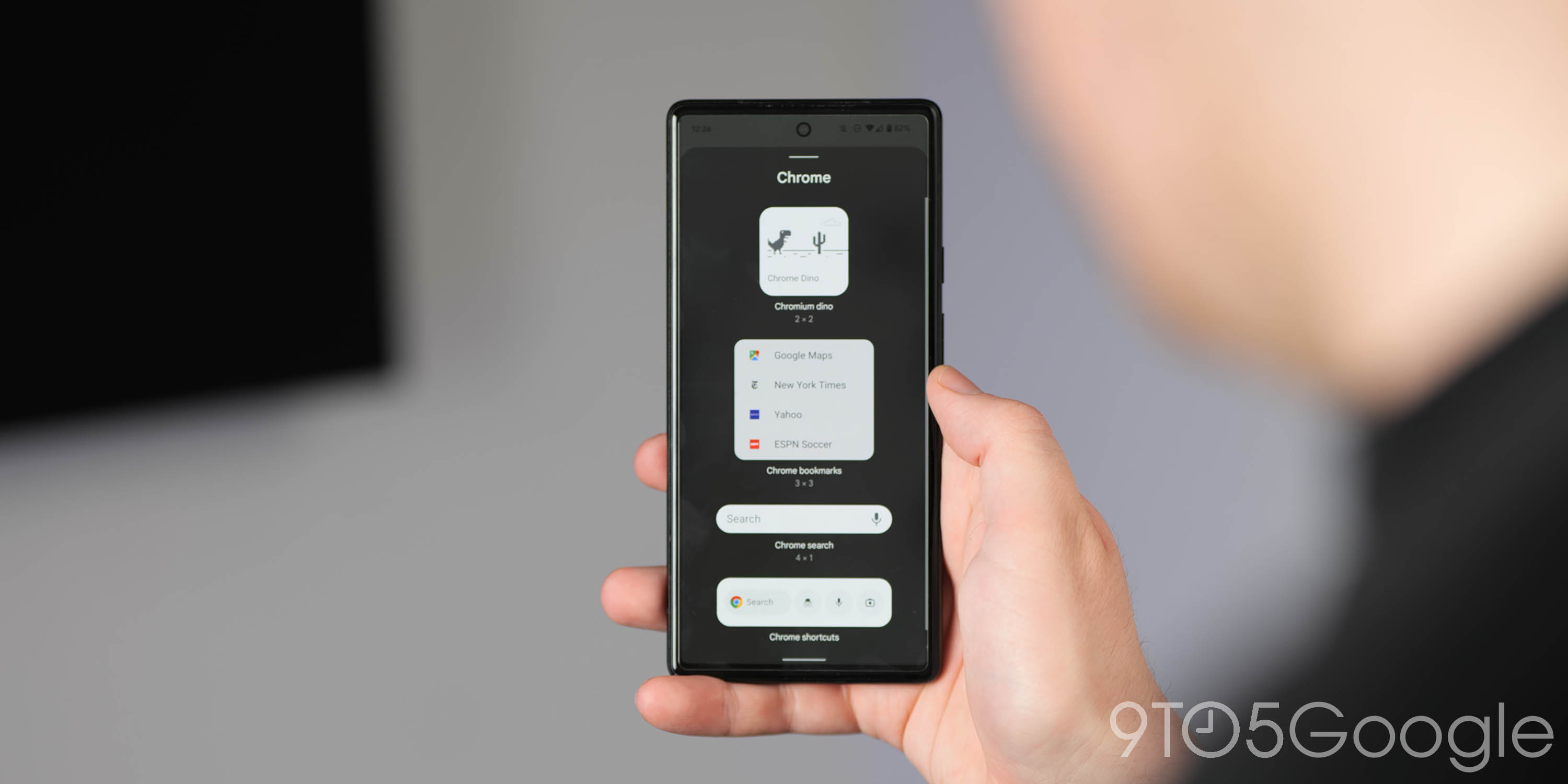
- Full-screen pop-up widget sheet
When selecting a widget after long-pressing an app icon, the widget selection sheet now takes up all of your display rather than a small anchored section. This makes it easier to see all app-specific widgets without having UI portions cut off or obscured. This also mimics the wider widget picker settings.
- New “Weather” widget grouping
To add to the other widget selection tweaks, there is now a dedicated “Weather” section for widgets that is uncoupled from the Google widgets. This includes the quick current conditions and hourly forecast weather widgets powered by the Google app.
Usability changes
You don’t have to dive into the Wallpapers & style app to change your on-device wallpaper, as Android 12L features a super-quick switcher that can be accessed via a homescreen long-press. Find a blank space and press and hold and a new larger pop-up menu will allow you to select any of your previous five wallpapers. All system accenting and colors will also adjust if the option is enabled here, too.
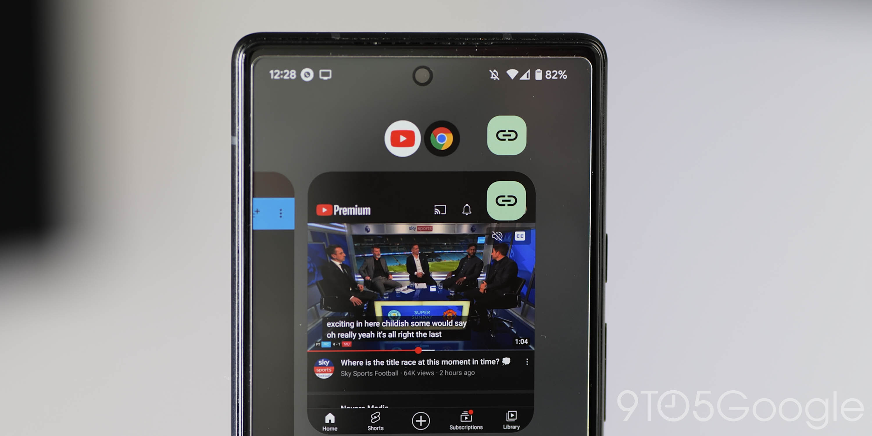
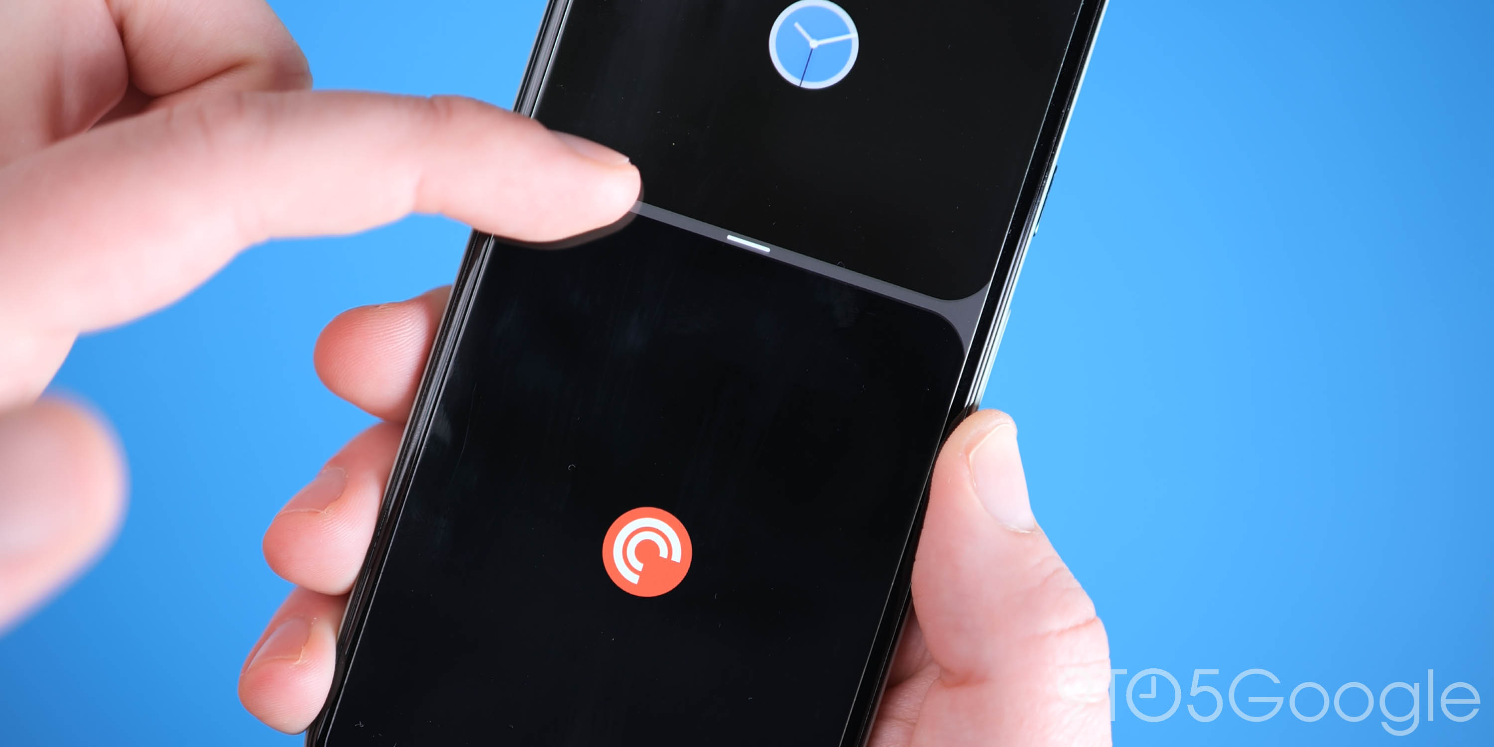
12L has gained the long-awaited “App Pairs” feature, which is just a repackaged method of split-screen on your Android homescreen. Groupings are now preserved within the Recents app view rather than giving the top application in split-screen view precedence. This makes it easier to combine two popular apps together (for example YouTube and Chrome/browser) and quickly return to this dual view when switching out or accessing another UI portion.
- Centered expanded Quick Settings pop-ups
Likely to help improve usability and reachability, almost all Quick Settings expanded menus and pop-ups are now more centrally aligned to help you access further device control options. A prime example is the Wi-Fi toggle, which now is larger and detached from the standard bottom sheet.
- Enhanced UI haptics
Haptics are now present in more areas of Android 12L with vibration-based feedback now noticeable when accessing or expanding the Pixel Launcher app drawer. You will also notice haptics when scrolling through the Recents app menu with the addition of a soft vibration when closing or dismissing any apps here, too.
- Cast volume controls in Sound & vibration panel
Although present in Android 12 with recent security updates, Cast volume controls have returned fully within Android 12L if you have not yet updated your device or have used previous Android betas.
- Split-screen picture-in-picture shortcut
To help improve launch times for split-screen, provided you’re viewing a video using the picture-in-picture mode and open another app in full screen, tapping the floating player will add a new toggle. It may look like a “pause” icon, but it will launch the video playing app and the current full-screen app into split-screen mode instantly.
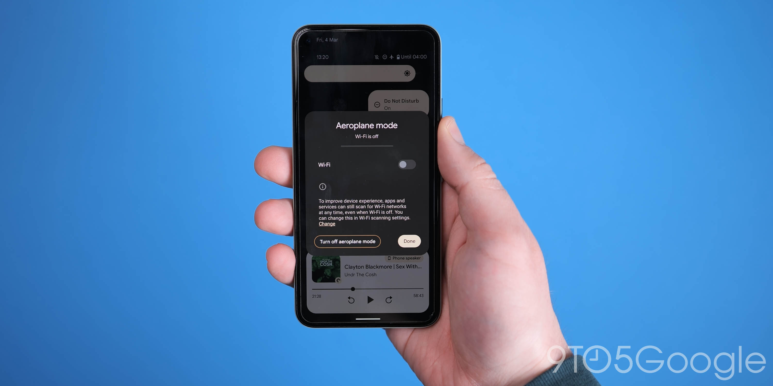
- Turn off Airplane mode shortcut
Completely new in Android 12L allows you to quickly disable or turn off Airplane mode when attempting to activate on device Wi-Fi. When you’re in Airplane mode, tapping the Wi-Fi or internet toggle will offer up a button to just exit quickly, but you can still keep other connections deactivated and enable Wi-Fi if you wish.
- “Split-screen” toggle now renamed “Split-top” with new icon
When opening the Recents app menu, launching the split-screen mode does not differ drastically but is renamed to “Split-top” to indicate that the first selected app will appear at the top half of your display. This is accompanied by a new icon to indicate what pressing this button will achieve.
Calendar can be opened from At a Glance homescreen widget
Android 12L now lets you tap the date within the At a Glance widget to quickly launch into the Google Calendar app, which mimics the weather launching feature.
- Tablet and foldable UI optimizations
Because Android 12L is meant to offer foldable and tablet devices a unique set of features and functions, a number of tweaks have been added including a new persistent dock allowing access to your most used or favorite apps from all areas of Android. This is visible in all areas and is very reminiscent of the Windows taskbar or Mac dock.
A dual-view Settings menu is now also available. This splits the Settings section with a scrollable list of sections on the left, with the opened section viewable on the right. Also joining this is a dual-view lock screen and Quick Settings panel that includes notifications on the right side and up to six toggles on the left. On the lock screen, the clock is on the left, while your unread notifications are on the right.
Cosmetic changes
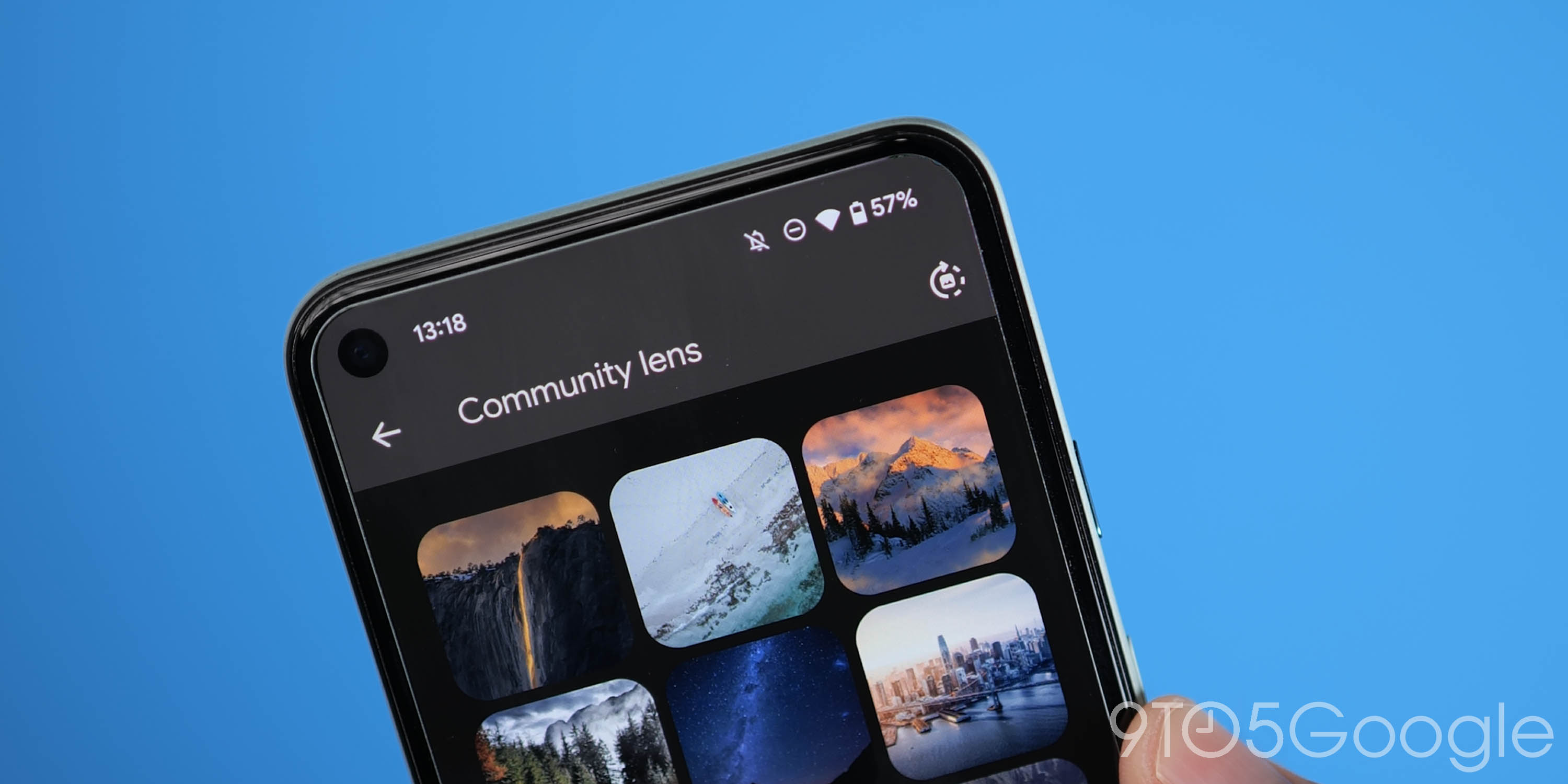
- New auto daily wallpaper icon in Wallpapers & style section
The toggle to select a new daily wallpaper within the Community lens section of the Wallpaper & style app now has a new icon.
- More rounded UI elements
Many UI elements have been updated with more rounded aesthetics and updated M3 buttons.
- Refined Quick Settings and general UI animations
General UI animations in Android 12L feature better collision and screen edge detection with smooth results. A prime example is the Quick Settings panel, with toggles expanding and contracting when the section is accessed from the top of your Pixel display.
- New Quick Settings Power menu animation
Tied to the wider animation improvements, when selecting the “Power menu” from the Quick Settings panel, this pop-up will expand from the button rather than slide in as previously seen in Android 12.
- Improved and more prominent M3 buttons for camera/microphone access
If microphone and camera access toggles are deactivated and preventing access to these hardware features, in Android 12L the on-screen pop-up now has more rounded M3 buttons to indicate and reauthorize access where deemed necessary.
- Updated “Press and hold” power button graphic in Settings
To help you better understand the option, the “Press and hold” section within Settings now has an updated graphic with a gif.
- Double-line lock screen clock option
You can now disable the large double-line lock screen clock from within the Settings menu in Android 12L. This feature allows you to just enable the smaller upper-left single line clock option that will usually appear when notifications are waiting on your device. This can be found by heading to Settings > Display > Lock screen > Double-line clock.
- New fingerprint unlock animation on lockscreen
The Pixel 6 and 6 Pro have gained an updated fingerprint unlock animation for the in-display reader. This animation has a minor “glow” around the activation point, which is missing from older builds.
- Increased split-screen corner radii for App Pairs
Android 12L features more rounded UI corners for the split-screen mode. The radii of the corners will correspond to the shape of your smartphone display. For example more rounded corners on the Pixel 5 but sharper, squared-off corners on the Pixel 6 and 6 Pro.
- “No notifications” banner more centrally placed in Quick Settings panel
If you have no new notifications to view or read, the “No notifications” banner is now placed further down your display and centrally aligned within the Quick Settings panel.
- Screen saver Settings page UI changes
The “Screen saver” section within Settings has a new UI with a prominent “Start now” button, which replaces the more commonly used toggle.
What is your favorite new addition or feature within Android 12L?
This guide should cover every “core” change within Android 12L. Although there are a few exclusive options that will only be made available to those with Google Pixel phones courtesy of the March Feature Drop. Not counting those new options, what is your favorite new feature in Android 12L? Let us know down in the comments section below.
FTC: We use income earning auto affiliate links. More.


Comments