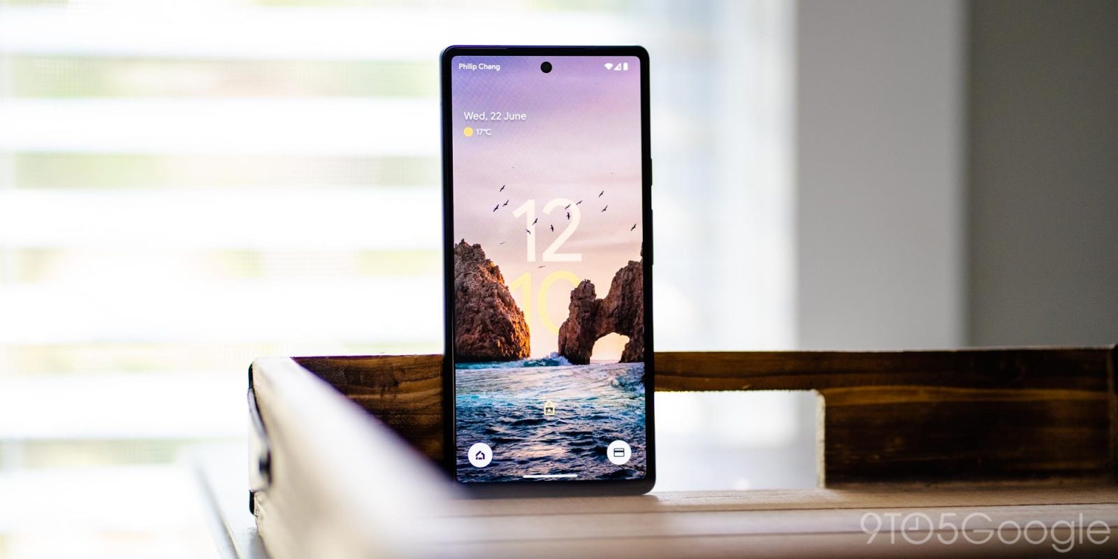
Android 12’s double-line clock is one of Google’s most notable expressions of Material You. Following iOS 16’s big emphasis, one concept design imagines how the Android and Pixel lockscreen could evolve with the addition of depth.
The Android lockscreen on Pixel phones today starts with the day/date in the top-left corner, while weather (condition and temperature) is underneath. Above this At a Glance widget is Android’s status bar where the carrier is noted at the left and the right shows battery percentage and connection statuses. At the bottom of the lockscreen, you get a shortcut to open smart home controls and Google Pay (soon Google Wallet).
Besides the background, the clock (when there are no notifications) is literally the biggest attraction and it uses Dynamic Color to adapt to your set wallpaper.
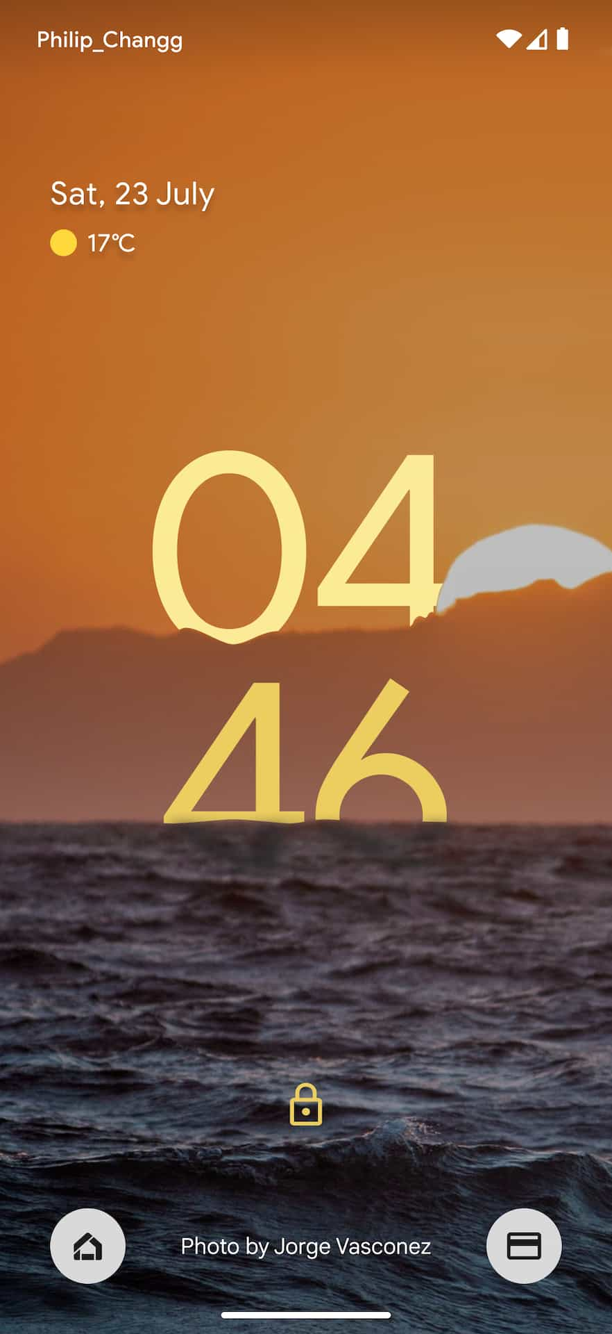
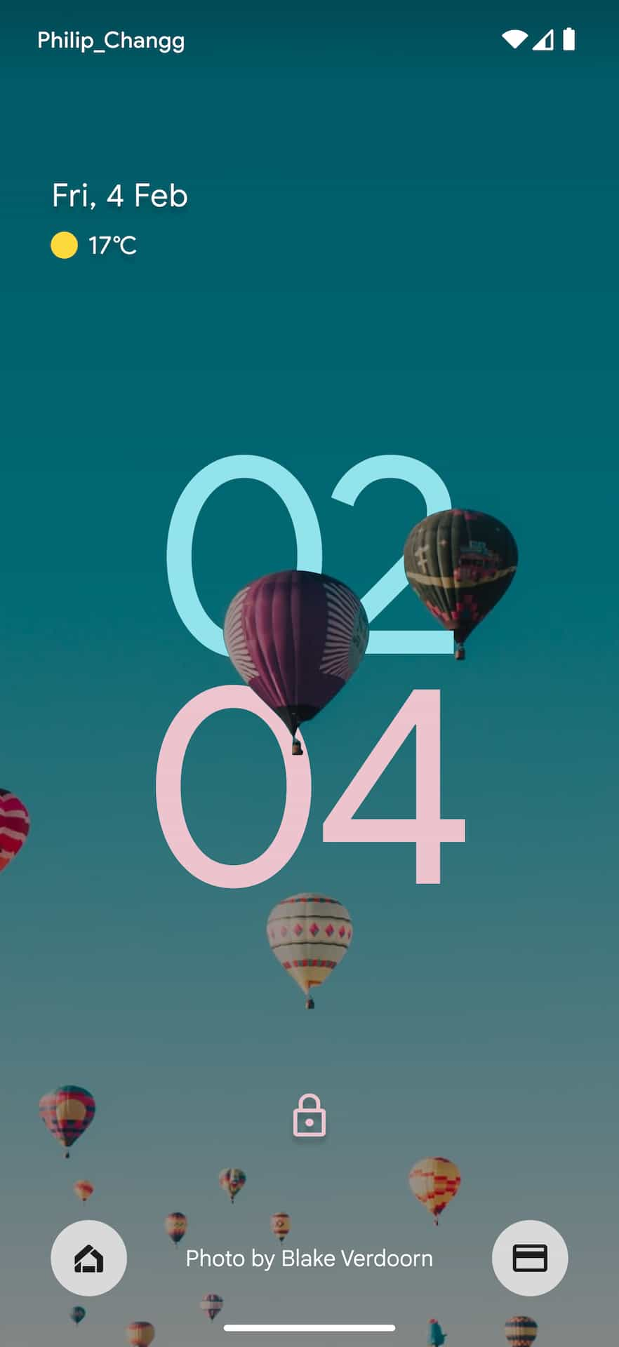
Designer Philip Chang (Twitter + Instagram) took inspiration from iOS 16 to imagine what the Android lockscreen could look like in the future. Namely, depth is applied so that the clock also adapts to what’s in the actual background image. In the example seen above, “10” is displayed behind the rock formations and the seagulls are clearly layered above the “12.” Also note how the hours and minutes are using different colors.
Other examples show the time as if it were appearing on the other side of a bridge, behind a mountain’s peak, and against a waterfall. My favorite example is the hour appearing behind clouds, while the minutes are partially submerged underneath the waves so that visibility is not impacted.
Meanwhile friend of the site RKBDI also imagined different font styles on the Android lockscreen:
This depth effect will certainly be popularized by iOS 16, but it dates back to watchOS 8 with the introduction of the Portraits watch face:
The Portraits watch face uses Portrait mode photos from your iPhone to create a multilayered watch face with depth. You can choose from three different type styles and select up to 24 photos.
On the Apple Watch, a photo with depth data is needed, but iOS 16 just leverages machine learning for a more scalable solution that also allows for non-people backgrounds. A hypothetical Android lockscreen could take the same approach. Google certainly has that depth know-how as seen by Cinematic photos in Google Photos where ML predicts an image’s depth and produces a 3D representation of the scene.


However, another thing for Google to consider is making new live wallpapers that feature a depth effect for the clock. By curating the experience, the company can guarantee that readability of the time is never impacted while also allowing for motion.
Until then, here is more of Philip’s concept:
FTC: We use income earning auto affiliate links. More.


Comments