
After three developer previews, five betas, and the AOSP release, Android 12 is ready to launch on Pixel phones as Google’s biggest mobile OS release in recent memory. The new Material You design language is a defining aspect of this Android version that spans every screen and interaction. The other big highlights are more privacy and security controls.
Material You redesign
This visual revamp starts at the lockscreen with a large two-line clock at the center of the screen when you have no notifications. When there are alerts, the time shrinks and moves to the top-left corner. Underneath that is the day and date, as well as temperature/condition. Notifications appear as a list, like before, underneath. You also get home and wallet icons in the bottom corners to access Device controls and Google Pay, respectively, while the lock indicator has also moved below.
If you unlock via fingerprint, you’ll notice that a ripple radiates from where the sensor is located on the rear. There are also fullscreen ripples when you tap the power button, plug in to charge, or lay on a wireless charger. Otherwise, you’ll encounter a tweaked PIN keypad with a 3×4 grid of circular buttons that lack the usual T9 layout.

Once on the homescreen, you’ll notice how At a Glance is now left-aligned and can surface flight boarding QR codes, timers, and select third-party app status indicators, while the search bar at the very bottom is slightly taller. Long-pressing on an icon reveals a tweaked app shortcut menu that makes use of pill-shaped shortcuts, while “Widgets” – more on that later – and “App info” get their own lines for a taller menu.
Meanwhile, holding down on free space and selecting “Wallpaper & style” reveals a new experience for selecting wallpaper and making customizations. A key part of Material You is “Dynamic Color.” Google will look at your wallpaper and select a handful of key colors that are used to theme various parts of the system and inside supported apps that have been updated, like Gboard, Google Calculator, Calendar, Camera, Clock, Contacts, Drive/Docs, Files, Gmail, Keep, and Phone.
You can select from a palette that applies different levels of theming or choose a consistent “Basic color.” This page also lets you enable/disable “Dark theme,” set app grid density (4×5 is new), or apply Themed icons that switch app logos to flat monochrome designs. Since only first-party apps are currently updated, this option is not really consistent if you have several third-party ones.
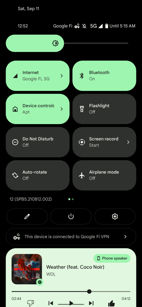
Swiping down from the top (or on the bottom gesture bar) reveals the next big Material You redesign. Quick Settings have been thoroughly modernized with pill-shaped buttons. On the initial pull, you get a 2×2 grid versus six actions before. Another swipe has Quick Settings take over the entire screen for a total of eight more shortcuts.
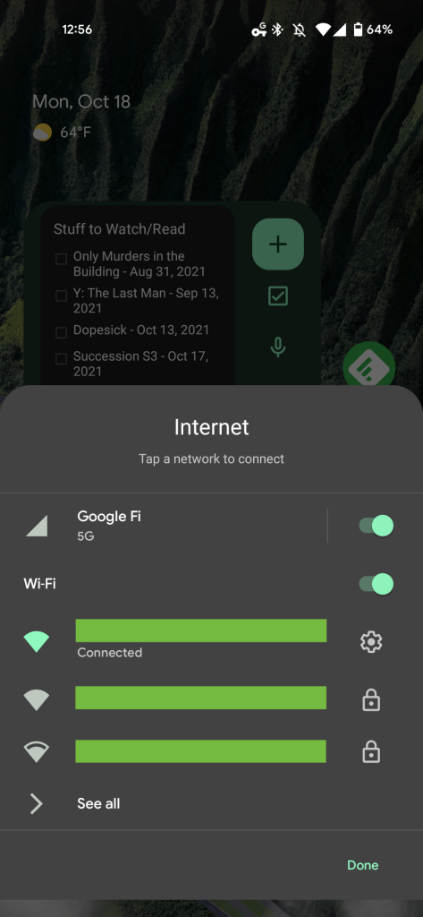
Some QS tiles have been significantly changed. “Internet” replaces/combines Wi-Fi and Mobile data with a sheet that slides up from the bottom. Device controls and Google Pay are now their own tiles with independent, full-page UIs. Overall, it’s easier to tap the larger buttons, but the reduced density is unfortunate.
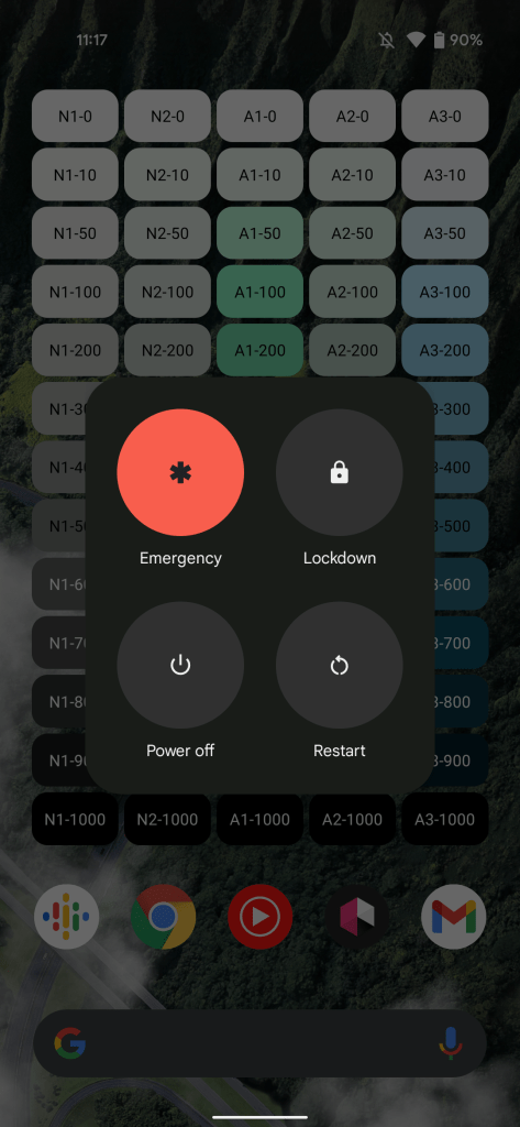
There’s also a thicker brightness slider and the ability to edit, open Settings, and access the Power menu at the very bottom. That software button comes as holding down on the power key no longer gives you a full-page menu with smart home controls and Google Pay. Rather, that action now launches Google Assistant, though users can disable this Android 12 hardware gesture for Pixel phones (Settings > System > Gestures > Press and hold power button) to just get the Emergency, Power off, Restart, and Lockdown panel.
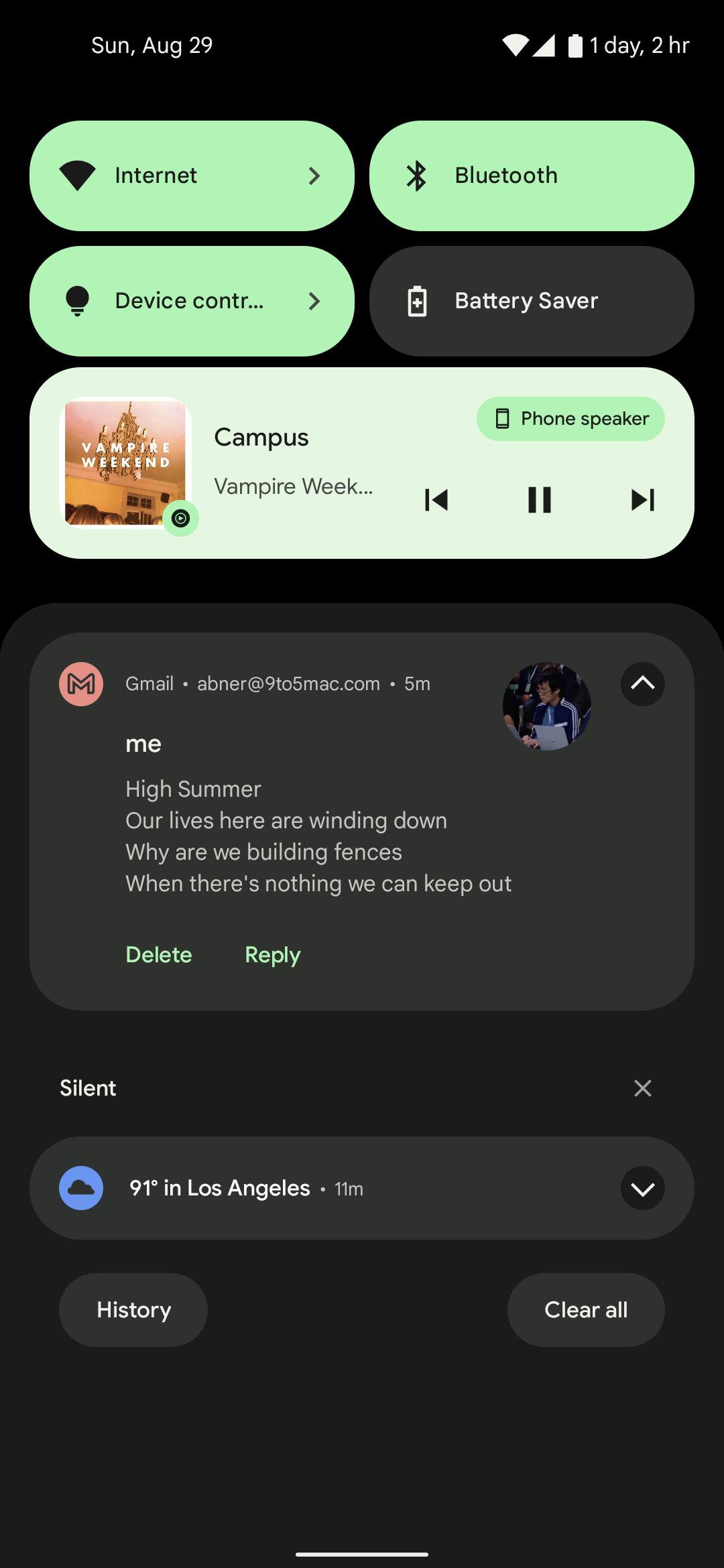
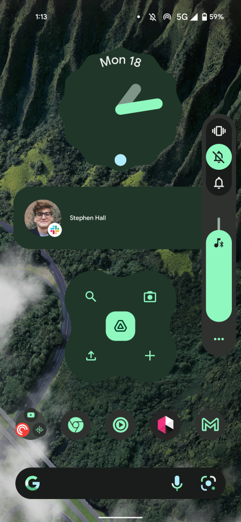
The notification layout has been slightly tweaked with a more sizable status bar icon at the left and a larger avatar/contact image on the other end. A change to media notifications sees Google no longer explicitly name what app is responsible for what’s playing. Rather, a badged icon is displayed in the bottom-right corner of slightly larger album art.
Android 12 tweaks the volume rocker with one joint pill-shaped panel. Like with brightness, the volume slider is much larger and easier to grab.
Apps, widgets, and other tweaks
Each app launch in Android 12 is accompanied by a splash screen that briefly shows the application’s icon before letting you continue. Some, like Gmail and Drive, have delightful animated icons for a slightly whimsical touch.
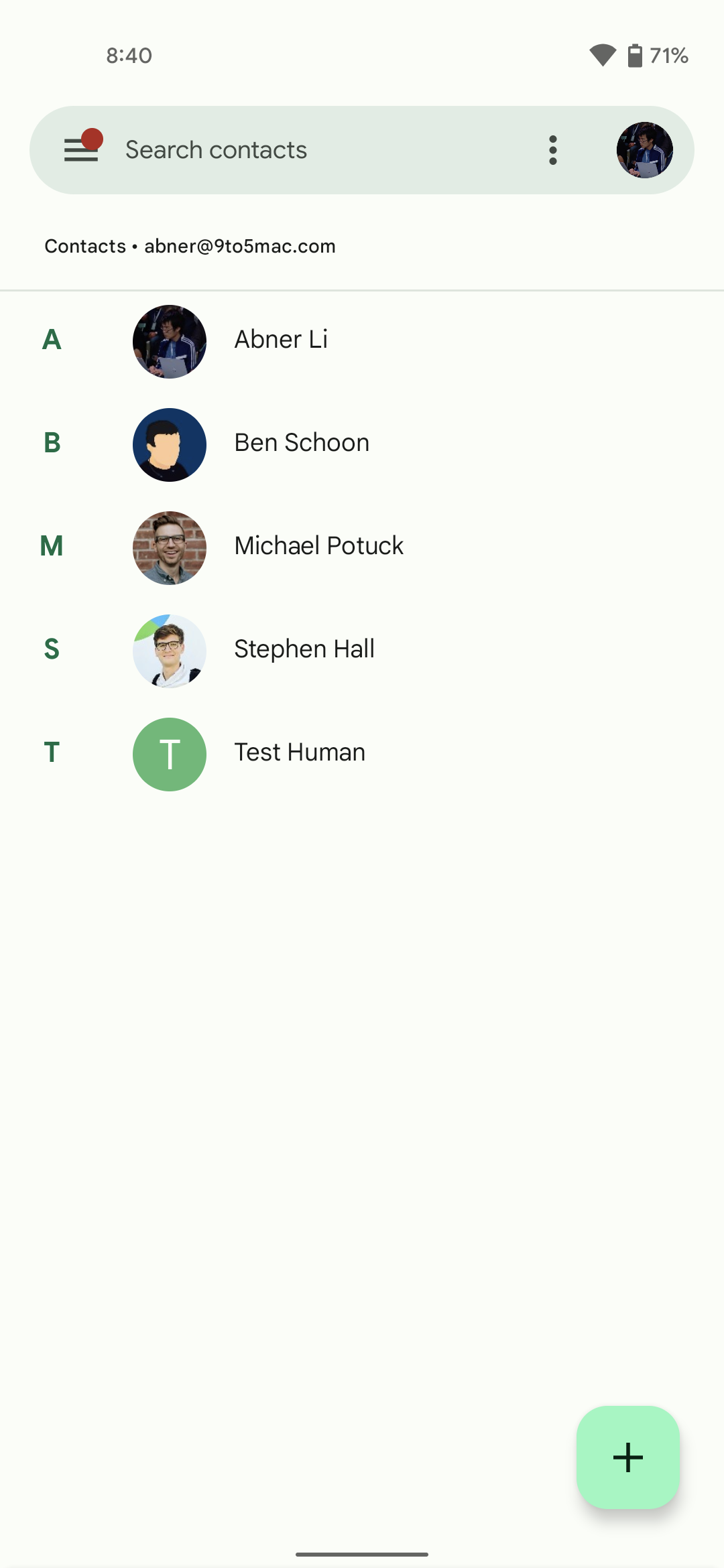
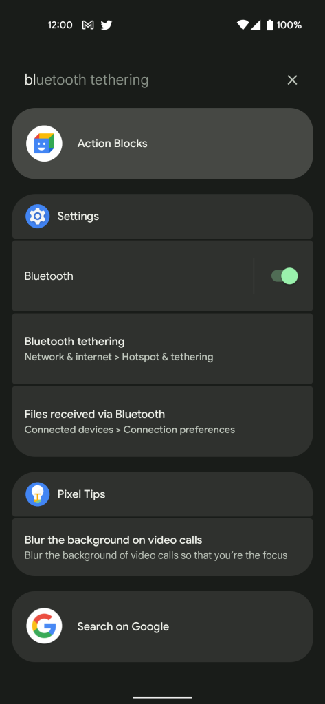
New “Device search” available from the top of the app drawer lets you find applications (and their shortcuts), settings, direct preference toggles, People (Contacts and conversations), and Pixel Tips. Upon swiping up from the homescreen, you can have the keyboard “always show” for immediate text entry.
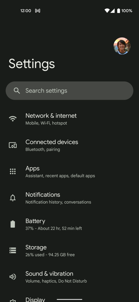
The Settings app is tweaked with large headers that name the current screen you’re viewing. Gone are the colorful icons beside each menu item for a cleaner look. Toggles have been redesigned to be larger, while high-level preferences are emphasized at the top of the screen. Here – or on any other list – you can test Android 12’s new overscroll effect. Once you reach the bottom of a list, Android now stretches and bounces back instead of showing a glow. Similarly, holding down (but not clicking) on a menu item will demo the ripple effect with tiny sparkles.

Speaking of applications, the multitasking UI has been visually tweaked so that the app icon is now separate from the Recents card. For Chrome, Google will show a button in the top-right corner to quickly copy the visible page’s URL. This also works with images for quick Lens analysis and saving. After tapping, you’ll get a row of Direct Share contacts at the bottom of the screen for very convenient sharing.
Android 12 sees a renewed focus on Widgets. This starts with a new Widgets sheet that highlights key experiences. By default, all now feature rounded corners, while Google Clock and Keep are examples of completely revamped widgets. Google is introducing a Conversations widget that shows recent messages and contacts from first and third-party apps.
The Markup tool has been updated so that in addition to drawing you can also write text with a handful of fonts available. Of course, the bigger upgrade here is support for scrolling screenshots. After taking a screen capture, the preview that appears in the bottom left has a “Capture more” button. This takes you to an editor where you can decide how much of the screen to save.
The new Game dashboard serves as a fast way to screenshot, start a recording, FPS, and turn on do not disturb (DND) – which can automatically be enabled upon entering a title. You select what tools you want to appear in a floating pill that sticks to the edge of the screen. Tiles below let you stream with YouTube Live, see achievements, and set an optimization (on supported games).
Other major UI/UX changes include:
- Picture-in-picture has been tweaked with rounded corners, while Android 12 removes the ability to resize the window by dragging the corners. Rather, you can pinch in and out to adjust.
- The Pixel 5 (and future devices) gets a Quick Tap gesture where double-tapping on the rear of the device will let you: Take screenshot, Access your digital assistant, Play or pause media, See recent apps, Show notifications, Open [custom] app.
- One cool new capability is face-detection-powered auto-rotate where the front-facing camera is leveraged to improve accuracy.
Privacy and security
The other big Android 12 tentpole is privacy. This starts with pill-shaped status bar indicators in the top-right corner that signal when an app is using the microphone or camera. After a moment, it shrinks to a hued, persistent dot.
New tiles in Quick Settings let you enable/disable “Camera access” and “Mic access” for all apps. For example, you’d need to switch the tiles on to use Assistant voice commands or the Camera app. In Settings > Privacy, you get a Privacy dashboard that shows which apps used key permissions over the past 24 hours. This includes location in a UI that is similar to Digital Wellbeing.
For location, you can now determine whether apps get your “Precise” or just an “Approximate” position. Weather apps, for example, would suffice with the latter and just knowing where you generally are.
Elsewhere, Google will alert users when apps access their copy clipboard with an “[App] pasted from your clipboard” toast message.
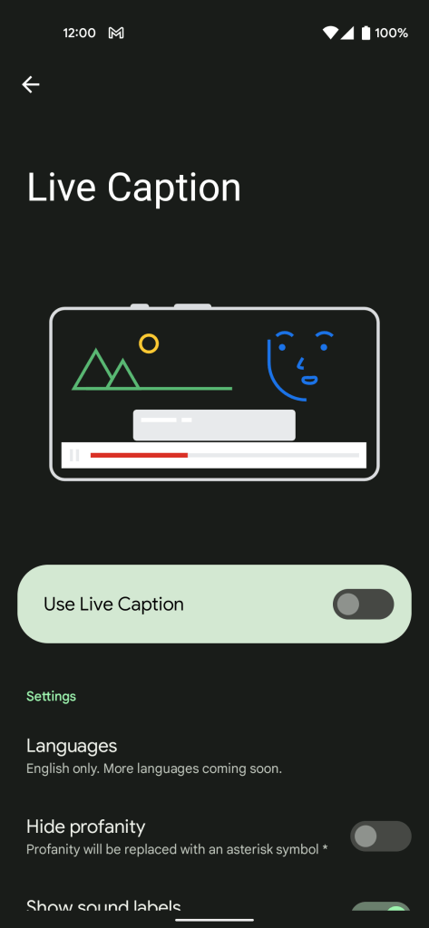
Google is also introducing (and branding) the “Android Private Compute Core.” That is where audio and language processing for features like Live Caption, Now Playing, and Smart Reply take place in an on-device manner that’s isolated from the network.
There’s now also a Security “hub” that lets you manage App security (Play Protect), make sure Find My Device is enabled, see you’re on the latest Security (patch) update, set Screen lock, Fingerprint Unlock, and Google (Account) Security Checkup.
Android 12 Pixel launch
The Android 12 launch kicks off today for the Pixel 3, Pixel 3 XL, Pixel 3a, Pixel 3a XL, Pixel 4, Pixel 4 XL, Pixel 4a, Pixel 4a 5G, Pixel 5, and Pixel 5a. Visit Settings > System > System update and click the “Check for update” button if the OTA hasn’t already appeared on your device. Android 12 Beta 5 users will get a small update to this final release.
FTC: We use income earning auto affiliate links. More.

Comments