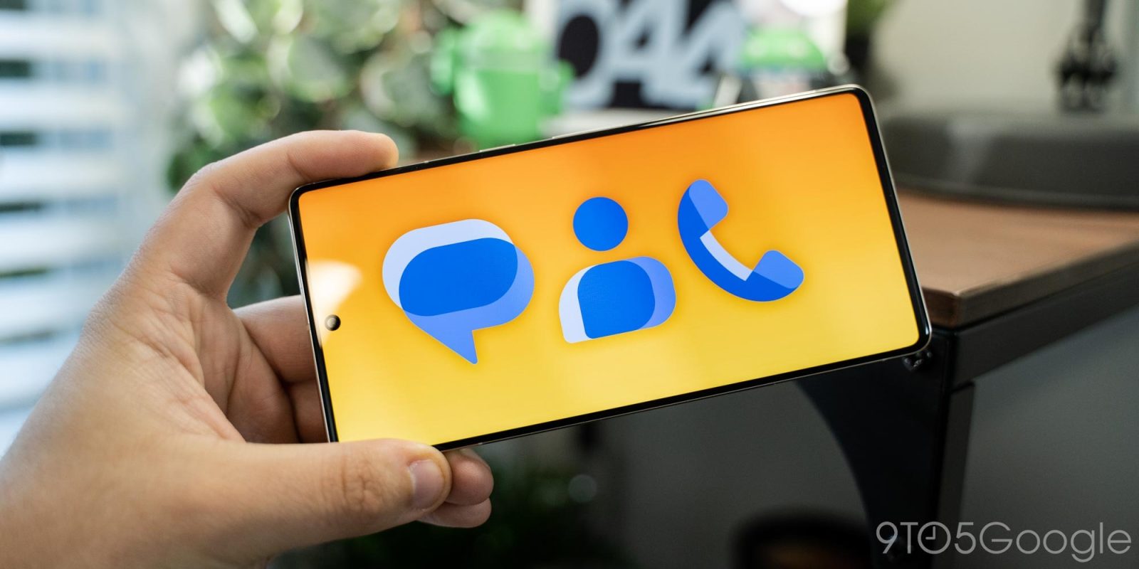
In addition to introducing a handful of Messages features, Google is rolling out new icons for the SMS/RCS app, as well as Phone and Contacts.
Update 11/20: As with the mobile version, the Phone app was updated last on Wear OS. The update rolled out over the weekend and completes the new icon trio on watches nearly a month after Contacts and Messages.
- Contacts: 1.16.0.483846653-wear
- Messages: messages.android_20221115_01_RC00.wear.openbeta dynamic
- Phone: 27.0.487435690-release-wear
Update 10/28: Just a week after the icons were announced, Phone by Google has been updated with the new logo. The Phone icon is now flatter than before, while the Themed version is quite simple. Version 92.0.484272277 rolled out to the beta channel this morning, though it’s not yet there on Wear OS.
Update 10/22: Version 3.79.25.482243121 of Google Contacts introduces the new app icon. It’s rather straightforward with no shadow and a white background. The Themed icon is slightly more interesting and simplifies the ‘body’ design. It does feel more distinctive than the previous version.
This update is not yet widely rolled out via the Play Store, while the Google Phone app is next and presumably taking advantage of its beta program.
Update 10/21: Google is already rolling out the new Messages icon with version messages.android_20221018_01_RC00.phone.openbeta_dynamic. It’s also live on Wear OS, and you can sign-up for that beta right here.
As expected, the blue icon is placed on a light background that’s pretty unremarkable. There’s no animated splash screen, which even Google Chat features, and the animation seen in Google’s promo video does not make an appearance today.
Meanwhile, the Themed icon is better and somewhat more recognizable even with its simplified logo.
Original 10/20: These three icons continue to share the same style to convey that they’re part of the same app family responsible for communication. Overlapping message bubbles is the key motif here to represent how texting (and calling) involves at least two participants. This is similar to the green Google Chat logo.
A darker blue is used where that overlap occurs, while there are also two other shades of lighter blues in use. There is a faux sense of shadow-derived depth — a rarity in modern Google iconography — as a result.
In the case of the Google Messages icon (and to ensure continuity and user familiarity), blue also represents RCS’s (Rich Communication Services) default bubble color. It’s a recognizable icon, but the overlapping portion, especially at the bottom-left and upper-right, result in a somewhat imprecise and messy look.
Google Phone, Messages, and Contacts
Top comment by Thomas Cotelli
Meanwhile, the new Google Phone app icon looks quite nice, while Contacts is straightforward enough, though the lighter shades of blue look like arms instead of what’s presumably intended (people side-by-side).
Compared to the current icon set, these icons might stand out less if they’re placed on a light background instead of dark blue. Overall, they’re less realistic and more stylized.
Google says these icons are meant to fit in with other first-party apps and “each is designed to adapt to Material You themes.” There’s certainly the flatness and lack of shadows as seen in the Workspace icons. However, another comparison is to the YouTube family of icons and its minimal color palette.
The new Google Phone, Messages, and Contacts icons are rolling out over the next few weeks.
FTC: We use income earning auto affiliate links. More.


Comments